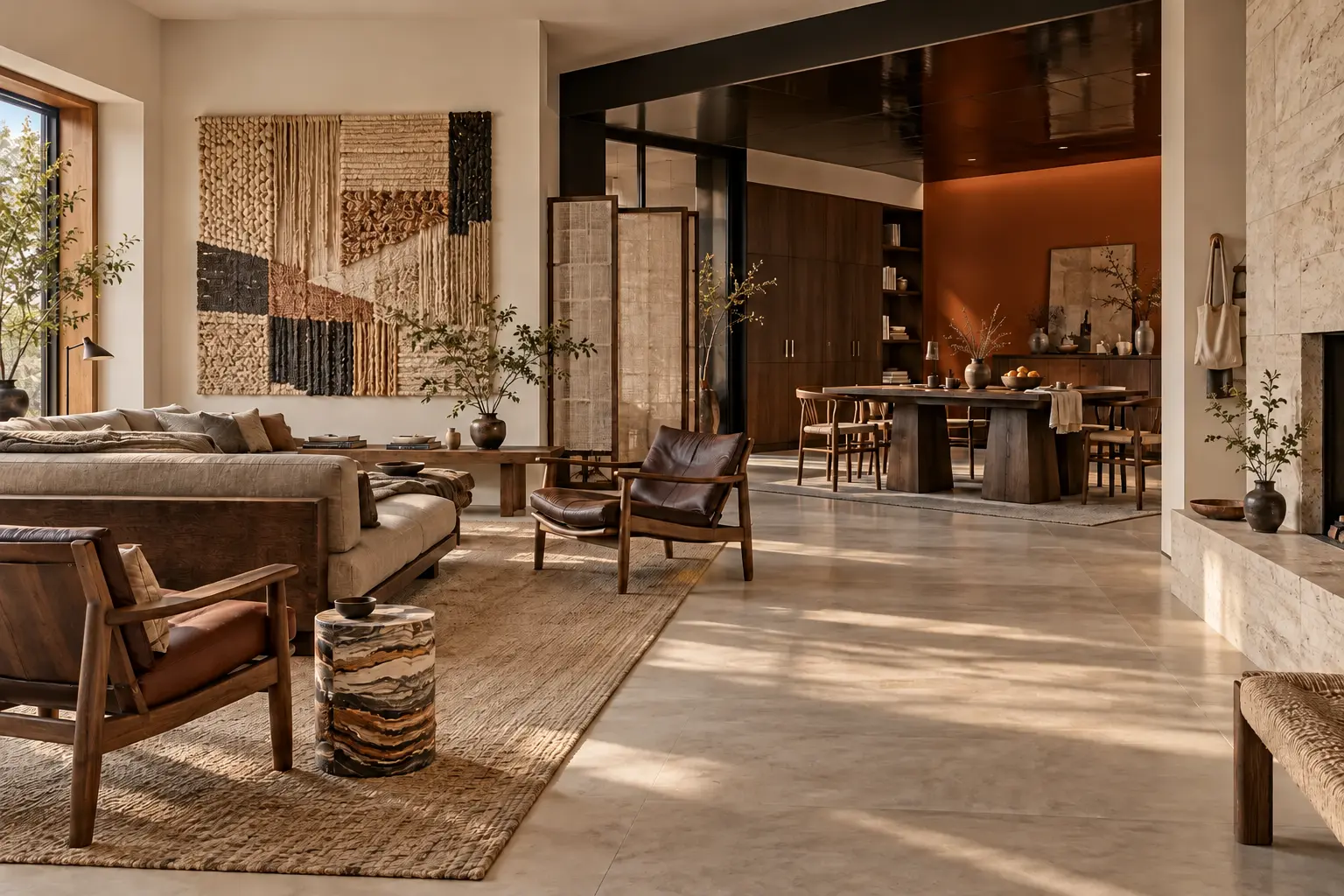
NEW JAPANDI INTERIORS 2027: CALM IS NOT THE SAME AS QUIET
Japandi became the universal language of good taste: pale timber, low furniture, linen, a handmade bowl and almost no colour. Its appeal was real, but repetition flattened the idea into a formula.
The next version keeps the discipline, tactility and respect for space. What changes is the emotional temperature. Colour becomes deeper, lacquer interrupts the matte surfaces, furniture carries architectural weight, craft grows stranger and empty space becomes deliberate rather than unfinished.
Each chapter below adds one new layer to the rooms before it. The final interior is not a rejection of Japandi. It is what happens when the style stops trying to disappear.
All interiors are AI-generated editorial visualisations, informed by the cited 2026 collections, launches and forecasts. Product references are inspirational unless an exact piece is explicitly identified.
01
COLOUR RETURNS
The first shift is also the easiest to live with: calm no longer has to mean colourless. These are grounded, mineral shades rather than decorative accents. Start with one enveloping colour and keep the furniture materially quiet.
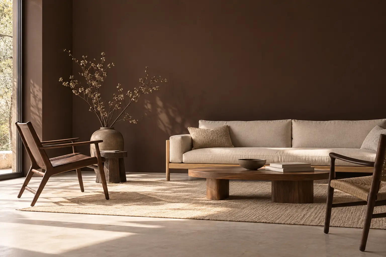
BENJAMIN MOORE SILHOUETTE — DEEP COLOUR, QUIET FURNITURE.
BENJAMIN MOORE / COLOUR OF THE YEAR 2026
SILHOUETTE AF-655
An espresso brown with charcoal notes, Silhouette replaces pale beige as the room’s quiet envelope. Used across an uninterrupted matte wall, it gives familiar cream linen and warm timber more definition without asking the furniture to perform.
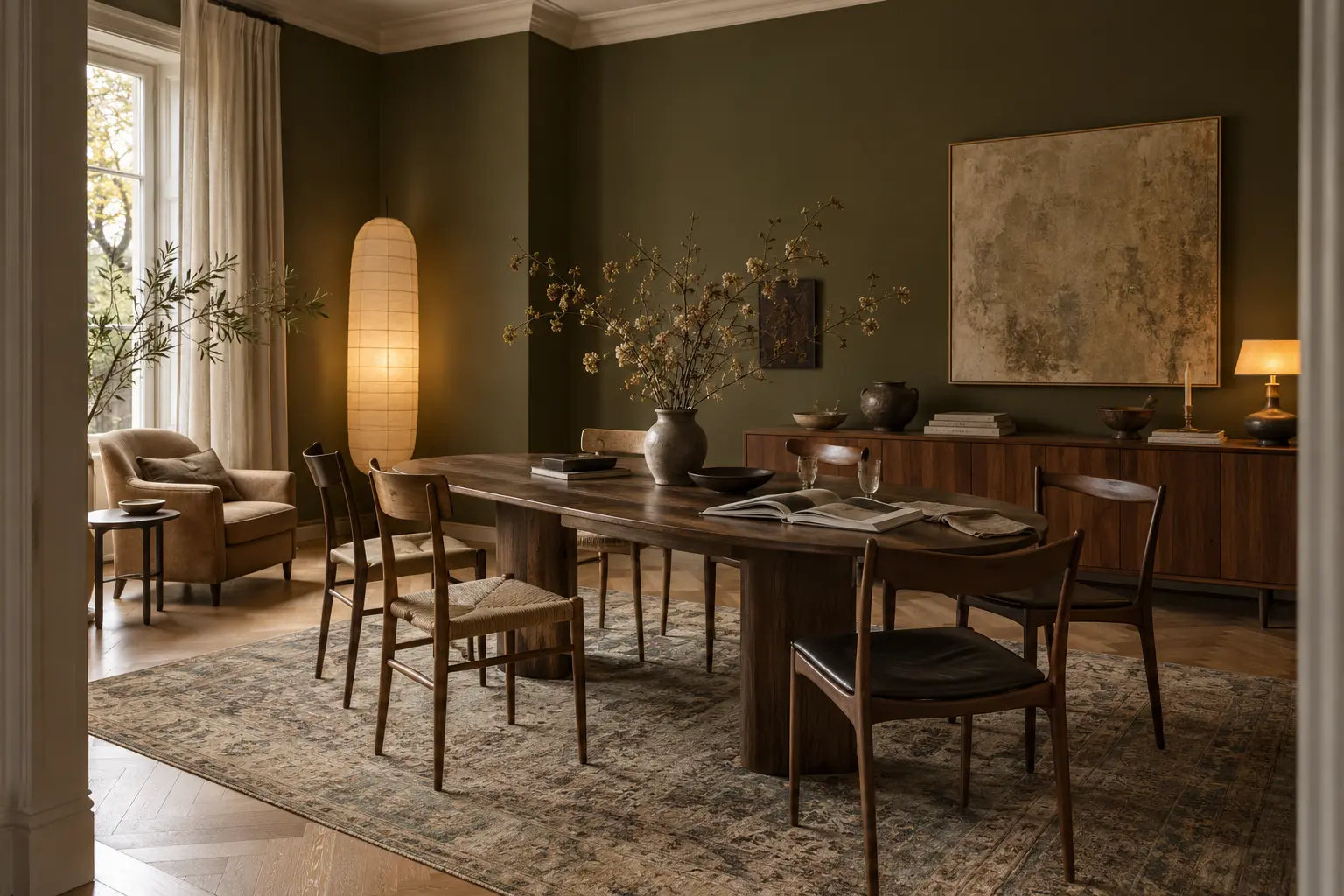
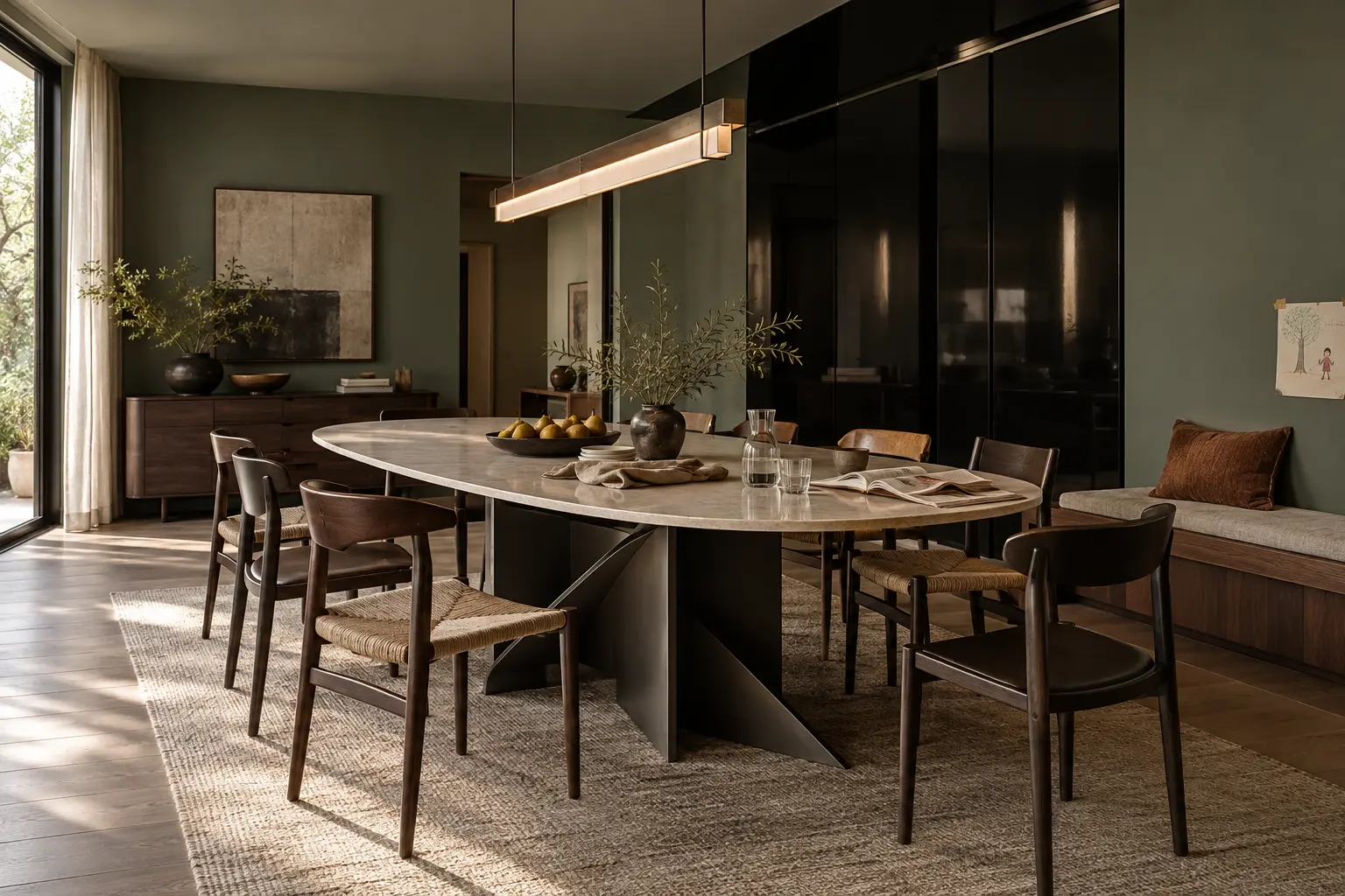
BEHR GROUNDED — A MOSSY OLIVE WITH EARTHY BROWN UNDERTONES.
BEHR / COLOUR OF THE YEAR 2027
GROUNDED T27-01
Grounded moves olive into a warmer, browner register. Across the whole dining room it acts as a natural neutral, giving walnut, aged leather, paper light and a faded rug greater depth while the broad matte walls keep the composition calm.
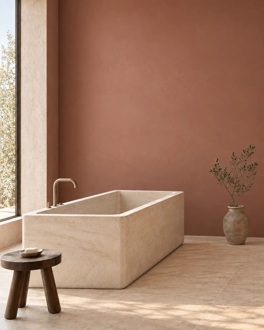
GRAHAM & BROWN ROSE EARTH — MINERAL COLOUR AGAINST PALE STONE.
GRAHAM & BROWN / COLOUR OF THE YEAR 2027
ROSE EARTH
Inspired by the mineral pigments of Italian clay, Rose Earth is warmer and more grounded than conventional pink. In the bathroom, the matte rose-clay wall becomes more distinct against pale limestone flooring and a restrained dark-walnut accent.
02
GLOSS BREAKS THE MATTE SPELL
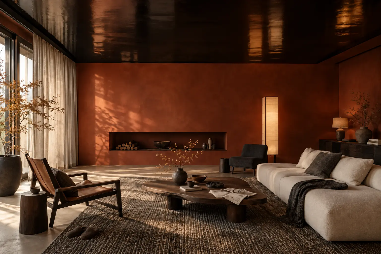
Now keep the colour, but change the finish. Lacquer returns as a precise interruption inside softer rooms: one plane, one door or one built-in element. Gloss should sharpen the interior, not turn it into a showroom.
COLOUR, NOW CUT WITH A SINGLE REFLECTIVE PLANE.
ONE REFLECTIVE PLANE
THE CEILING DEEPENS THE ROOM
A black lacquered ceiling gives the paprika-coloured living room a darker horizon and reflects light without introducing another object. Timber, linen and stone remain matte, so the contrast stays controlled.
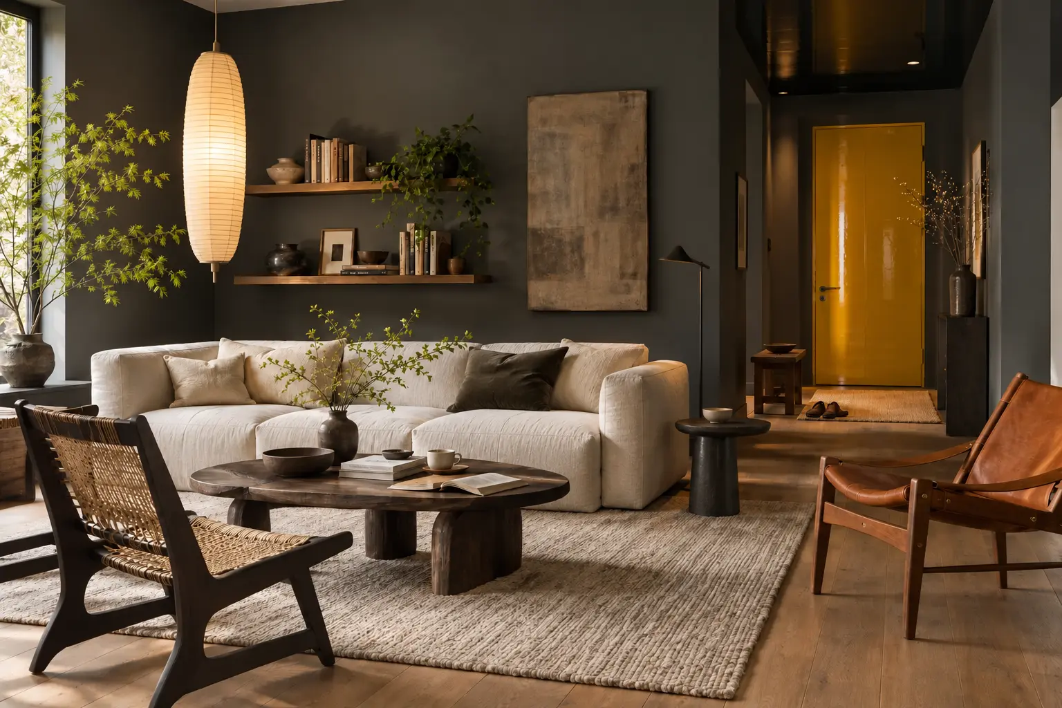
ONE ARCHITECTURAL DETAIL IS ENOUGH.
THE SMALLEST HIGH-IMPACT MOVE
ONE LACQUERED DOOR
A single golden door becomes graphic punctuation inside a graphite room. Because the surrounding walls, upholstery and timber stay quiet, the gloss reads as an intentional layer rather than a decorative effect.
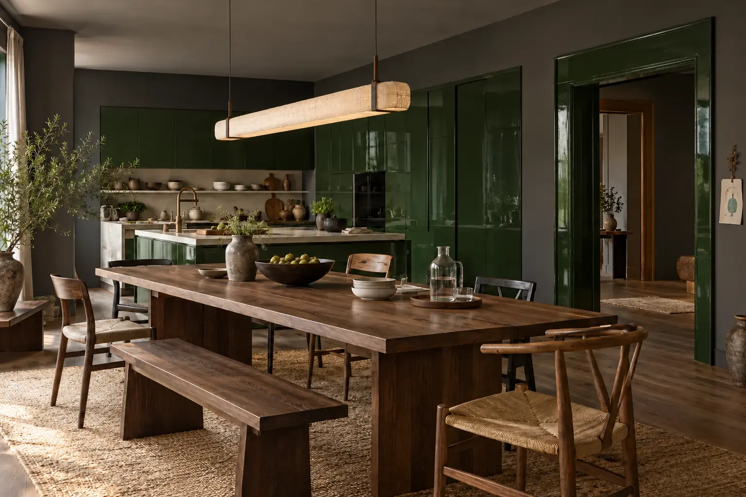
LACQUER WORKS BEST WHEN WOOD, PAPER AND STONE STAY MATTE.
GLOSS AS A BUILT-IN SURFACE
THE KITCHEN REFLECTS MOVEMENT
Deep green lacquer brings changing daylight into the kitchen while the dining table, chairs and floor preserve the warm timber foundation. Reflection is concentrated in the cabinetry, not spread across the whole room.
03
FURNITURE BECOMES ARCHITECTURE
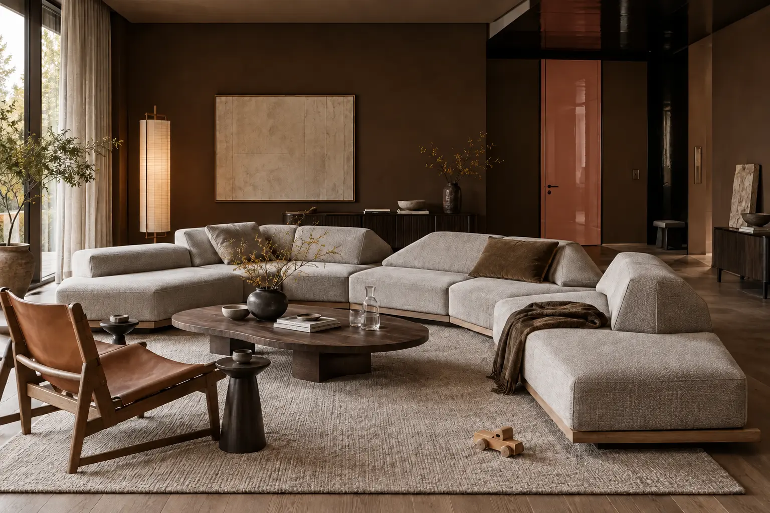
The third layer changes scale. Keep the deeper colour and controlled gloss, then add one piece with enough presence to organise the whole room. Sofas become landscapes, tables act like small buildings and chairs establish a repeated rhythm.
SOFT IN USE, ARCHITECTURAL IN COMPOSITION.
INSPIRED BY MINOTTI / ORION 2026
THE SOFA BECOMES A LANDSCAPE
A modular sofa no longer sits politely against one wall. Its low interlocking volumes divide the room, direct movement and create several ways to sit while the brown envelope and one lacquered door preserve the earlier layers.
THE BASE, NOT THE TOP, DEFINES THE ROOM.
THE NEW CENTREPIECE
THE TABLE ACTS LIKE A SMALL BUILDING
Here the base carries the idea: intersecting dark planes support a quieter stone top and give the dining room a clear centre of gravity. Familiar timber chairs keep the gesture usable rather than monumental.
LEANER FURNITURE, STRONGER RHYTHM.
INSPIRED BY MOLTENI&C / CORSETTO
REPETITION CREATES THE ARCHITECTURE
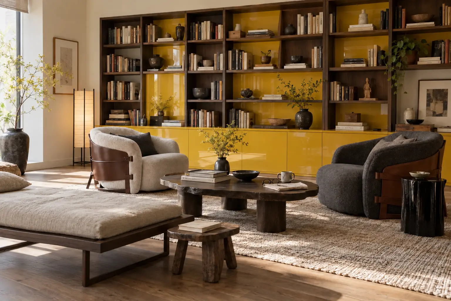
A lean chair can still carry authority when its silhouette is repeated. Against the long library wall, the sequence of timber, leather and curved upholstery produces rhythm without adding another oversized object.
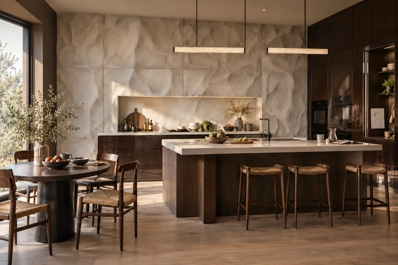
The familiar limewashed wall is no longer enough on its own. Keep colour, gloss and stronger furniture, then give one wall physical depth. The new surface has a reason: it extends the kitchen, holds the bed or frames the desk.
A MATERIAL WALL WITH AN ARCHITECTURAL JOB.
INSPIRED BY PATRICIA URQUIOLA / MOSSO FOR CIMENTO
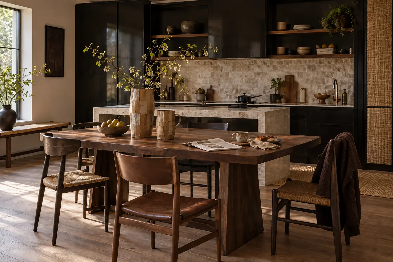
RELIEF EXTENDS THE KITCHEN
The mineral wall runs behind the working zone instead of appearing as an isolated decorative panel. Its shallow movement catches daylight across a large surface while dark walnut cabinetry keeps the kitchen grounded.
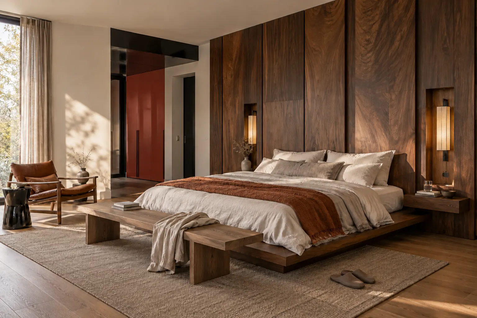
TIMBER USED AS ARCHITECTURE, NOT AS AN ACCENT.
TIMBER AS ENVELOPE
THE WALL HOLDS THE BED
Full-height walnut panelling absorbs the headboard, bedside storage and lighting into one continuous plane. The result feels substantial without requiring more furniture, while the restrained red door carries forward the earlier colour layer.
DEPTH REPLACES THE CONVENTIONAL FEATURE WALL.
INSPIRED BY MUTINA / EMISFERI
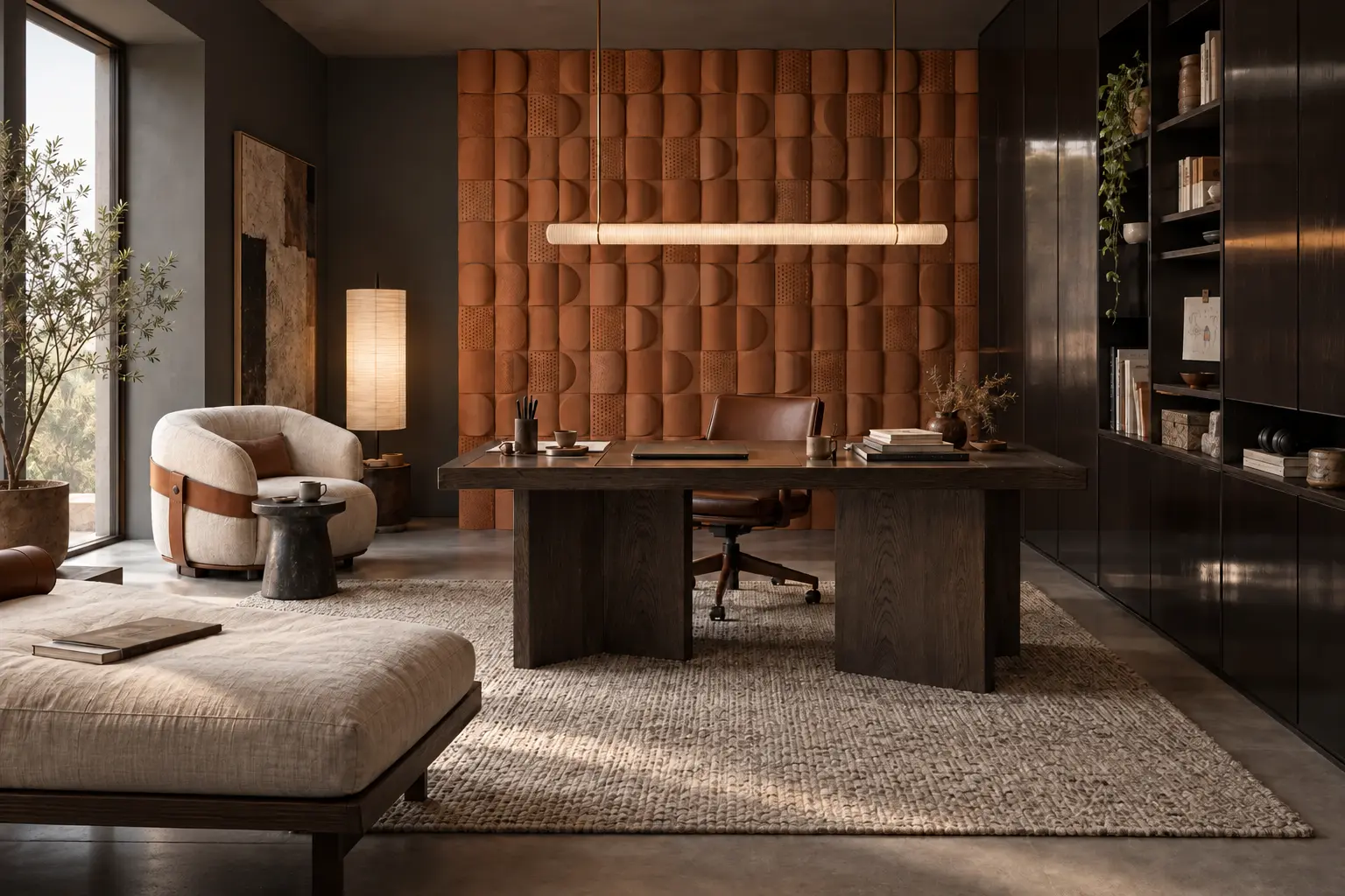
RELIEF MAKES LIGHT VISIBLE
In the study, a field of rounded terracotta modules turns small changes in daylight into shadow and movement. The palette remains controlled; depth, rather than pattern, gives the wall its presence.
Calm is more interesting when it has a point of view.
05
A COLDER MATERIAL ENTERS
Aluminium is the deliberate disturbance. Its coolness makes timber feel warmer, clay colours richer and woven surfaces softer. The rule is simple: one cold note per interior.
ALUMINIUM AS ONE SCULPTURAL INTERRUPTION.
INSPIRED BY NM3 × VISIONNAIRE
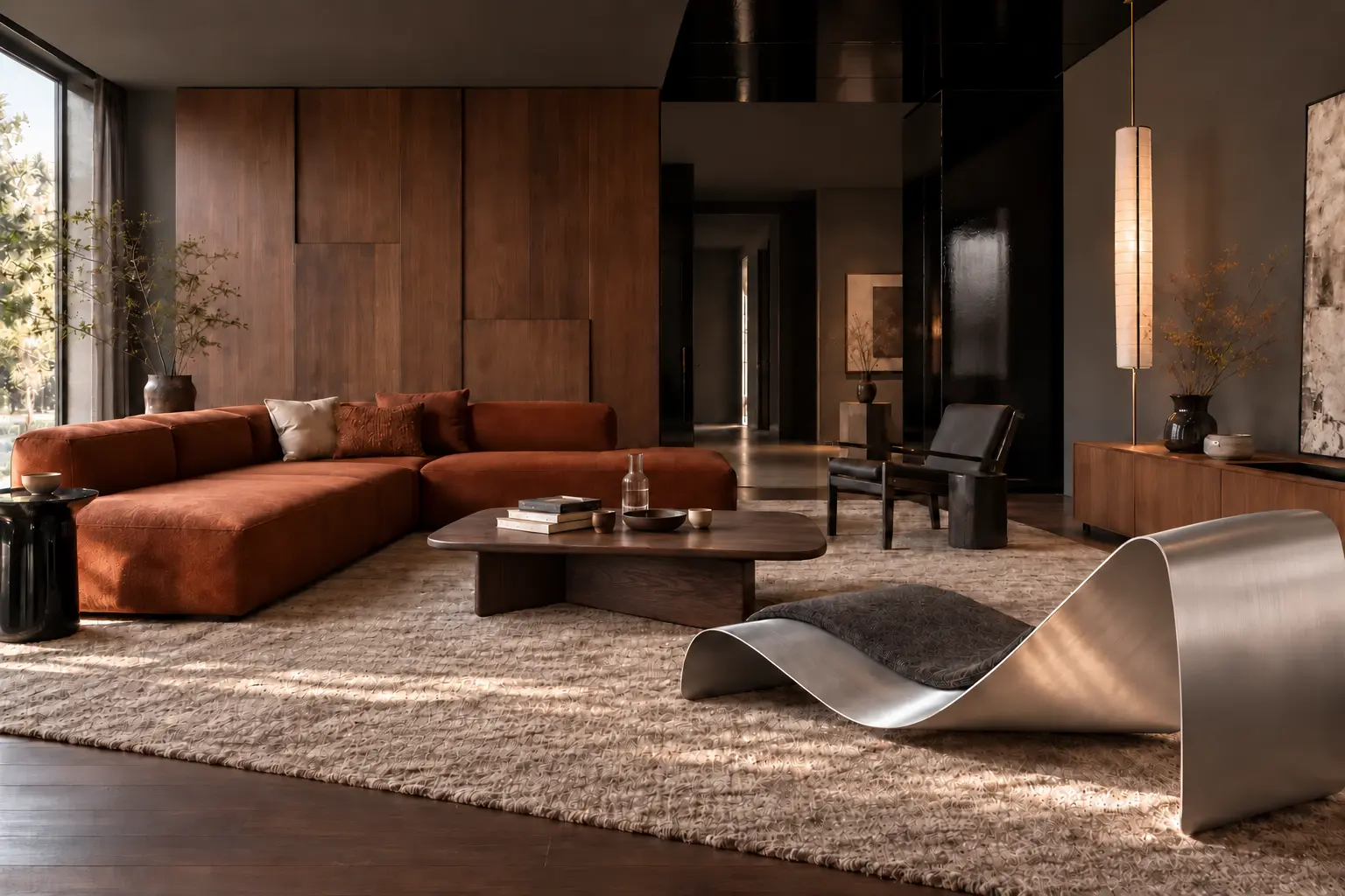
ONE COLD SCULPTURAL INTERRUPTION
The aluminium chaise is the room’s only major cold note. A dark-walnut coffee table restores warmth at the centre, while the plaster, textiles and timber remain matte and tactile.
PRECISION USED IN A QUIET DOMESTIC SCALE.
INSPIRED BY RIMOWA × LEHNI
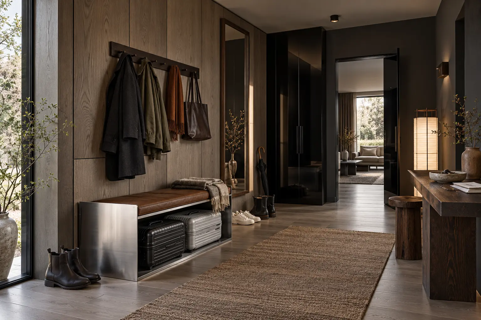
PRECISION AT A DOMESTIC SCALE
A restrained aluminium bench and storage element bring the precision of luggage engineering into a timber-lined entry. Their narrow profiles keep the metal present but never dominant.
METAL AS A SINGLE LINE AROUND SOFT UPHOLSTERY.
THE MOST LIVEABLE VERSION
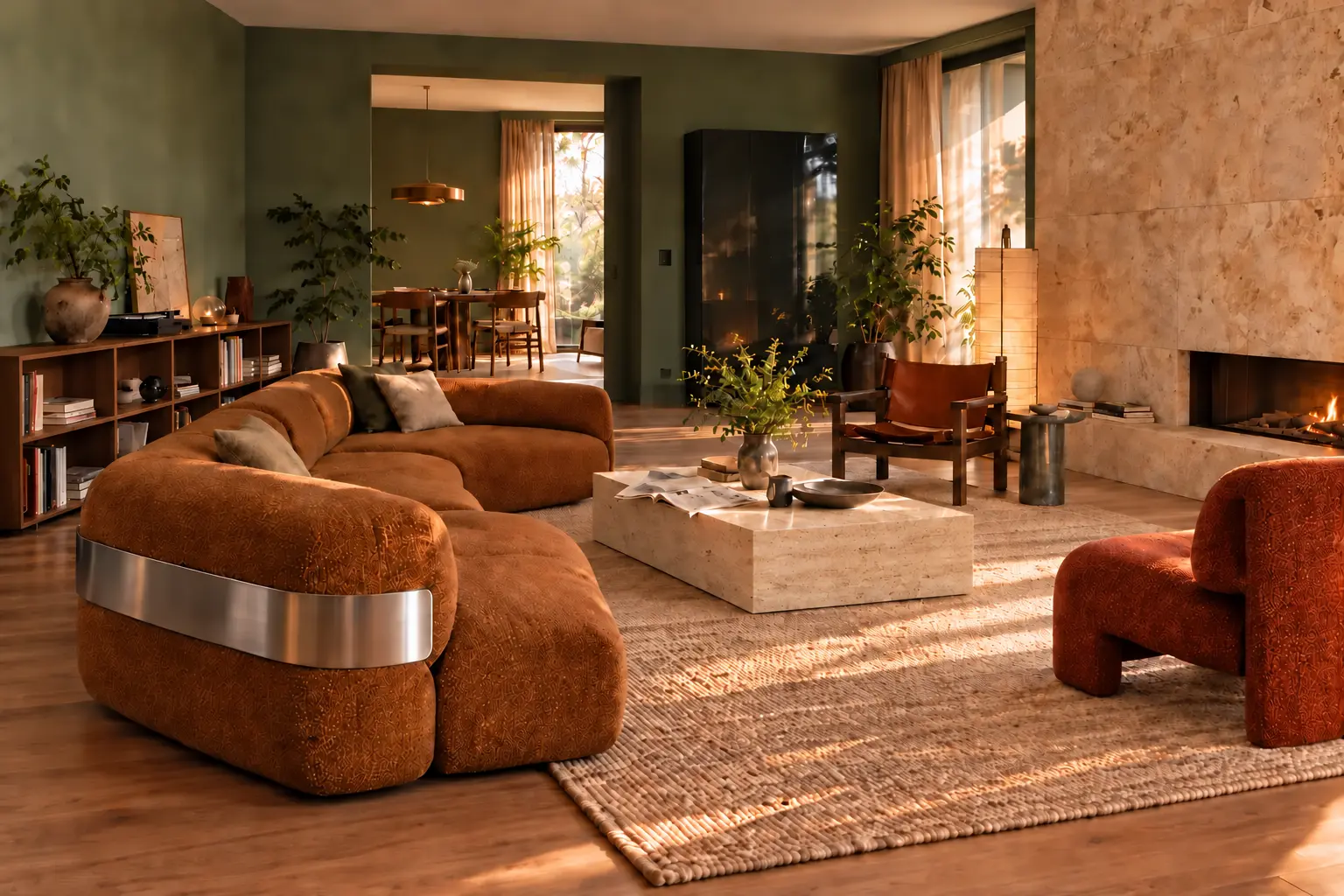
METAL BECOMES A SINGLE LINE
A slim brushed-aluminium band gives the cinnamon sofa a sharper outline without adding another metal object. Used as a detail rather than a mass, the colder material heightens the softness around it.
06
CRAFT BECOMES EXPERIMENTAL
Craft remains central, but reverence gives way to experimentation. Traditional techniques are enlarged, reshaped and merged with architecture, giving the room a visible human hand without nostalgia.
INSPIRED BY GRID UNWOVEN — LANZAVECCHIA + WAI WITH TAKANORI SENDA.
CRAFT X TECH / TOKAI 2026
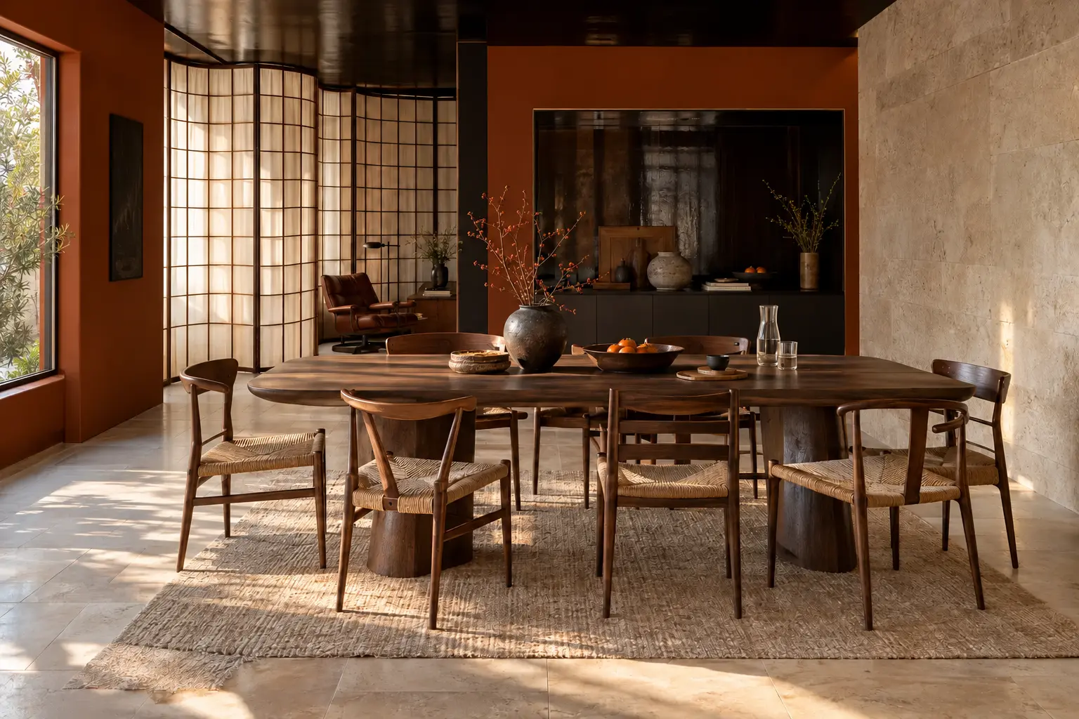
WASHI BECOMES A FLOWING WALL
Inspired by Grid Unwoven, the hand-made Mino washi screen is stretched to architectural scale. Its open weave filters light and separates the dining room without closing it.
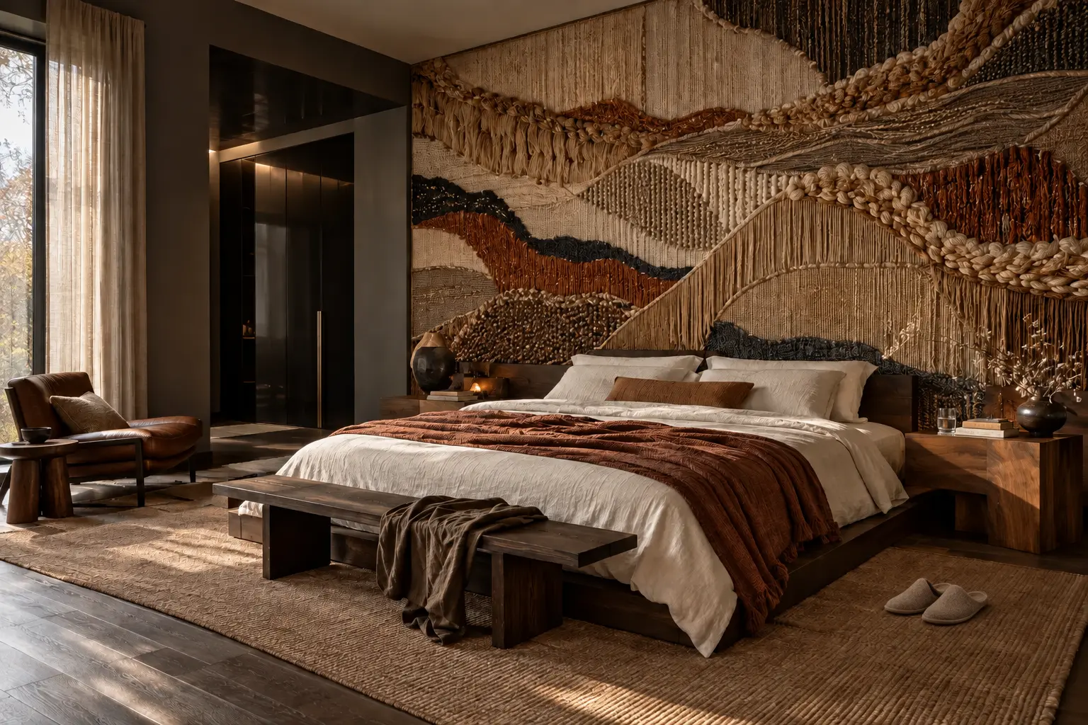
EMBROIDERY USED AS AN IMMERSIVE ARCHITECTURAL SURFACE.
INSPIRED BY DAVID/NICOLAS × DE GOURNAY
EMBROIDERY BECOMES A SPATIAL SKIN
Instead of a framed textile, dimensional embroidery wraps the bedroom wall and changes with the light. The craft is immersive, while the bed and surrounding furniture stay deliberately restrained.
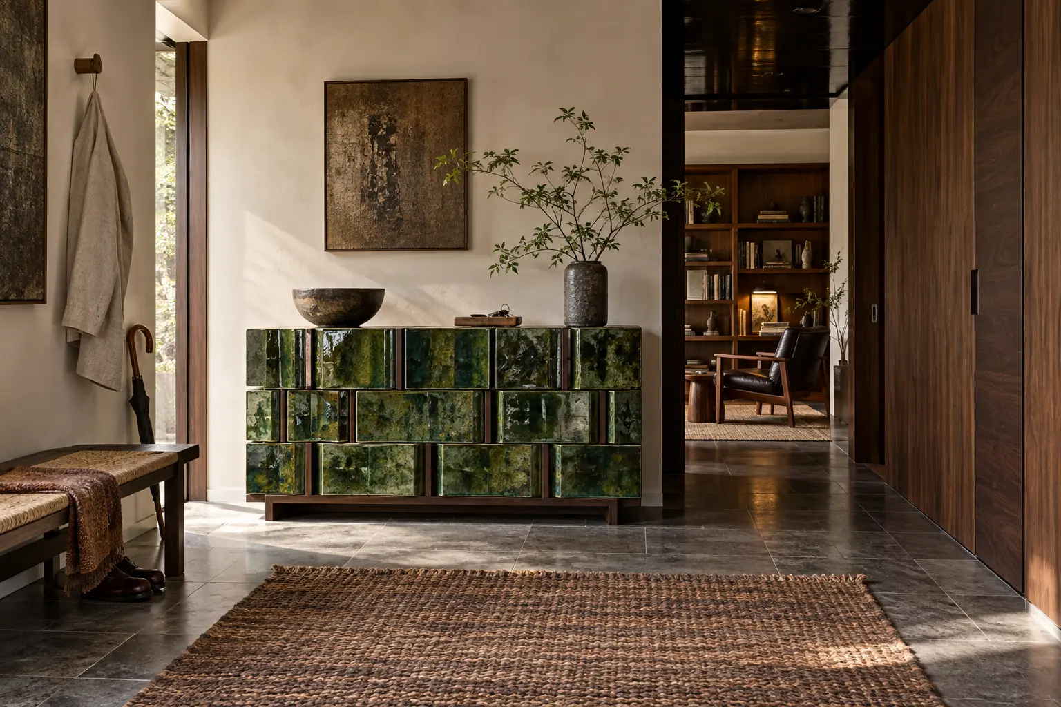
INSPIRED BY FUSHI — DAVID CAON WITH MINO YAKI MASTER YOHEI ITO.
CRAFT X TECH / FUSHI
CERAMIC BUILDS THE FURNITURE
Mino Yaki ceramic modules form a functional console rather than a decorative vessel. Their deep green glaze gives the entry one concentrated note of colour and a surface that visibly records the hand.
07
THE OBJECT STOPS BEHAVING
One object should make the reader look twice: furniture, sculpture, packaging or raw material? In a real home, one such anomaly is enough. Its job is not to match, but to disturb the category.
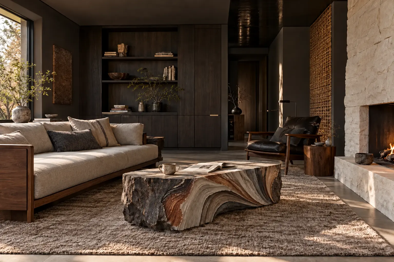
THE PAPER LOG — A LIGHT MATERIAL WITH MONUMENTAL PRESENCE.
ISSEY MIYAKE × ENSAMBLE STUDIO
PAPER TAKES ON ARCHITECTURAL WEIGHT
Compressed paper becomes a log-like bench and table with the visual mass of timber or stone. The unfamiliar material gives the quiet living room its single moment of productive uncertainty.
WOOD AS MASS, NOT SURFACE.
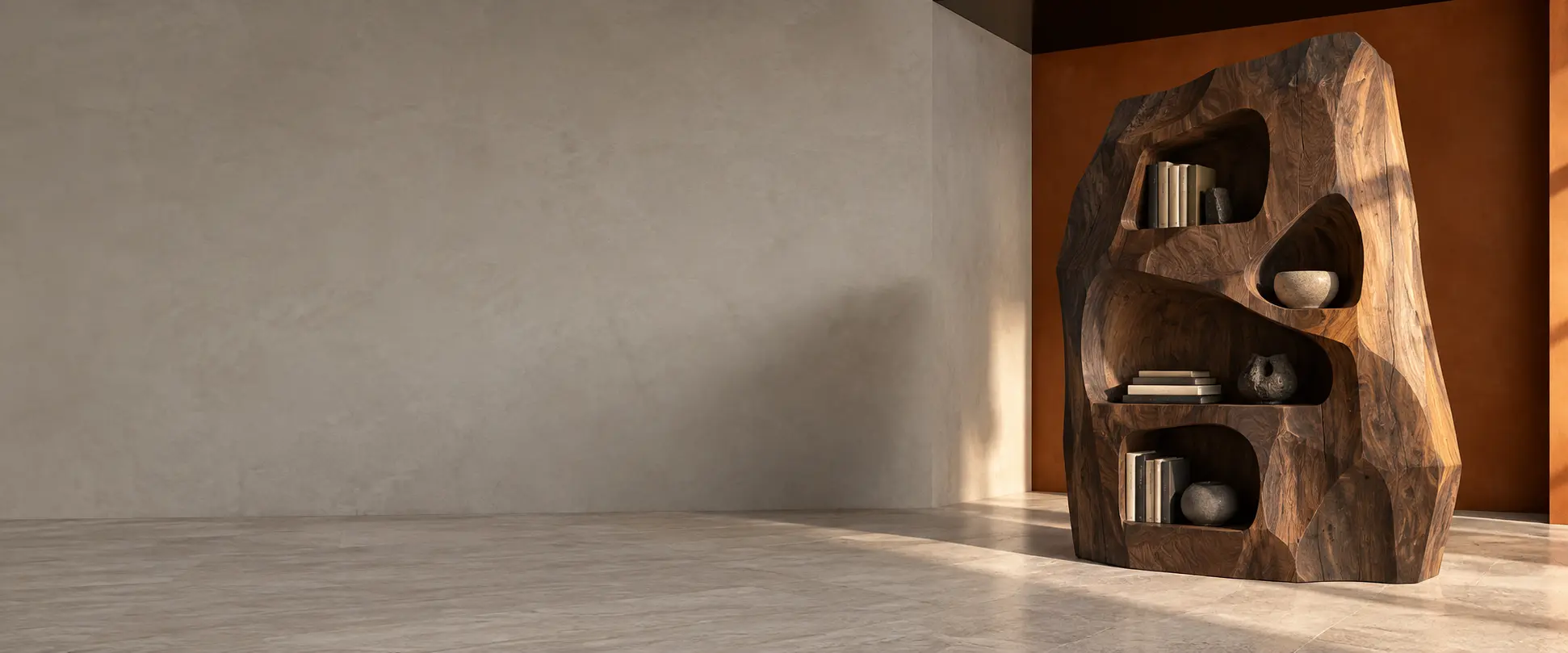
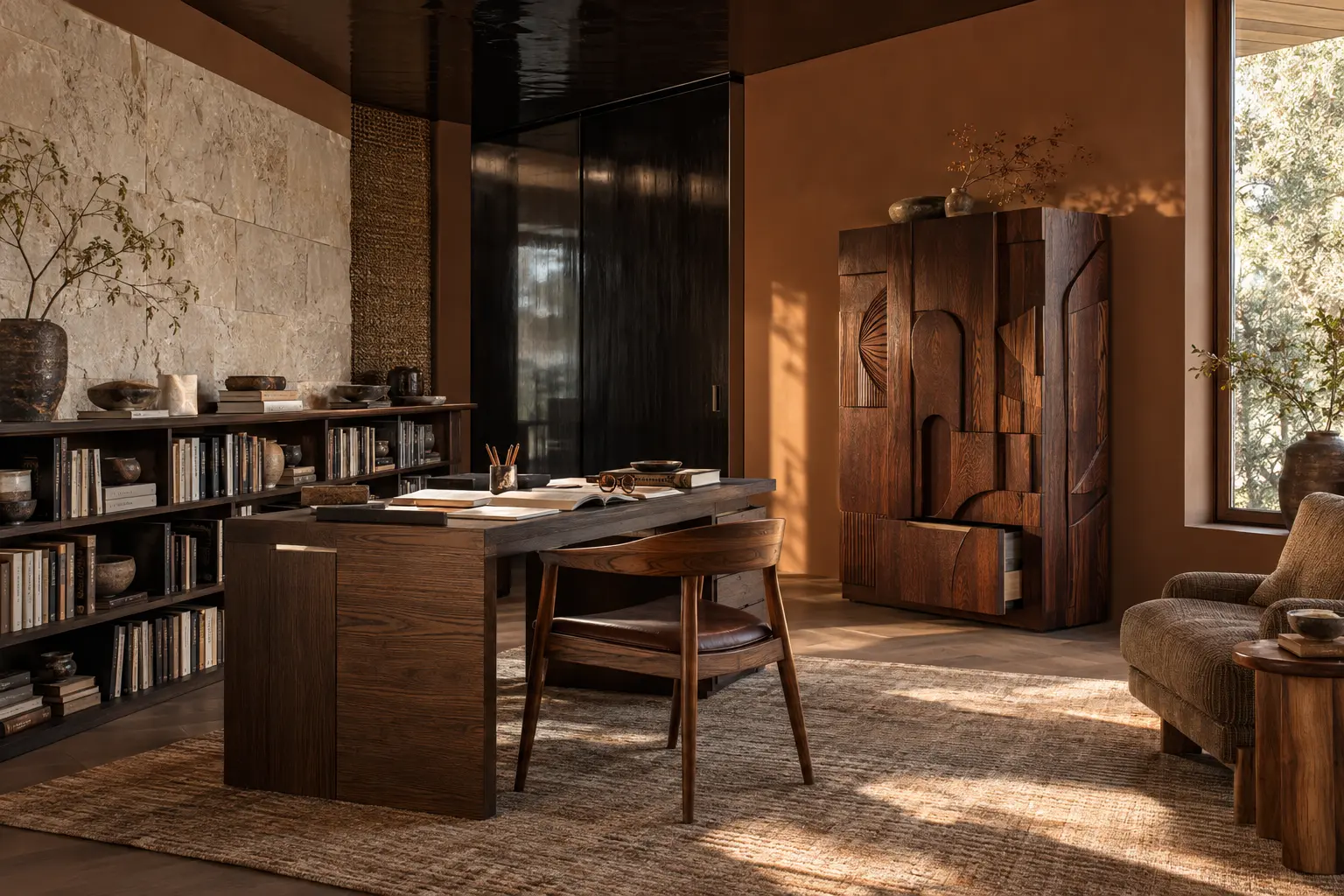
HANNES PEER × SEM CORE
WOOD IS TREATED AS SUBSTANCE
The carved cabinet reads almost like a geological fragment placed inside the home office. Solid wood is allowed to feel heavy, irregular and structural rather than reduced to a polite veneer.
INSPIRED BY JACQUES MONNERAUD — CRAFT WITH A SENSE OF MISCHIEF.
WALLPAPER* DESIGN AWARDS 2026
CERAMIC PRETENDS TO BE PACKAGING
Jacques Monneraud’s vessels imitate taped corrugated cardboard so convincingly that the domestic object becomes a visual trick. The gesture is witty, but its earthy surface still belongs naturally in the room.
08
EMPTY SPACE HAS A JOB
The final layer is not another object, but a decision about what remains open. A richly furnished room can still preserve a deliberate pause, giving every stronger material enough space to register.
A QUIET CENTRE INSIDE A COMPLETE, LIVED-IN ROOM.
SPACE AS THE CENTREPIECE
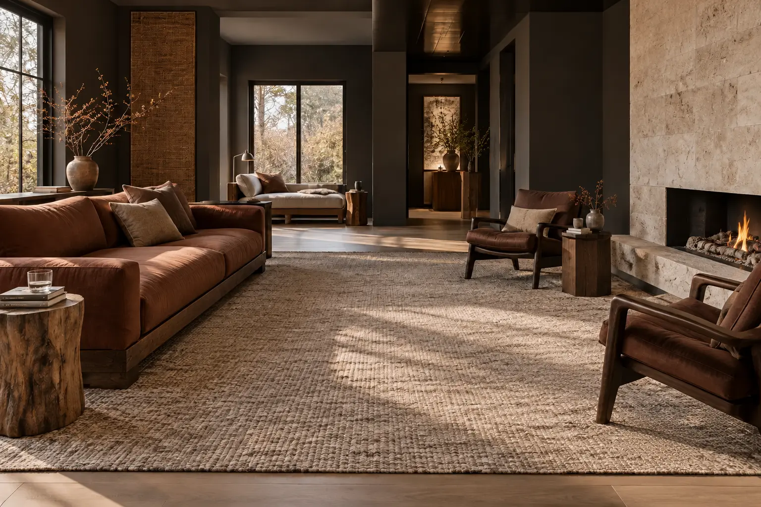
THE MIDDLE OF THE ROOM STAYS OPEN
The seating is complete, but it does not consume the centre. The open area improves movement and allows the deeper colour, tactile furniture and crafted details to be read as a composition.
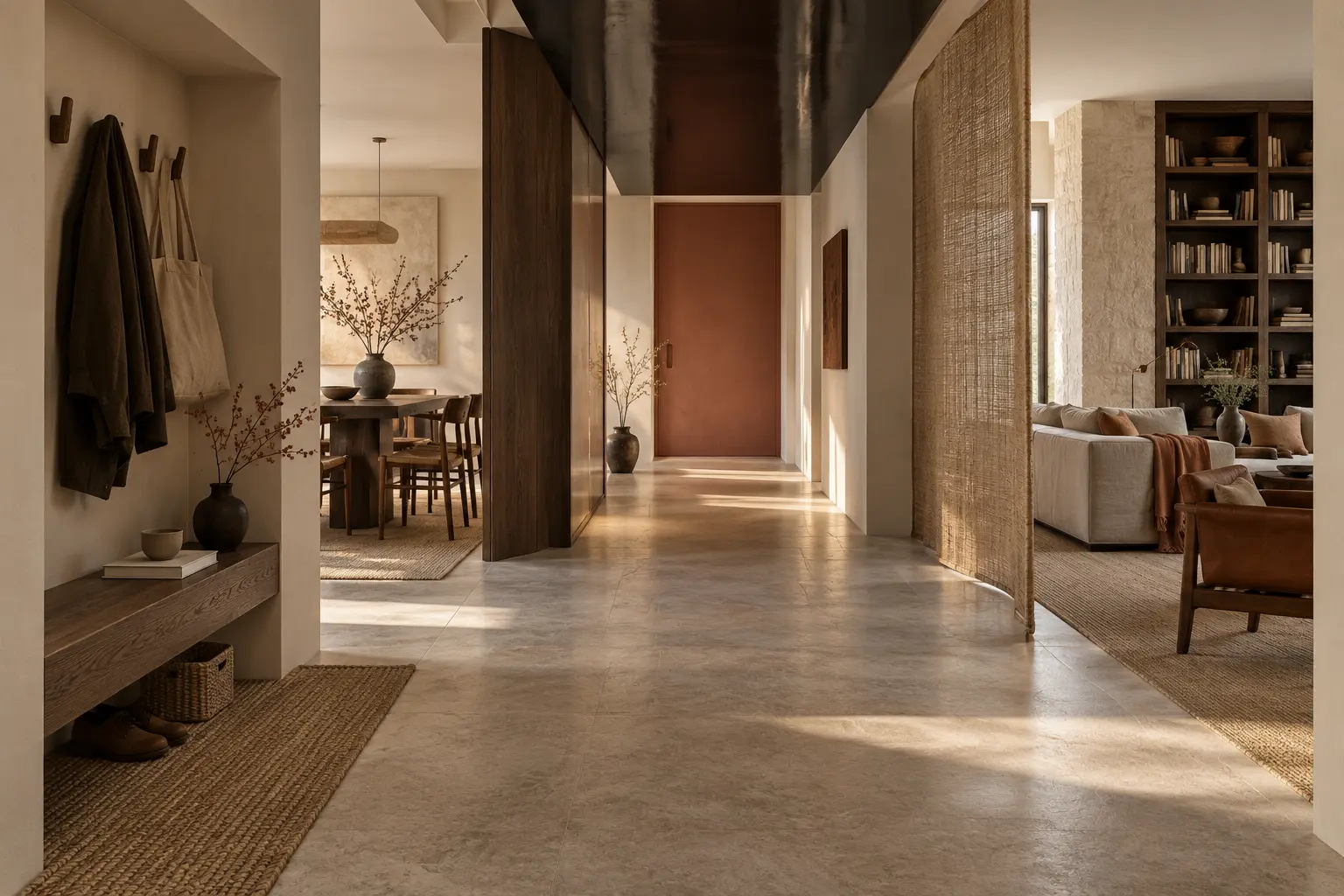
SPACE USED AS A THRESHOLD BETWEEN TWO ACTIVE ROOMS.
MICRO-ZONING
A THRESHOLD CONNECTS TWO ACTIVE ROOMS
A generous corridor between dining and living is not leftover floor area. It creates a clear transition, preserves long views and lets both furnished zones feel calm without becoming sparse.
THE FINAL ROOM — EVERY LAYER PRESENT, NONE OF THEM SHOUTING ALONE.
THE FINAL SYNTHESIS
EVERY LAYER, HELD IN BALANCE
Colour, controlled gloss, architectural furniture, a dimensional wall, a trace of metal, experimental craft and one unexpected object are all present. The open space is what stops any single idea from shouting.
MY EDIT
The ideas I’d take with me.
01
The deeper wall
I would start with the envelope of the room: a richer wall can make the furniture you already own feel more deliberate.
02
The single lacquered door
One reflective interruption is the part worth borrowing. There is no need to turn the whole interior into a glossy surface.
03
The ceramic console
A crafted object with enough character to hold your attention. I would give it space rather than surround it with more statements.
THE TAKEAWAY
Do not replace the Japandi room. Give it a stronger point of view.
KEEP THE CALM. ADD THE FRICTION.
Begin with one deeper wall colour. Add gloss to a single architectural surface. Choose one piece of furniture with real mass, one material wall and one object that is difficult to categorise. Keep aluminium to a narrow line. Then stop — and leave space around the result.
The new Japandi is not louder because it contains more. It is stronger because every addition has a reason.