Interior design trends 2027: homes with personality
The interior design trends I am taking into 2027 have five things in common: objects with a past, art that means something, lighting with presence, expressive colour and details you can almost feel. A room can hold all of them without looking like anyone else's.
There are already useful clues in the year-ahead releases. RAL’s 2027+ colour report explores craft and contrasting colour relationships. Creativeworld’s 2027 themes bring handwork, reused materials and personal memories into everyday rooms.
These forecasts sit alongside the 2026 design coverage that first shaped this story. The connection between them is my reading of where interiors are going. The rooms below show how I would bring those ideas home.
01 /
OBJECTS WITH A STORY
For 2027, I would keep the pieces with a previous life. Creativeworld’s Bedroom Stories works with memories, vintage elements and second-hand textiles. My own starting point is often something much smaller: the souvenir I still want to see every day.
THE THING THAT DOESN’T MATCH
Not everything in a room needs to belong there. Sometimes it just needs to belong to you.
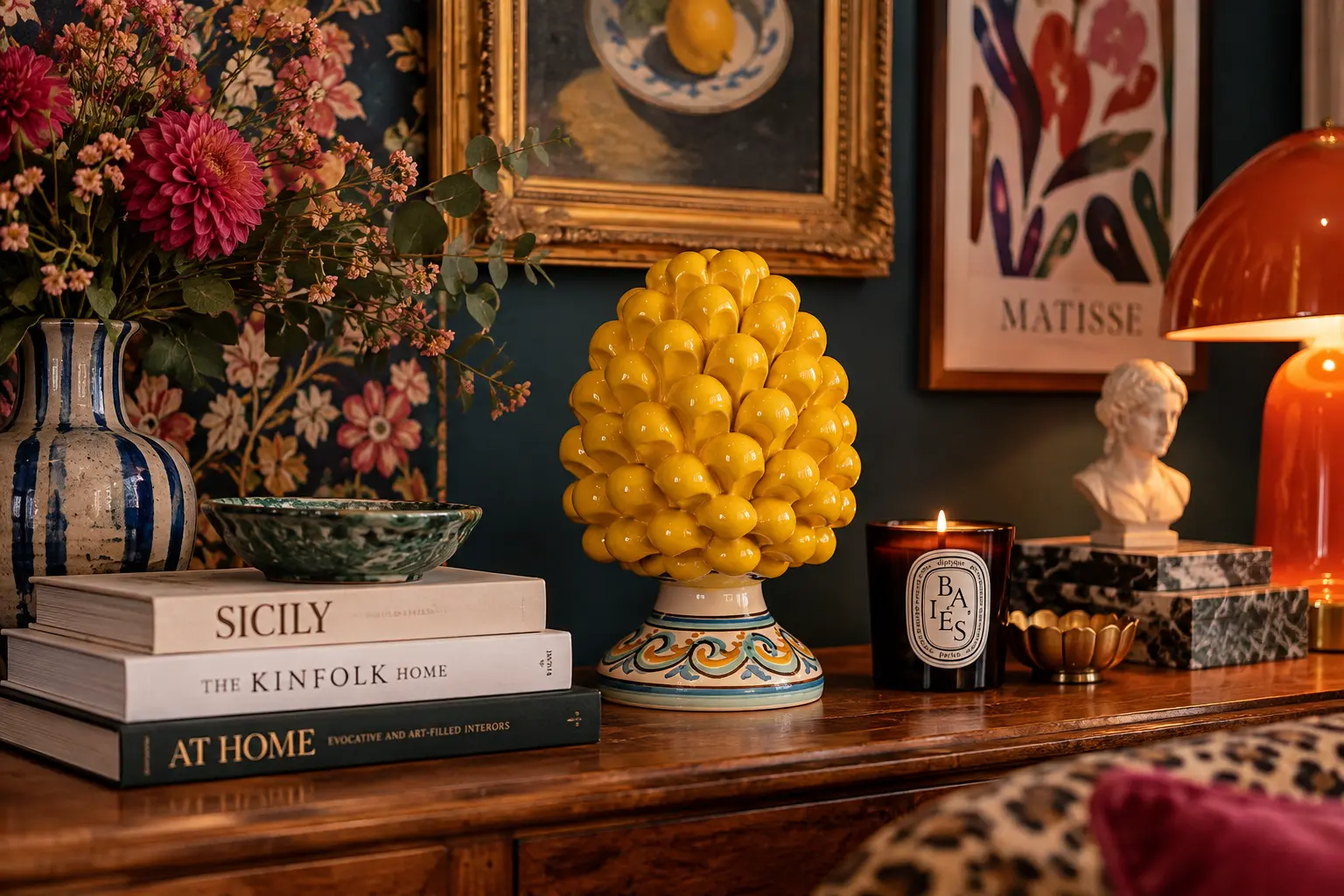
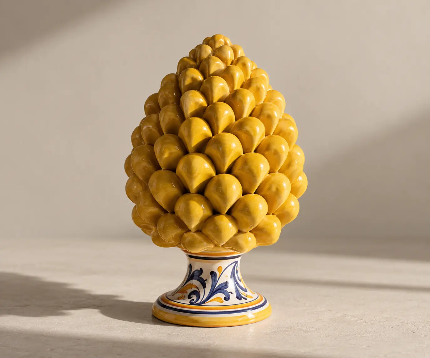
I brought this little ceramic pine cone home from Sicily after our summer holiday. It doesn’t really match anything around it — and that’s exactly why I keep it there.
Maybe that’s more important than matching the room.
THE OBJECT THAT REFUSES TO DISAPPEAR
Some objects are designed to blend in. Others make absolutely no attempt to.
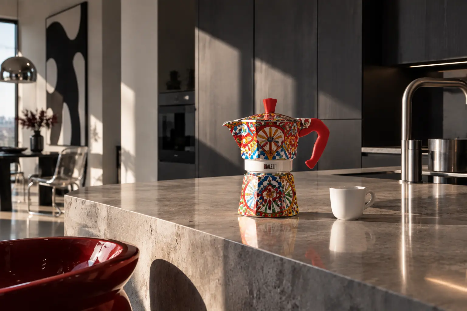
A coffee maker can be practical, familiar and completely ordinary — or it can become the loudest thing in the kitchen.
Sometimes function deserves a little personality too.
THE GROWN-UP TOY
Growing up doesn’t necessarily mean leaving everything playful behind.
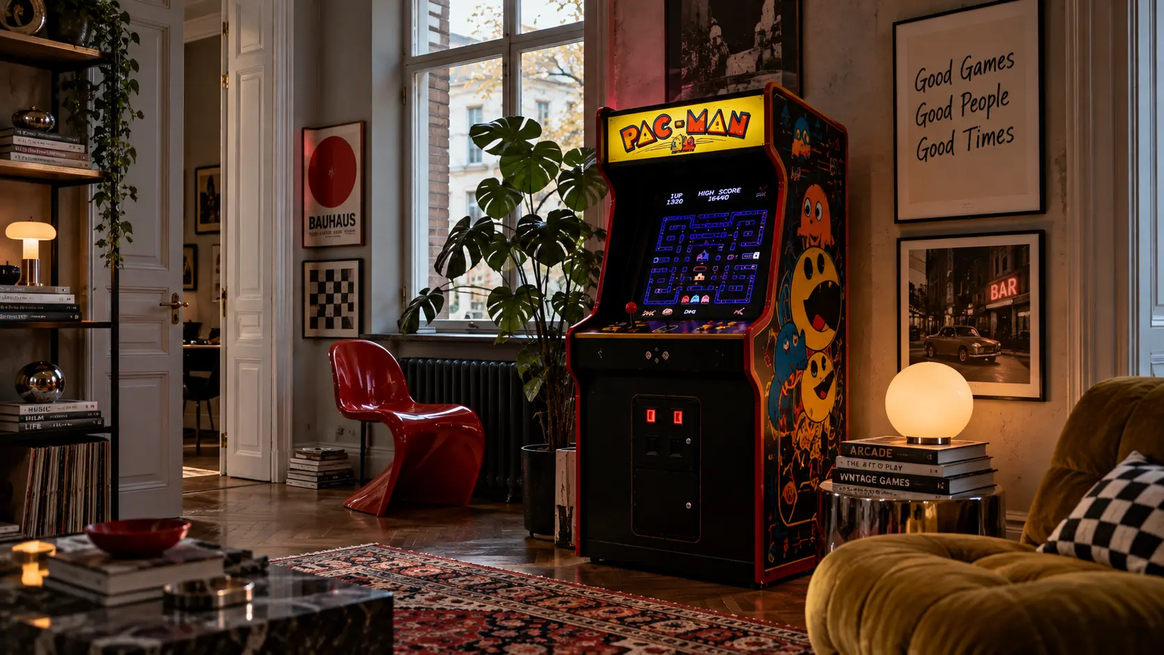
A retro arcade machine in a considered interior feels slightly wrong — which might be exactly why it works.
Nostalgia doesn’t have to stay in a box.
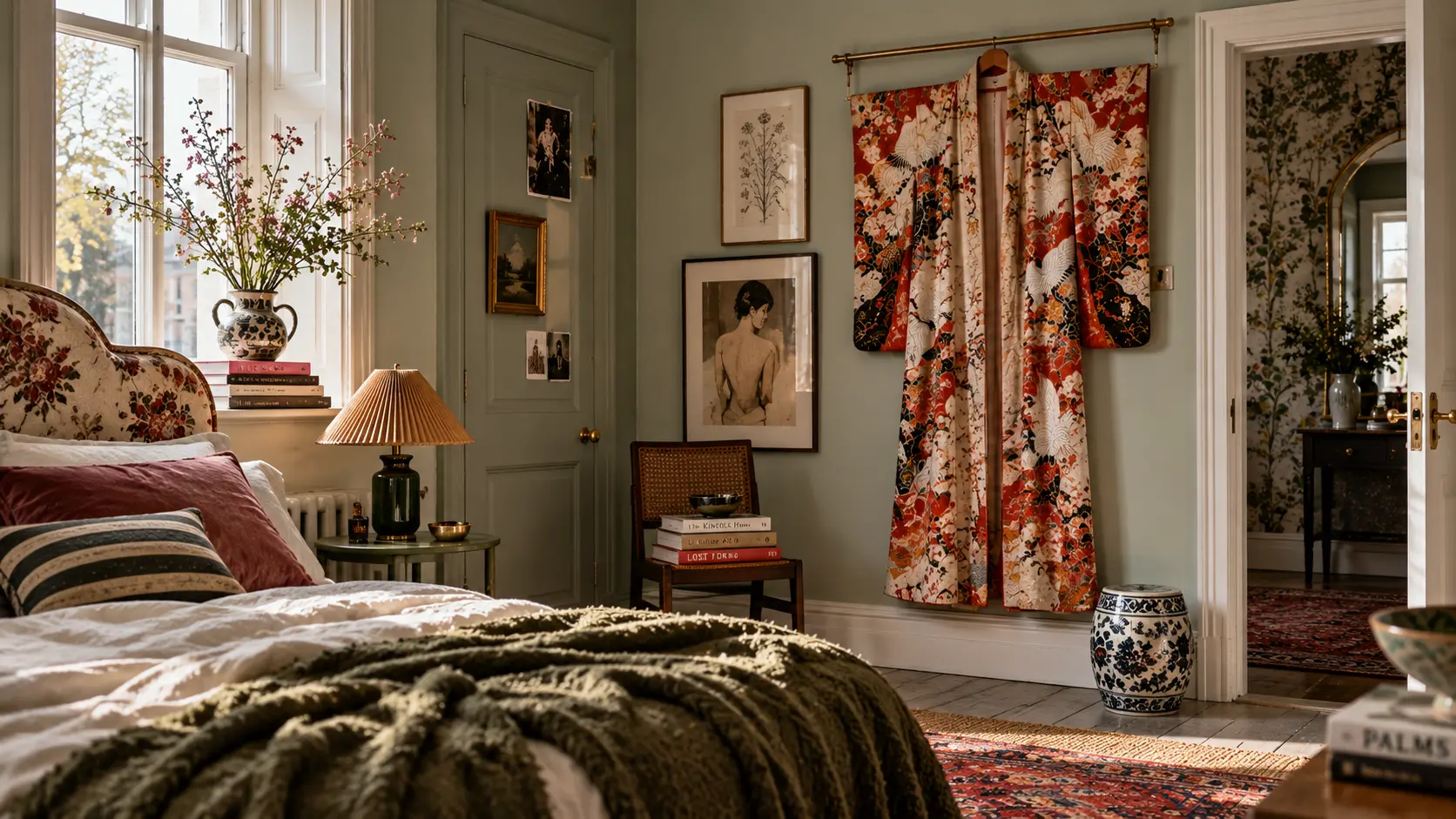
WHEN FASHION LEAVES THE WARDROBE
Some clothes are too beautiful to disappear behind a closed door.
A vintage kimono on the wall becomes something between fashion, memory and art — changing meaning simply because of where we choose to put it.
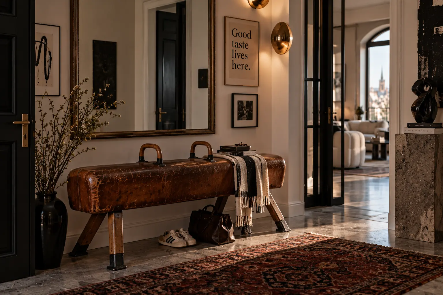
A NEW JOB FOR AN OLD THING
The most interesting objects are not always used the way they were intended.
An old leather gym horse becomes an entryway bench — still carrying traces of its first life while becoming part of another one.
That tension is what makes it interesting.
“Call it eclectic. Call it collected. I think it’s simply personal.”
02 /
THINGS THAT SHOULDN’T BE HERE
The most interesting rooms often have something in them that seems slightly out of place.
Not because it was chosen to match. Because someone loved it enough to make room for it.
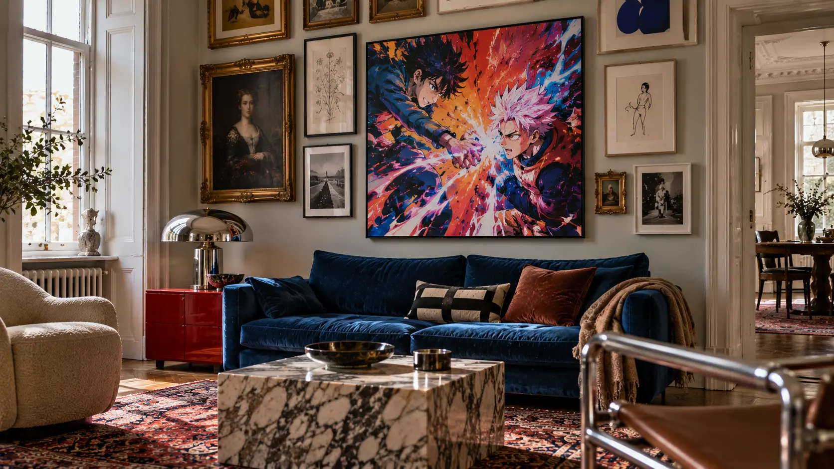
THE THING I NEVER THOUGHT I’D LIKE
Sometimes your taste changes because someone else brings something into your world.
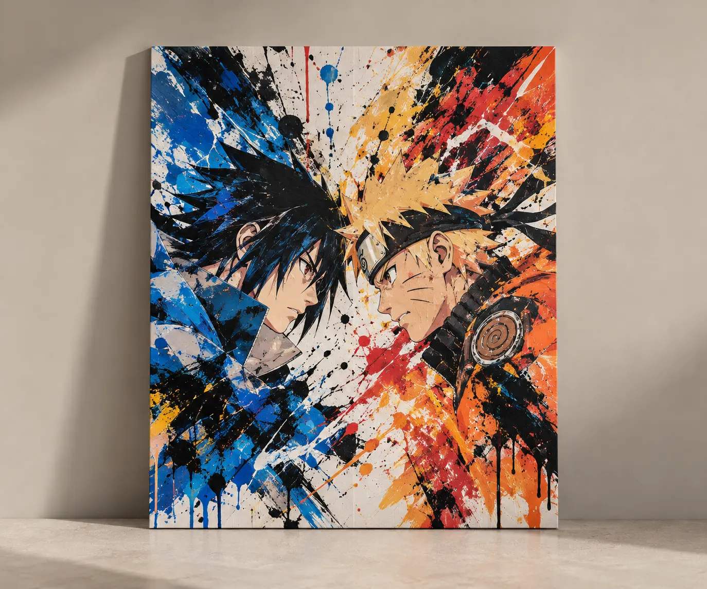
I painted an anime picture as a birthday present for one of my son’s friends.
Until then, anime had never really been part of my world. But while I was painting it, I started noticing the colours, the movement, the detail — and understanding why younger people find it so fascinating.
By the time I finished, something unexpected had happened.
I wanted one too.
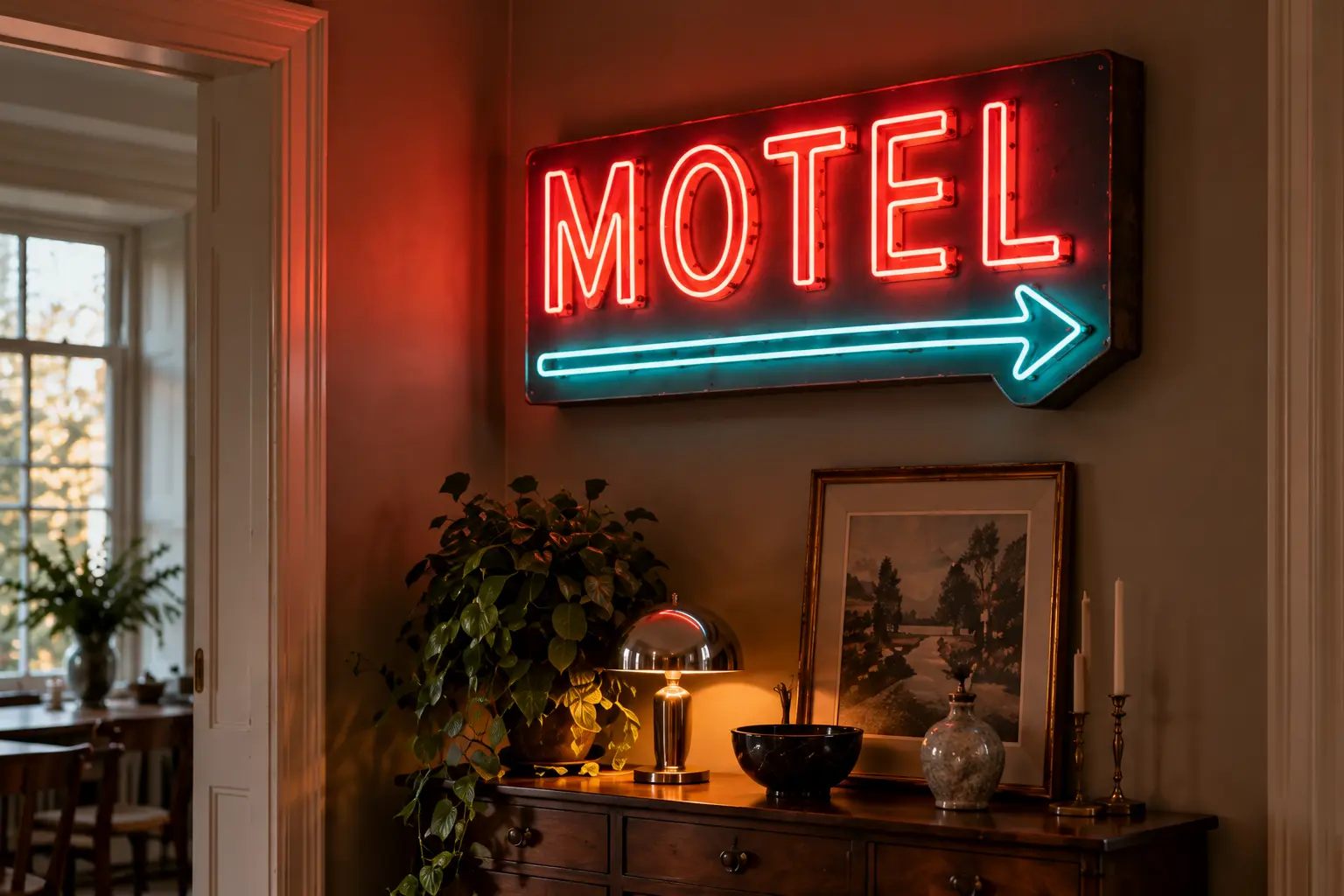
THE SIGN THAT CAME INSIDE
A motel sign belongs beside a road. Which is probably why it becomes so interesting when it ends up above a beautiful old cabinet.
Taken out of context, something ordinary can suddenly feel like art.
THE THING YOU ACTUALLY USE
Not every object in a beautiful room needs to have been bought for the room.
Sometimes the things we use, collect and carry through life become part of the interior simply because they belong to us.
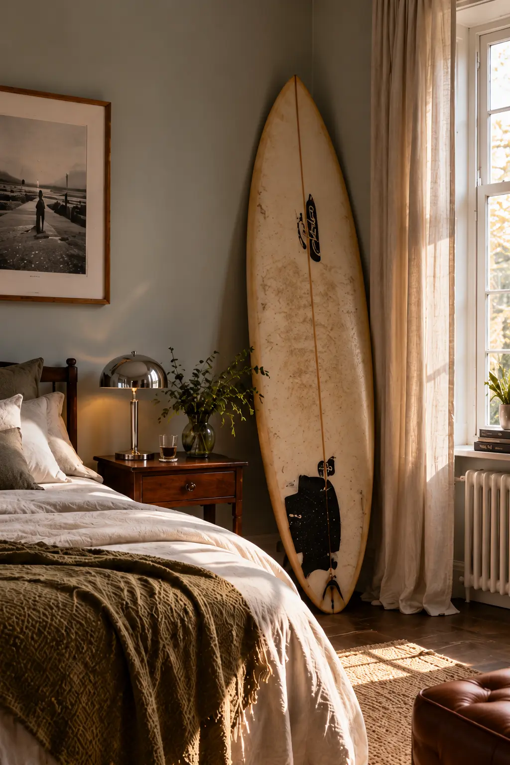
A worn surfboard in a city bedroom tells you more about the person who lives there than another perfectly chosen piece of decoration ever could.
A SEAT WITH A PREVIOUS LIFE
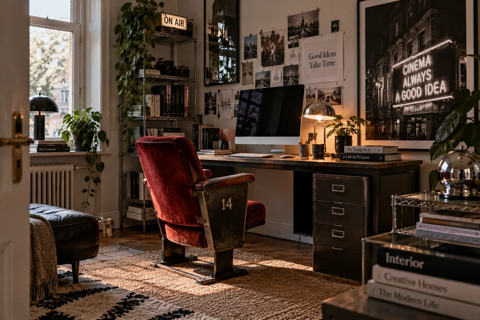
An old cinema seat was designed for a completely different room and a completely different purpose.
Move it into a home office and suddenly it becomes something else — functional, strange and full of character.
The best repurposed pieces never completely forget what they used to be.
Maybe the thing that doesn’t belong is the thing that makes the room yours.
03 /
LIGHTS YOU NOTICE
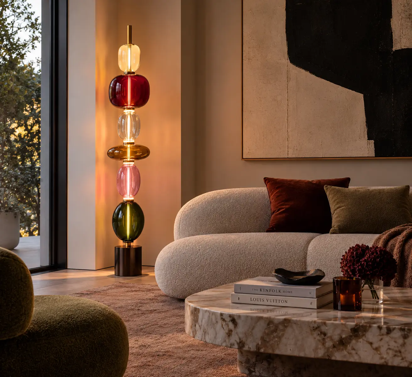
A good lamp doesn’t just light a room. Sometimes it becomes the reason you remember it.
This section is about lighting as part of the personality of a home — not something designed to disappear.
THE THING FROM ANOTHER DECADE
Not everything has to speak the same design language.
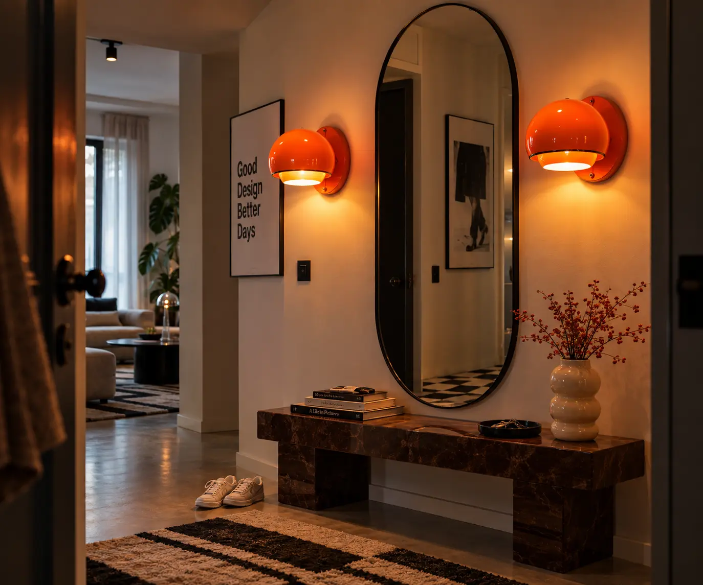
My hallway is quite simple — clean lines, black, wood, very little decoration.
The obvious choice would be lighting that disappears into it.
But I don’t want it to disappear.
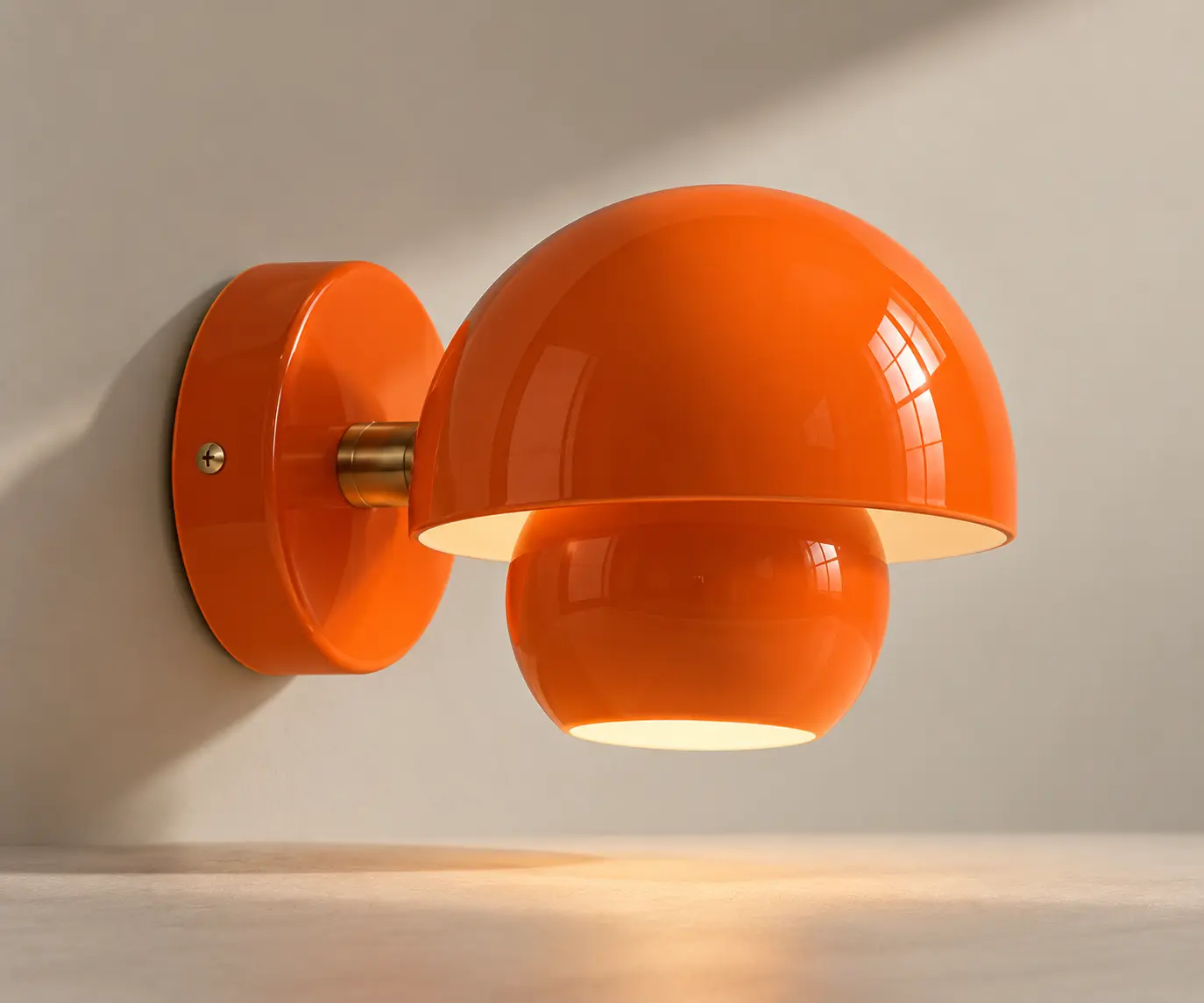
I’ve been looking for two wall lights for either side of the mirror, and instead of something minimal and modern, I keep coming back to glossy orange lamps that feel unmistakably 1980s.
They don’t really belong there.
That’s the point.
WHEN FUNCTION GETS A SHAPE
Some things enter a room because they are useful.
That doesn’t mean they have to be invisible.
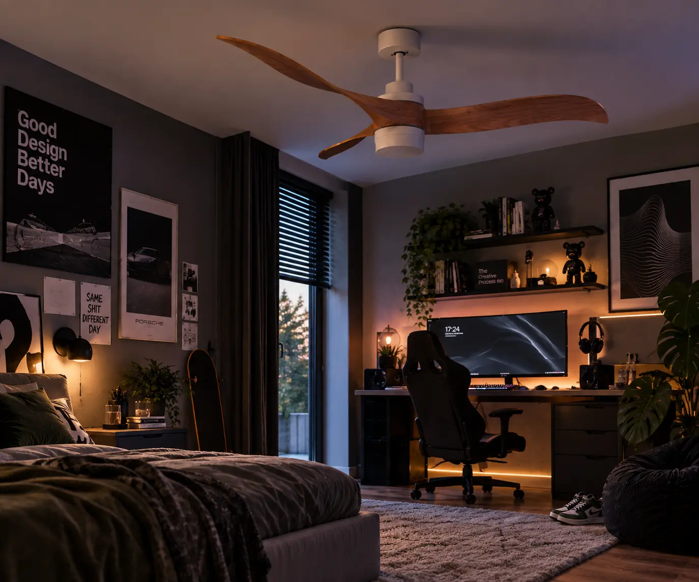
A ceiling fan can be practical and still have enough shape and movement to become part of the architecture of the room.
Here, the curved wooden blades make function feel almost sculptural.
THE LAMP THAT BECOMES FURNITURE
Sometimes a lamp takes up enough visual space to become almost another piece of furniture.
It changes the silhouette of the room even when the light is switched off.
This is lighting you choose to notice.
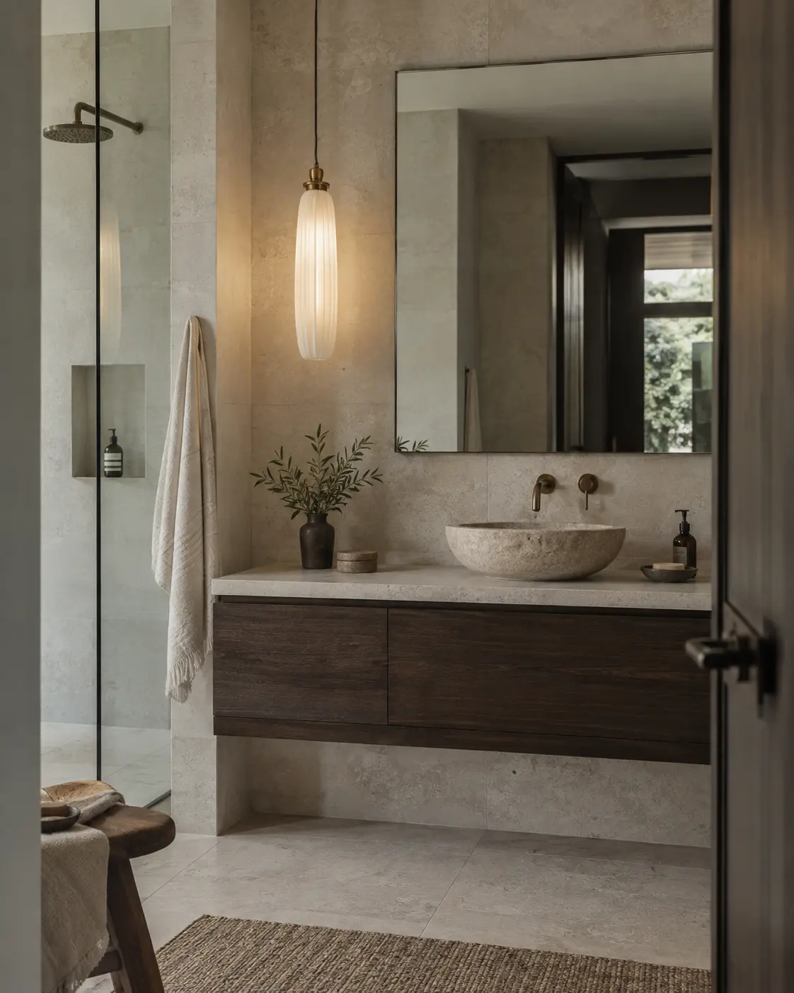
THE WRONG LAMP FOR THE RIGHT ROOM
Bathroom lighting is usually expected to be practical, quiet and easy to ignore.
But why should it be?
A slender pendant in hand-blown opaline glass feels more like something you would expect beside a sofa or above a dining table.
That unexpectedness is exactly what makes it work.
Light the room. But give us something to look at too.
After years of interiors designed to be quiet, rooms are becoming expressive again.
Not through one perfect palette — but through combinations that feel instinctive, layered and personal.
The 2027 colour releases give this direction a tangible palette. Behr’s Grounded is an earthy olive; Graham & Brown’s Rose Earth draws on Italian clay. I would use either as an anchor, then add the colours already living in the room.
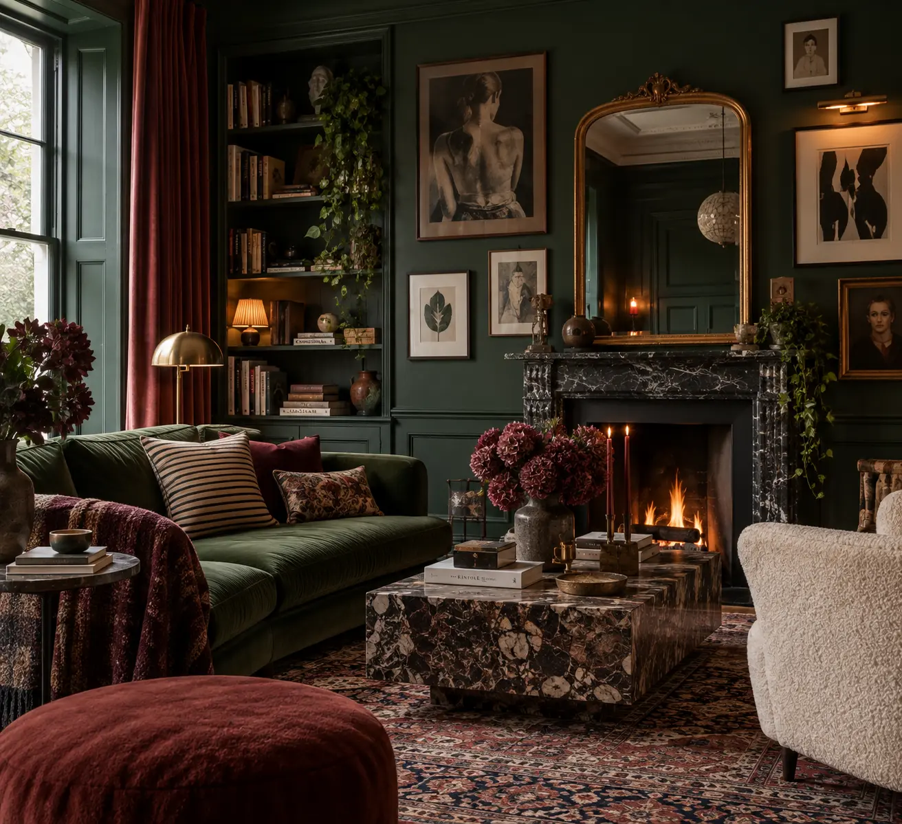
DARK DOESN’T HAVE TO MEAN SERIOUS
Deep colour changes the mood of a room immediately.
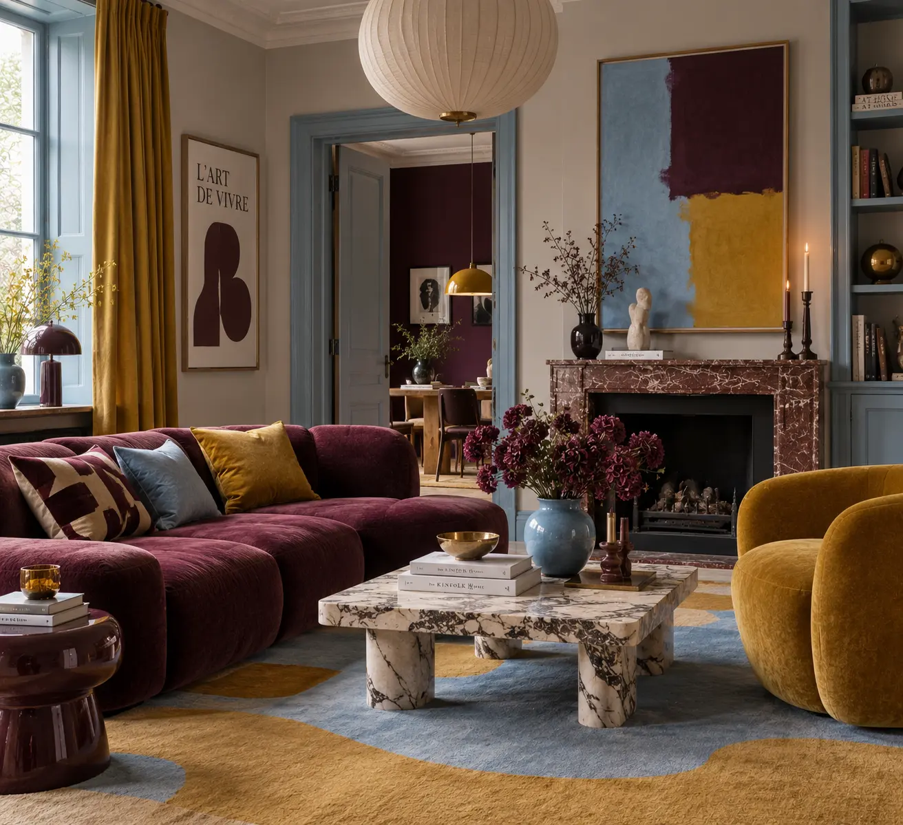
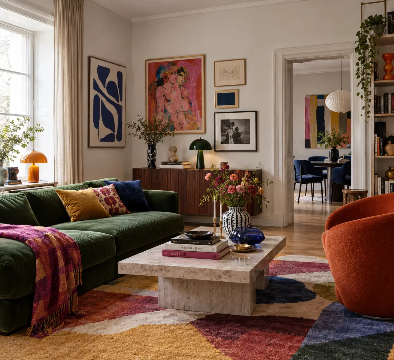
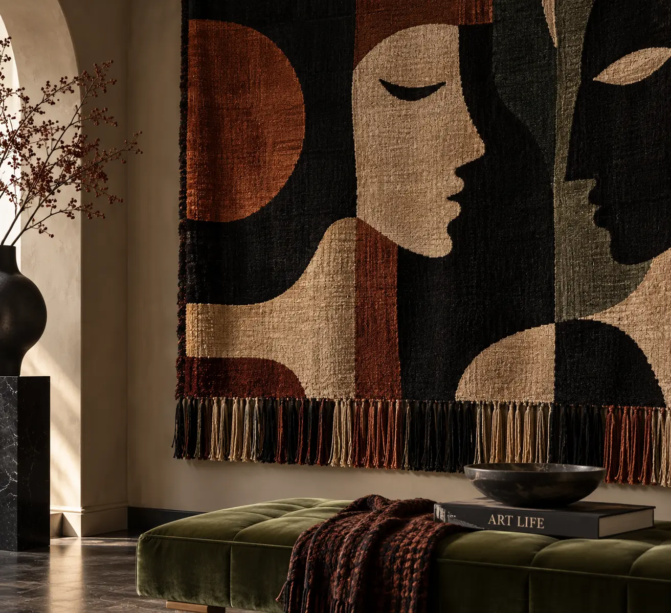
Green, burgundy, aubergine, old wood, patterned textiles and art can all live together without the room becoming heavy.
The secret isn’t restraint.
It’s confidence.
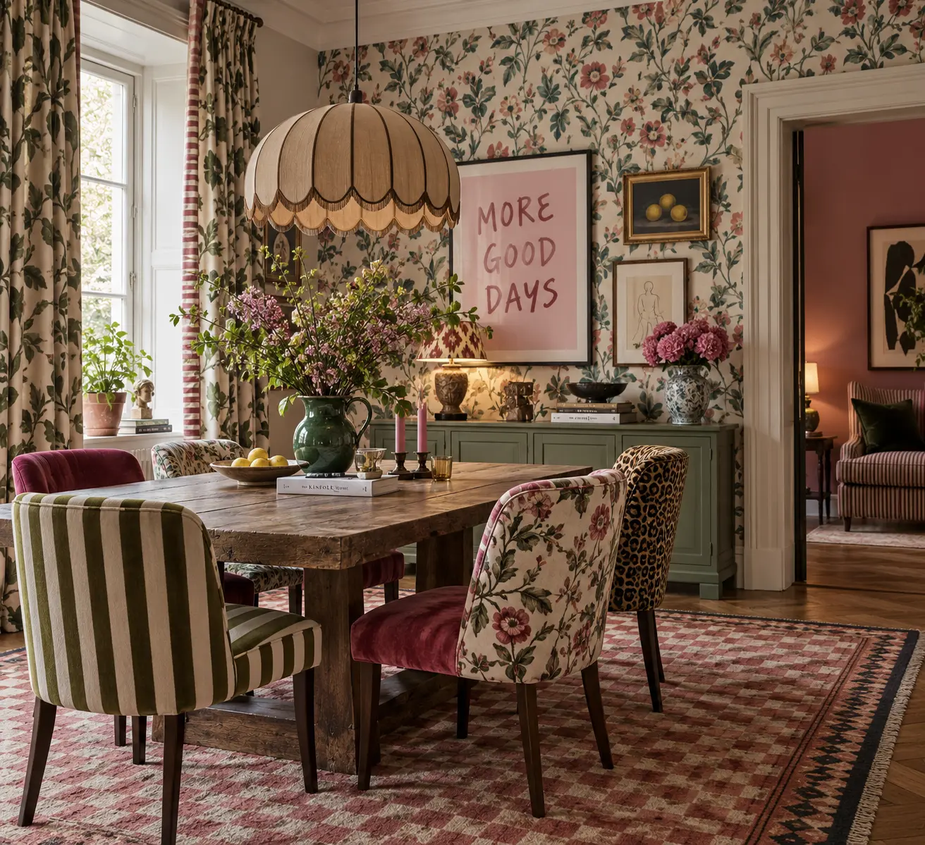
MORE THAN ONE PATTERN
Wallpaper doesn’t need quiet furniture. A patterned chair doesn’t need a plain rug.
The old rule was to choose one and let everything else calm down.
The more interesting idea is to let them talk to each other.
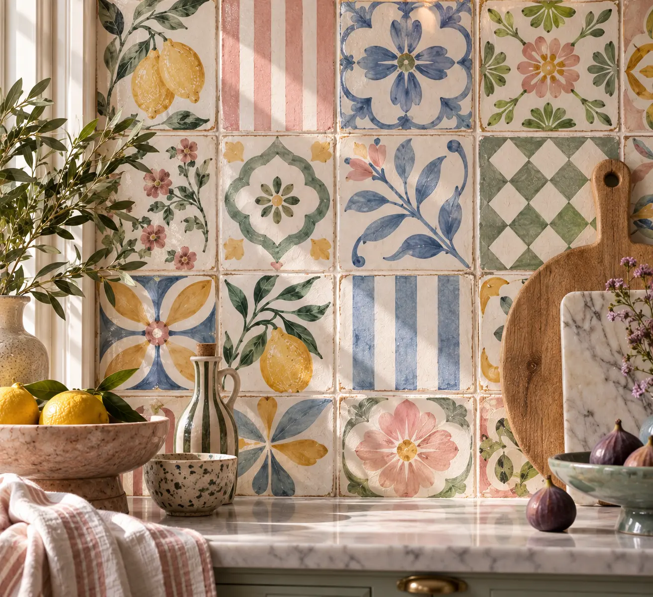
Stripes, florals, checks and unexpected prints can coexist when the room feels collected rather than coordinated.
COLOURS THAT WEREN’T SUPPOSED TO MEET
Some combinations make sense immediately.
Others become interesting because they don’t.
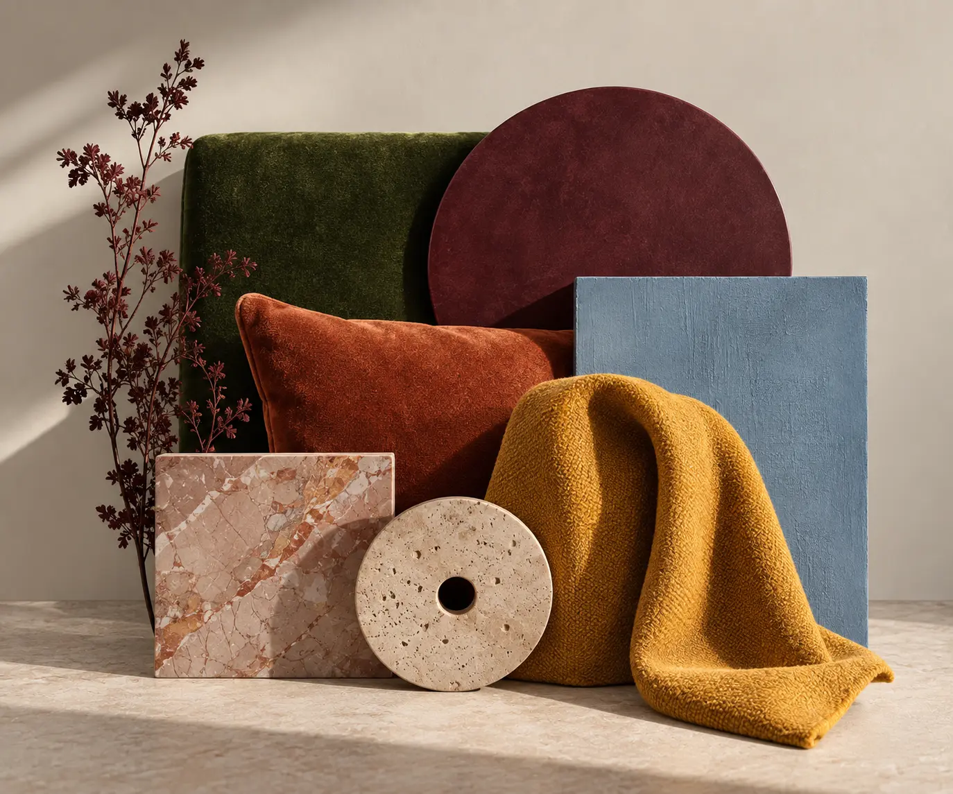
Aubergine, powder blue and mustard shouldn’t need a reason to sit together.
Sometimes the slightly uncomfortable combination is the one that gives a room its energy.
THE WALLS CAN STAY QUIET
A colourful room doesn’t necessarily need colourful walls.
Sometimes the architecture can stay almost silent while the things inside it do all the talking.
A green sofa. A rust-coloured chair. Art, textiles, objects, a rug.
Colour becomes something accumulated rather than applied.
And perhaps that is why it feels more personal.
A room doesn’t need a colour scheme. It needs a point of view.
05 /
THE DETAILS ARE GETTING INTERESTING AGAIN
After years of smooth, quiet surfaces, the details are becoming interesting again.
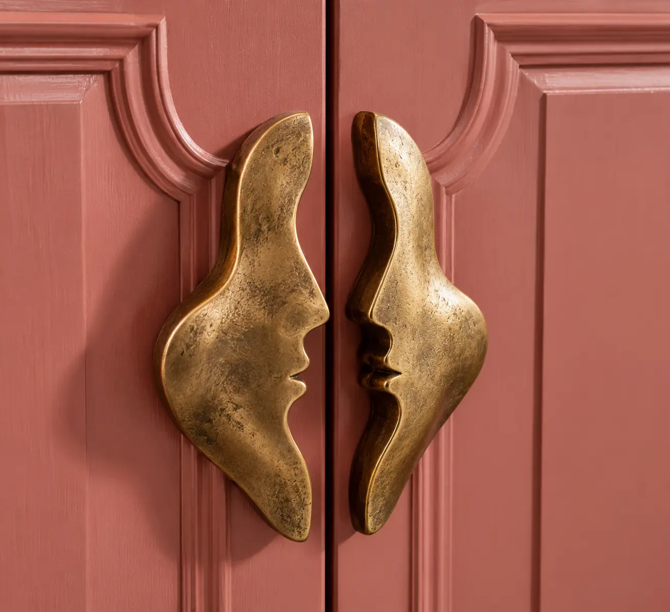
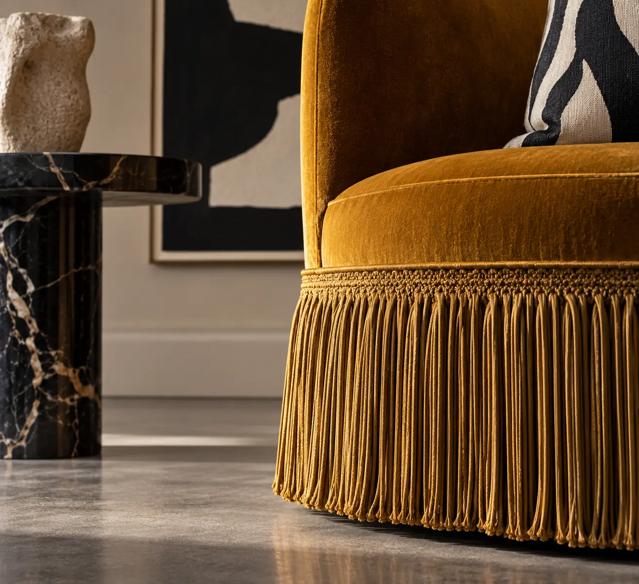
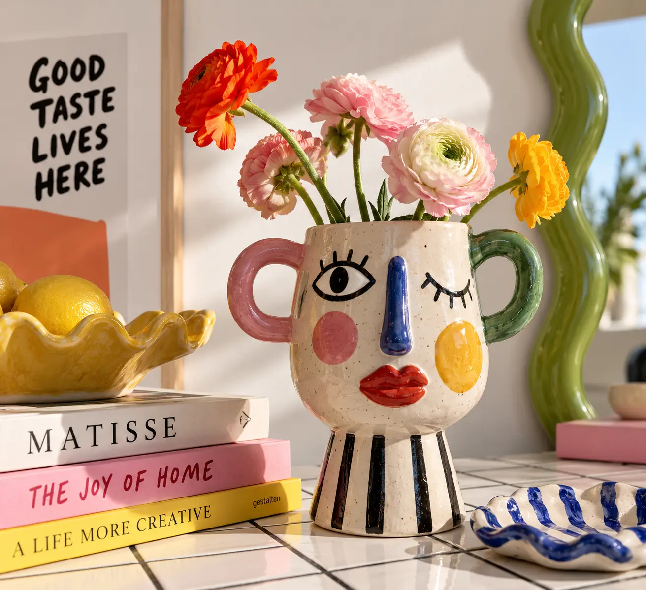
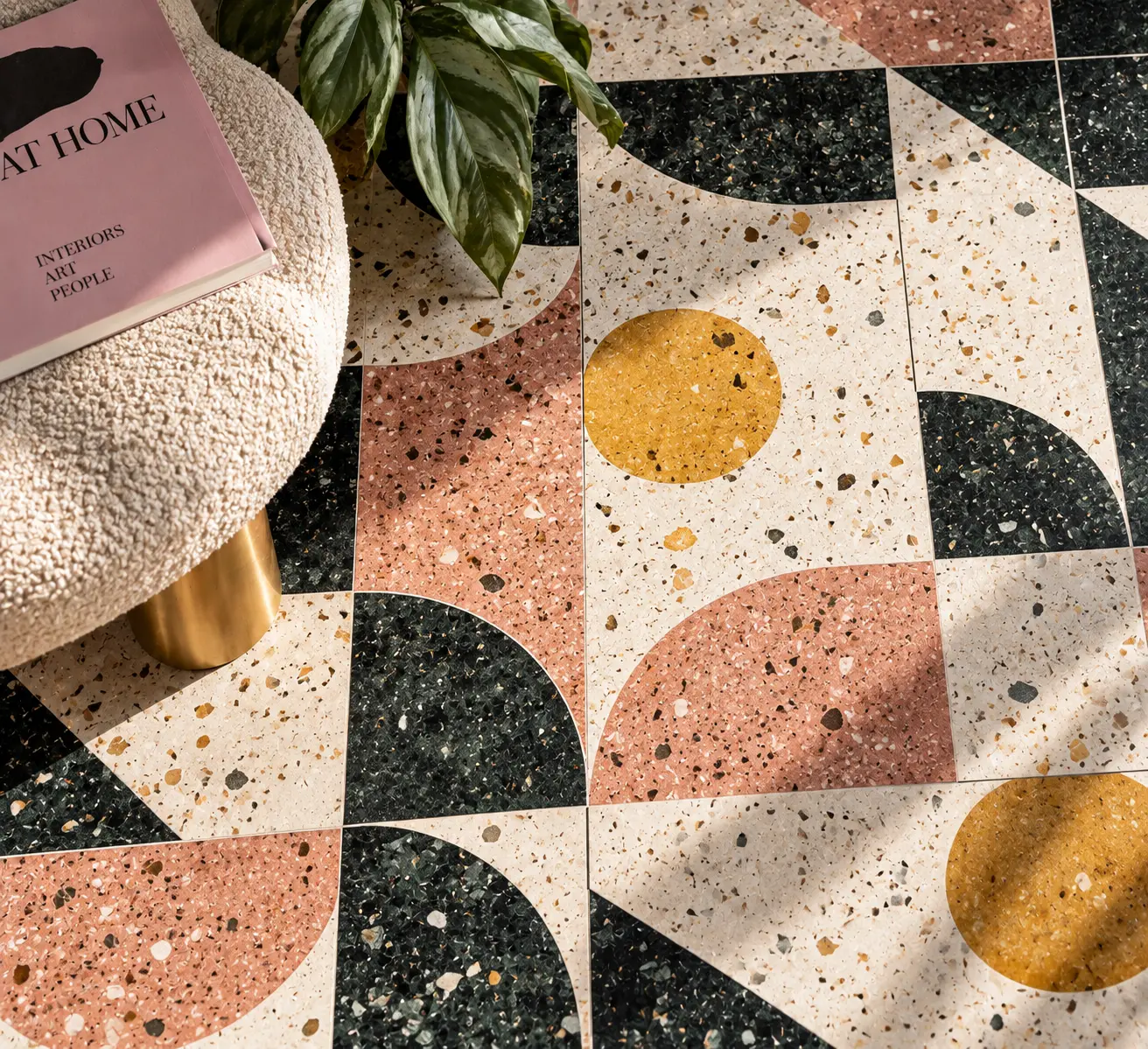
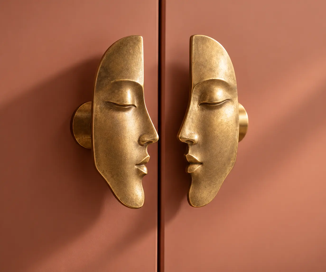
A handle can become jewellery. A tile can look hand-painted. A fringe can completely change a piece of furniture.
The smallest decisions are starting to have personality again.