Inspired by
Dries Van Noten
DRESSED HOMES · AW 2026–27
What happens when one runway collection becomes an entire home? I translated the colour, pattern and unexpected combinations of Dries Van Noten AW26/27 into a maximalist apartment, one room at a time.
About 10 min read
DRESSED HOMES · ISSUE 01
I often look at fashion collections and start imagining rooms. A jacket suggests a curtain. A cuff changes the colour of a chair. A brooch becomes a table. Dressed Homes is a new series in which I take one collection and use it to build a complete interior, rather than reducing it to a mood board or a list of matching colours.
For the first home, I chose Dries Van Noten Autumn/Winter 2026–27. Under Julian Klausner, the collection looks at identity while it is still taking shape. What stayed with me was the way it combines things that should almost compete: formal tailoring and varsity details, florals and checks, faded colours and flashes of acid lime.
I did not want to turn each room into a literal copy of an outfit. I wanted the apartment to carry the same confidence. The prints change scale, materials become more architectural and a small detail on a shoe can become the most memorable object in a room.
The interiors in this story are AI-generated editorial concepts created from my own design direction. They are not photographs of an existing home, and they do not reproduce the runway images.
01
THE LIVING ROOM
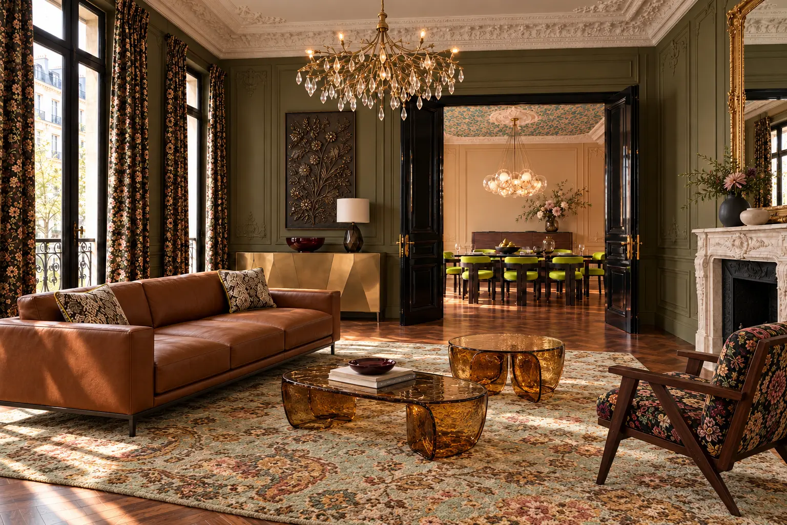
This was the look that started the whole apartment. I kept returning to the tiny floral jacket, the acid-lime layer underneath it, the faded blue-green skirt, the mixed tights and the snakeskin boots. Nothing is quiet, yet the silhouette is disciplined. I wanted the living room to feel exactly like that: generous and maximalist, but still composed.
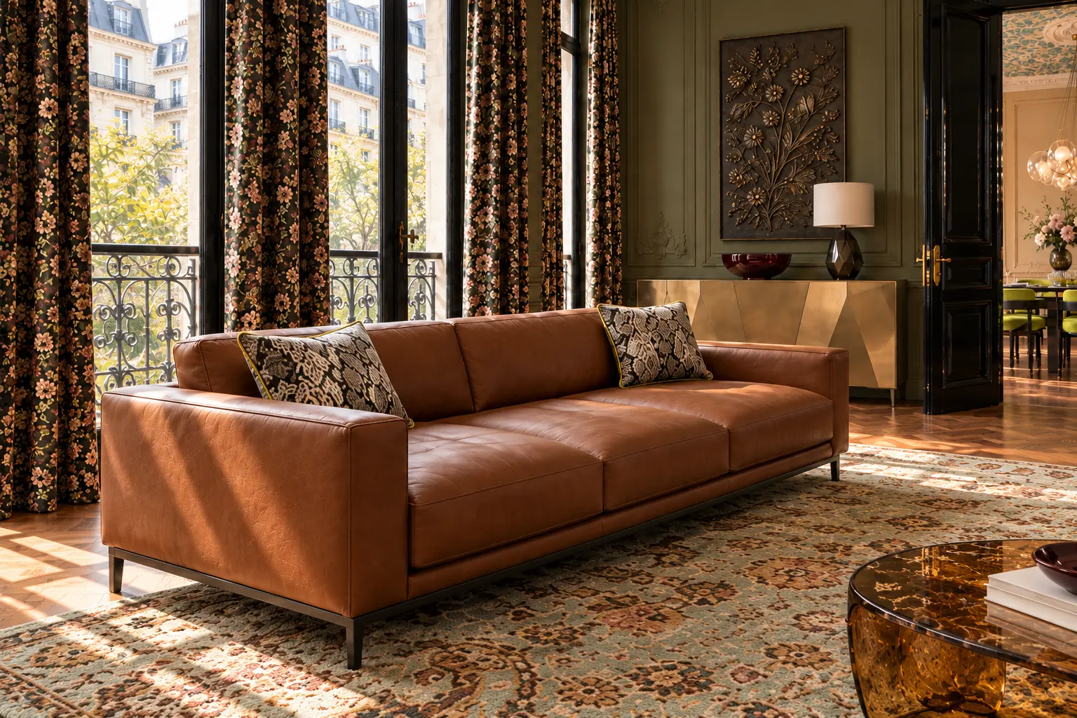
The floral jacket became the curtains rather than the sofa. Against the black window frames they feel dense and tailored, almost like fabric panels. I kept the sofa in cognac leather to give the patterns somewhere to rest, then used the snakeskin from the boots only on two cushions, finished with a very thin lime edge.
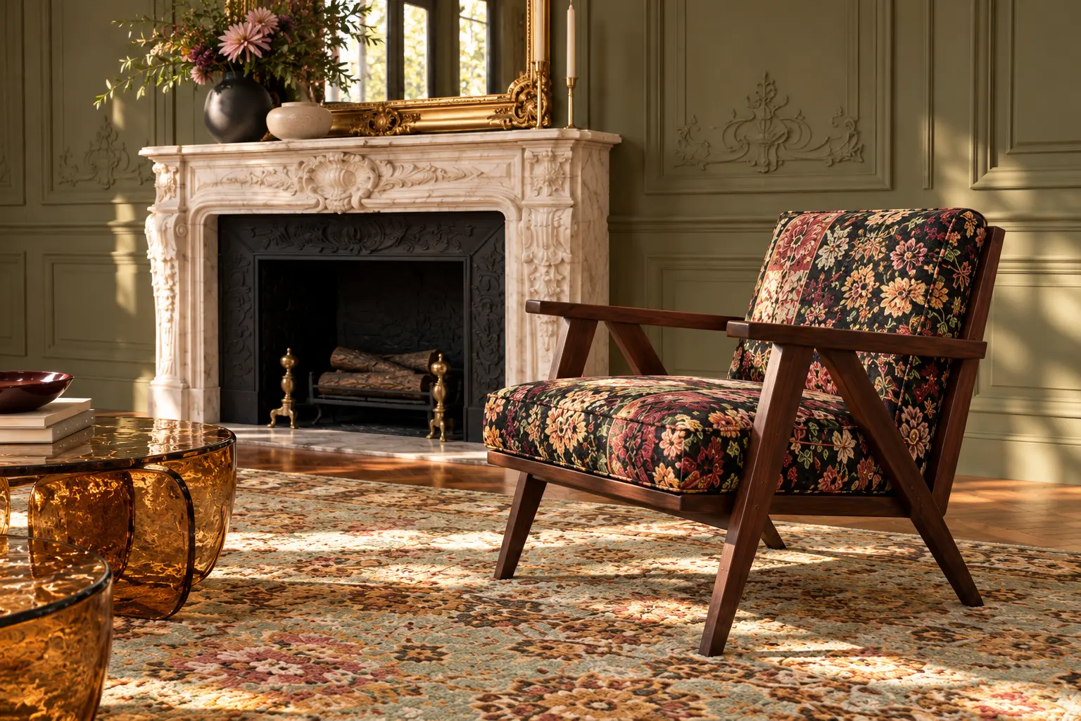
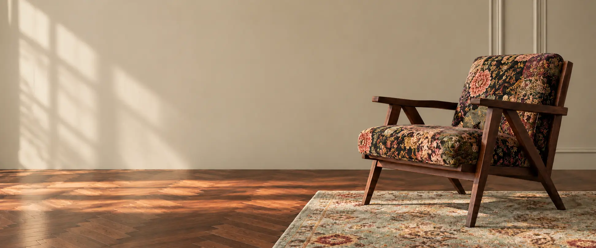
The chair takes its cue from the patchwork feeling of the tights. I wanted one piece to carry that complexity, not an entire matching set. The dark walnut frame keeps it sharp and makes the upholstery feel collected rather than decorative. Beside the carved marble fireplace, it gives the room a slightly unexpected, almost English note.
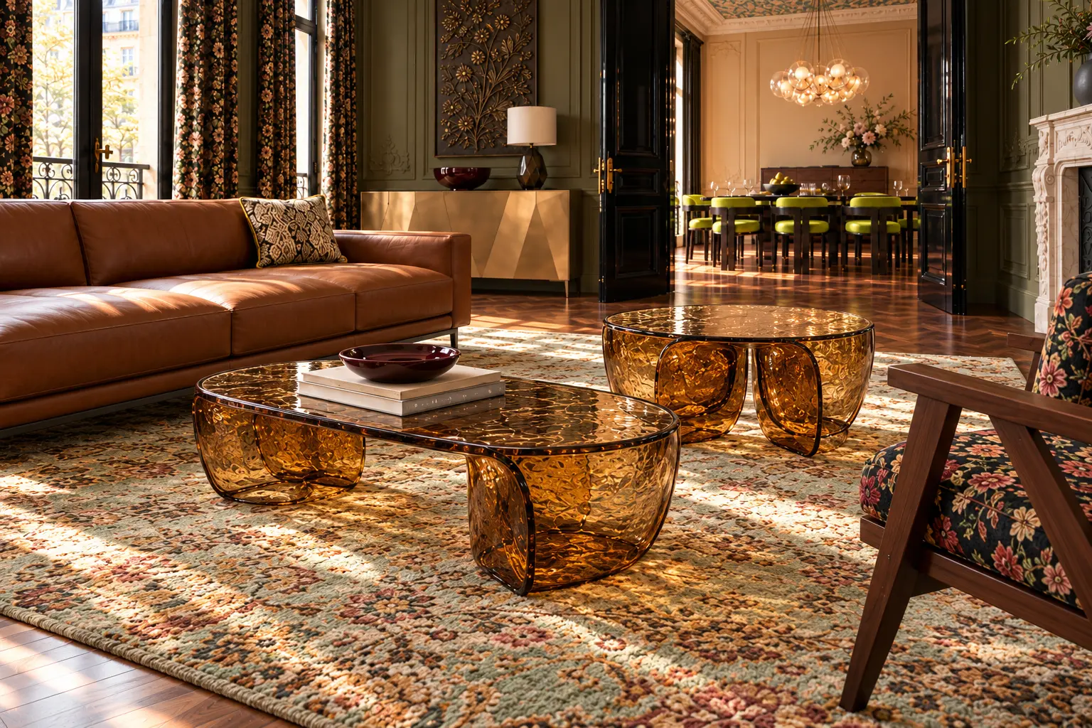
The pale rug borrows the softer celadon, tobacco and coral tones of the skirt without reproducing it. The two amber glass tables came from the brooch on the jacket. They sit in the middle of the room like oversized pieces of jewellery: transparent, warm and deliberately different in shape.
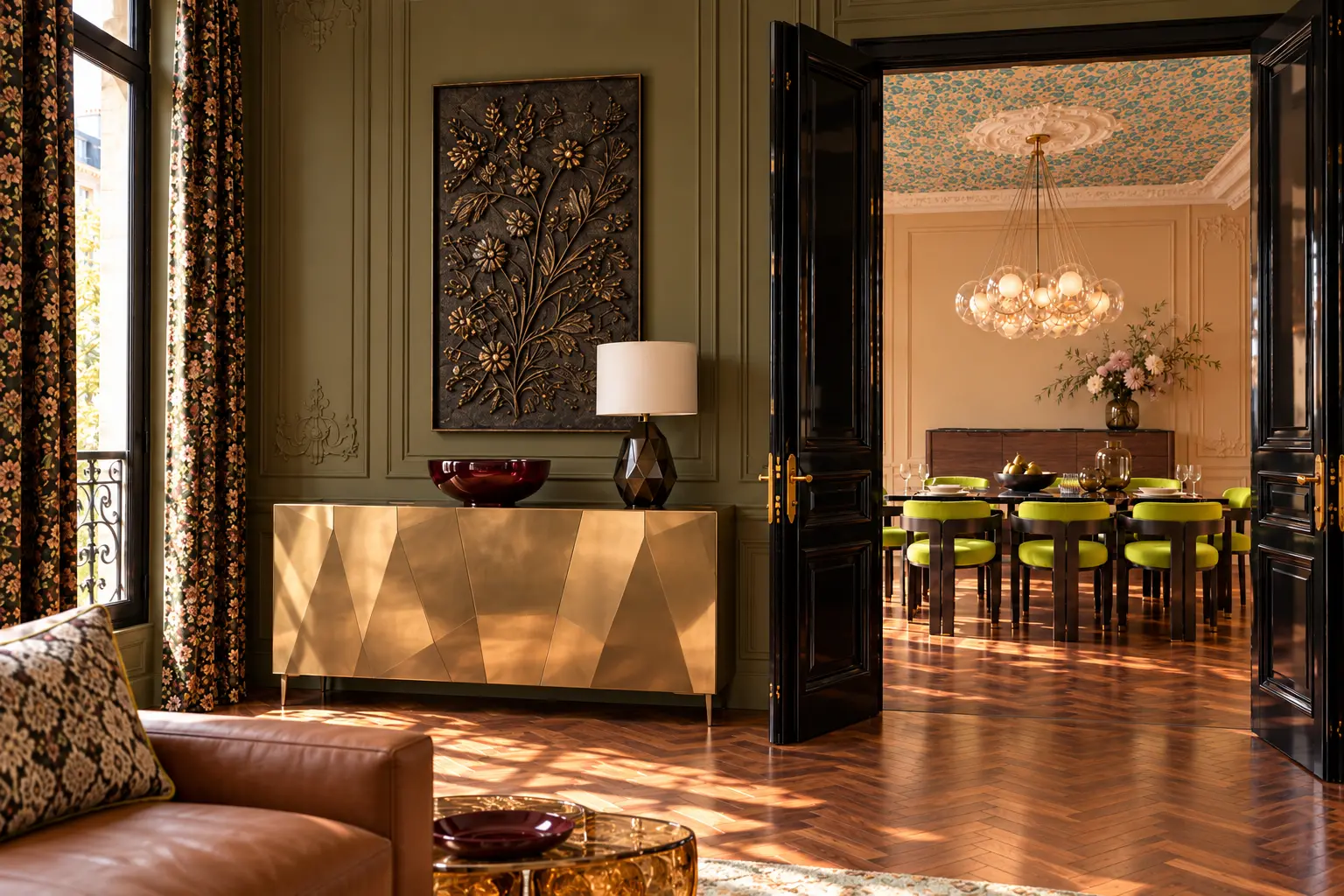
The faceted brass sideboard brings another jewellery-like surface into the room. I balanced it with the dark lacquered doors and the view into the dining room, where the lime returns. The colours continue from one room to the next, but they never appear in quite the same way.
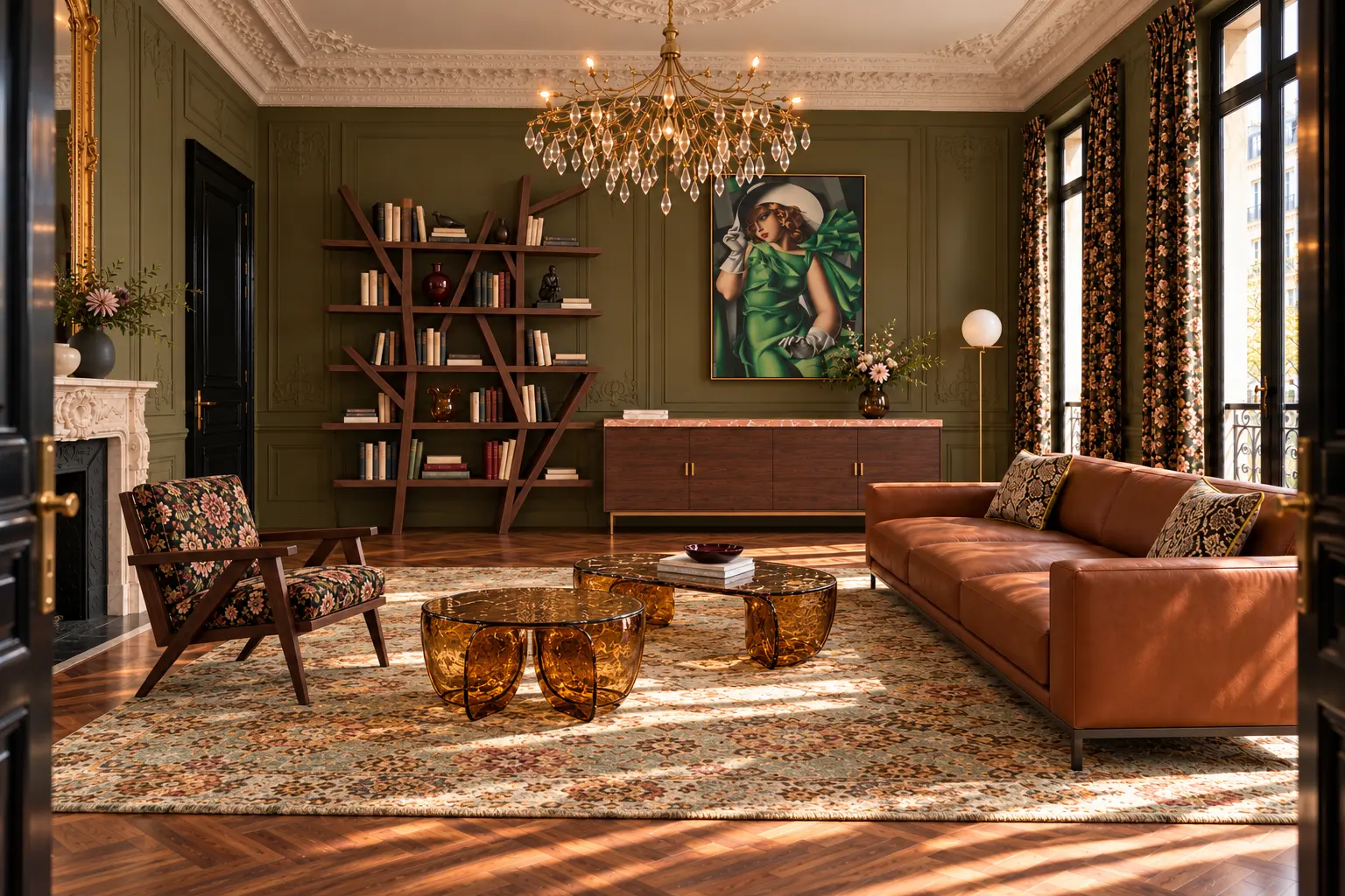
On the opposite wall, dark wood, books and art make the apartment feel inhabited. I did not want the room to become a perfect showroom for pattern. The quieter objects are what allow the stronger ones to feel believable. Maximalism still needs pauses.
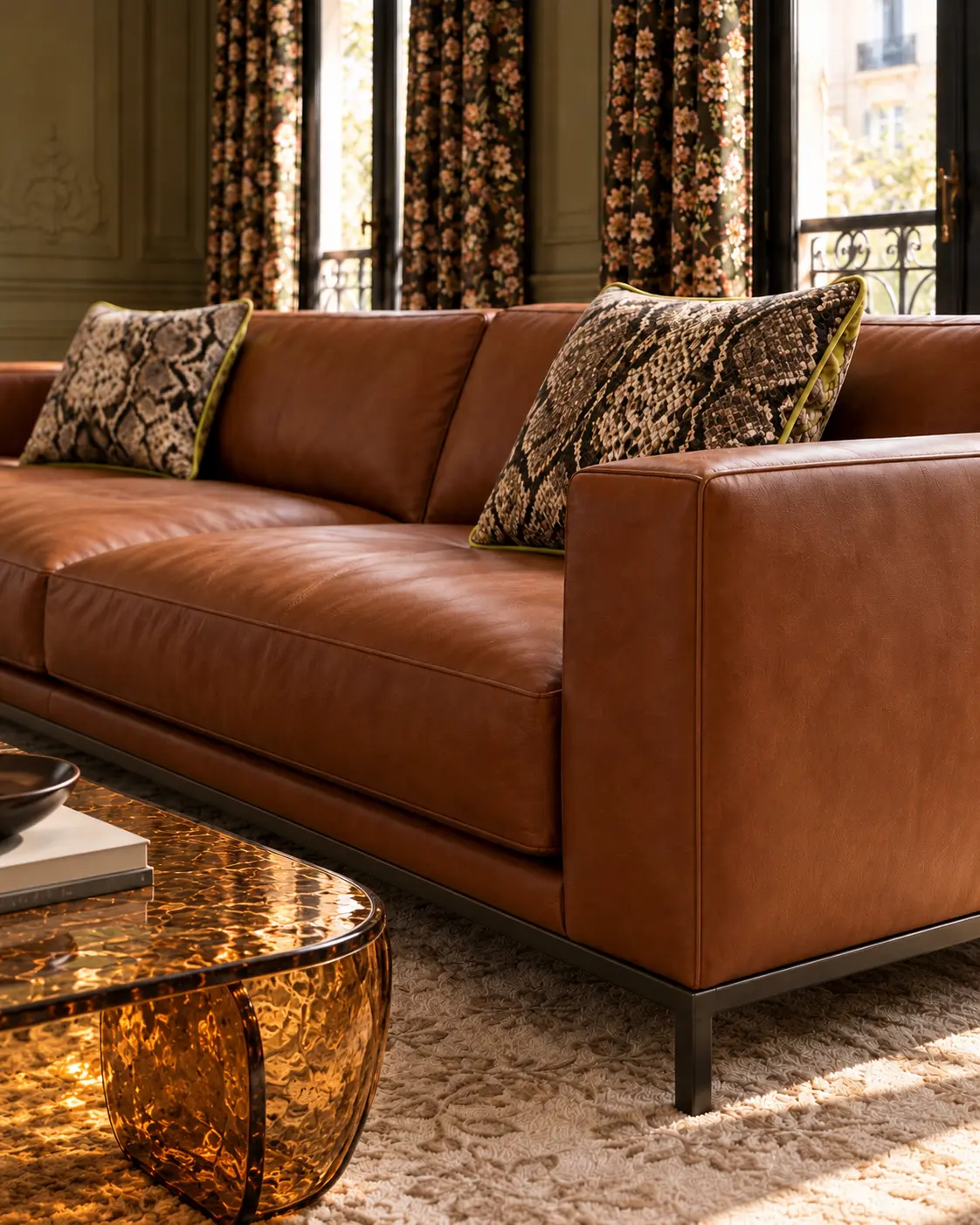
Seen close up, the sofa explains the balance of the room. The cognac leather is deliberately plain and beautifully tactile, while the snakeskin cushions bring in the boots and the narrow lime piping repeats the sharp layer beneath the jacket. It is a small detail, but it stops the leather from feeling predictable.
02
THE DINING ROOM
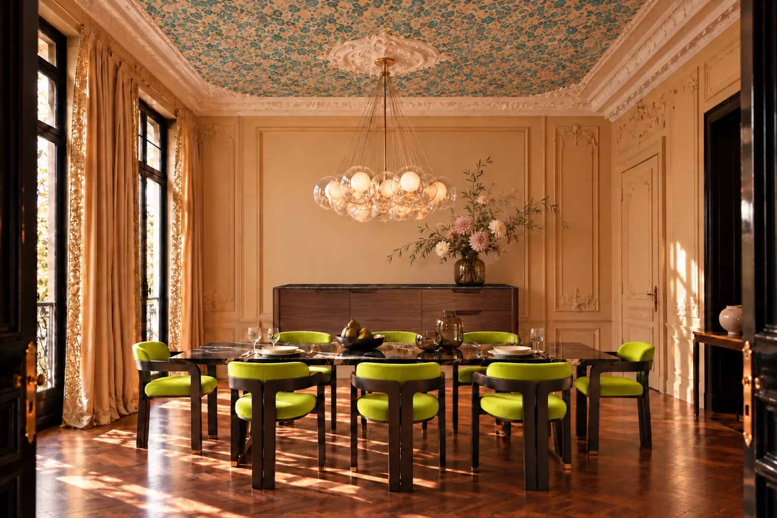
The dining room comes from the same runway look, but I wanted it to read as a lighter chapter. The pale blue-green print of the skirt moved to the ceiling, where it could be seen as one continuous surface. The lime from the layer beneath the jacket became the chairs: a small colour accent in the outfit, enlarged into the room’s clearest gesture.
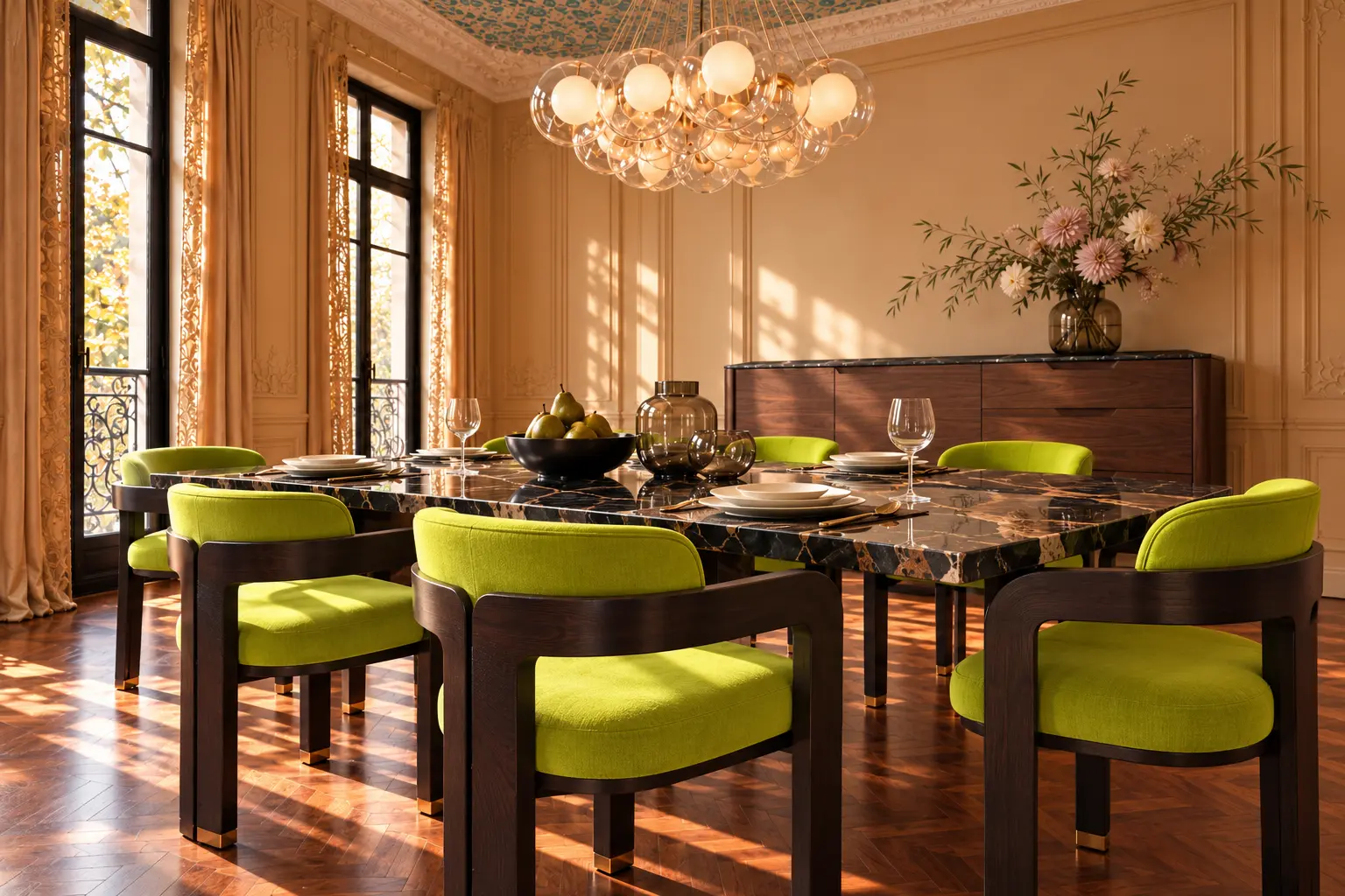
A dark, glossy stone table gives the lime upholstery enough weight. The chair frames remain deep brown, so they connect to the parquet rather than floating above it. I like the contrast between the formal architecture and this almost electric colour around the table.
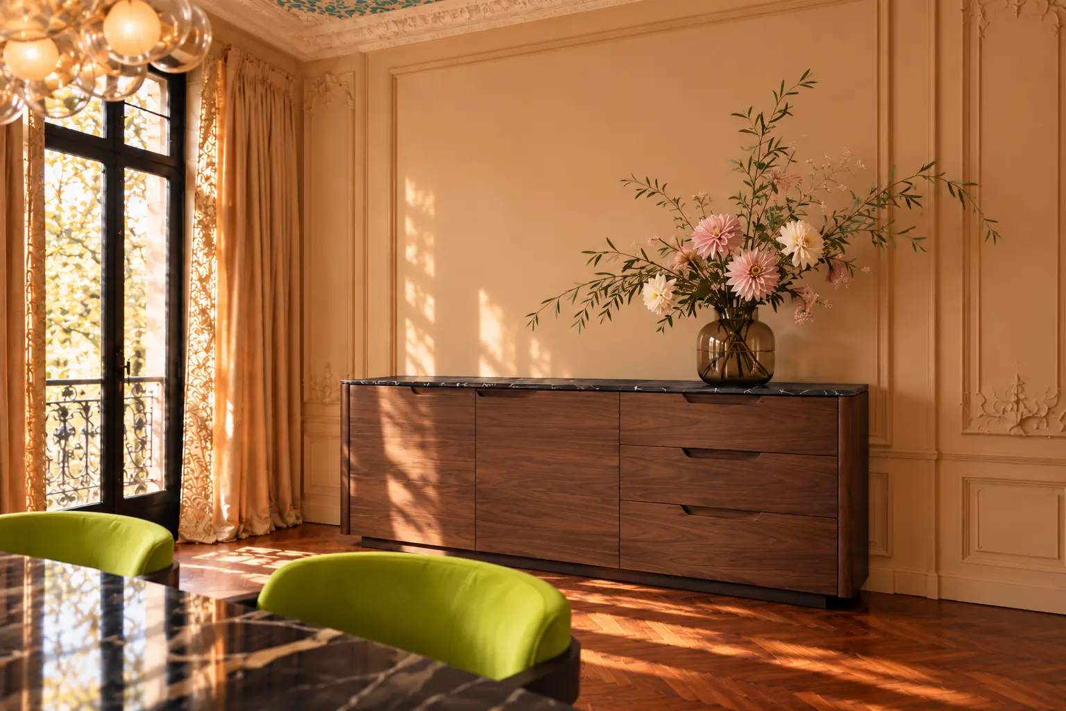
The walnut sideboard is intentionally calm. After the patterned ceiling and lime chairs, the room needed one broad, uninterrupted surface. A loose arrangement of pale flowers keeps it from feeling too severe without introducing another competing print.
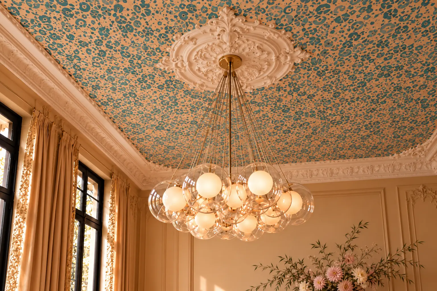
The ceiling is where the skirt’s faded turquoise and warm peach become architectural. I paired it with an opaline glass chandelier because I wanted lightness below the pattern, not another ornate object fighting for attention.
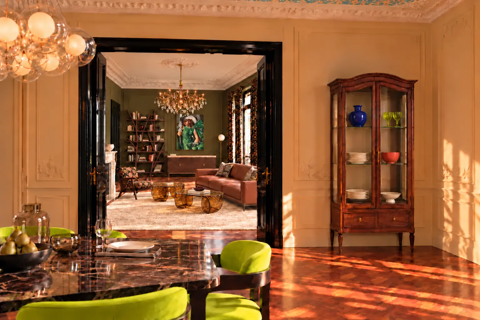
From the dining room, the open black doors frame the living room and make the two spaces feel like consecutive looks in the same collection. The antique walnut vitrine adds history, but cobalt ceramic, coral lacquer, lime glass and ivory tableware keep it from becoming too polite. Through the doorway, the two amber tables read as jewellery against the quieter rug.
03
THE KITCHEN
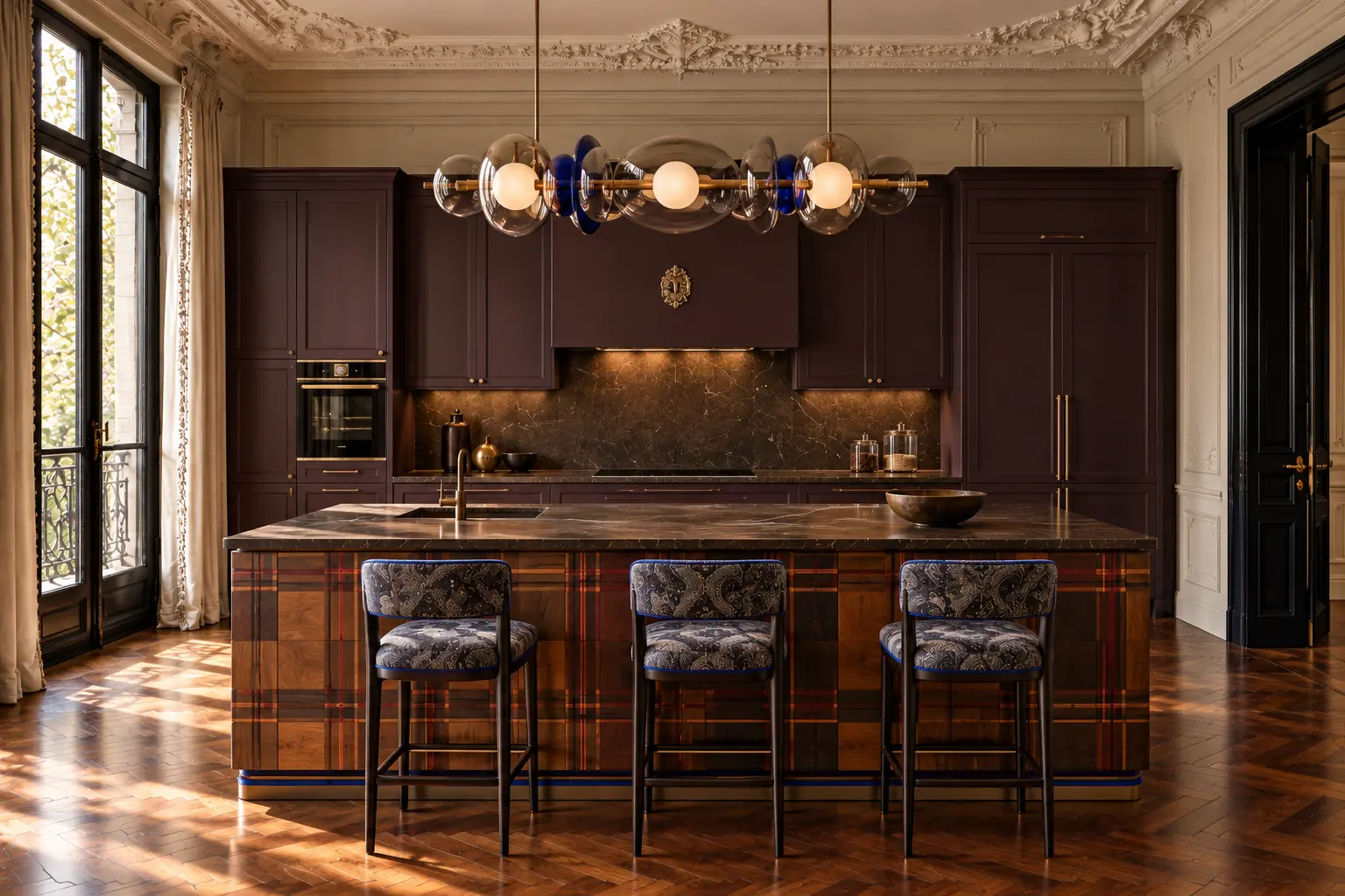
The kitchen began with an oversized varsity jacket worn over mismatched tartan panels. I loved the tension between something sporty and something traditional. The deep aubergine of the jacket became the cabinetry, while the checks wrapped the island like a piece of fabric pulled around a solid block.
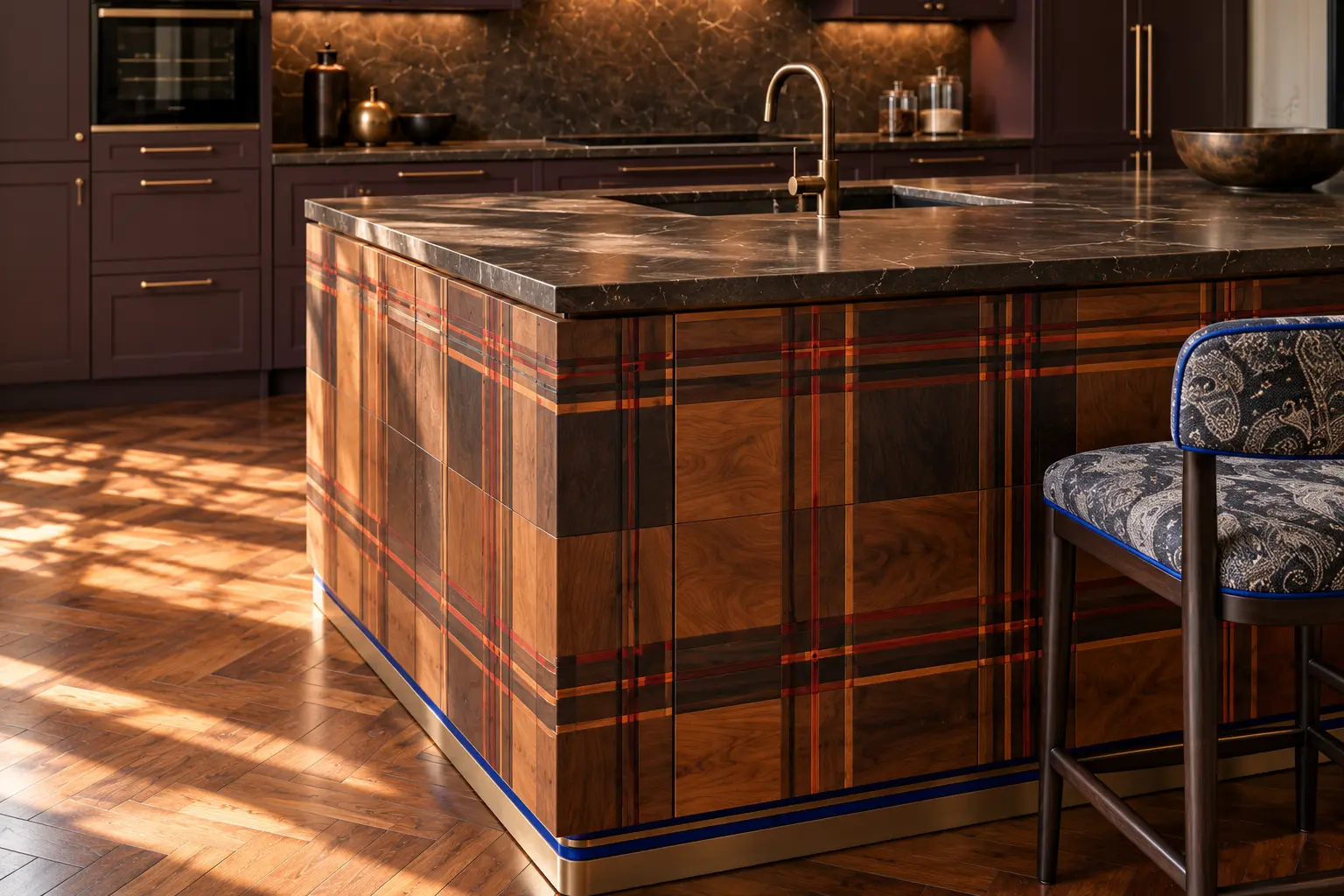
The island carries the strongest reference to the clothes. Brown, rust, orange and narrow blue lines meet across its panels, but the dark veined stone worktop makes it feel like a real piece of kitchen architecture rather than a novelty pattern.
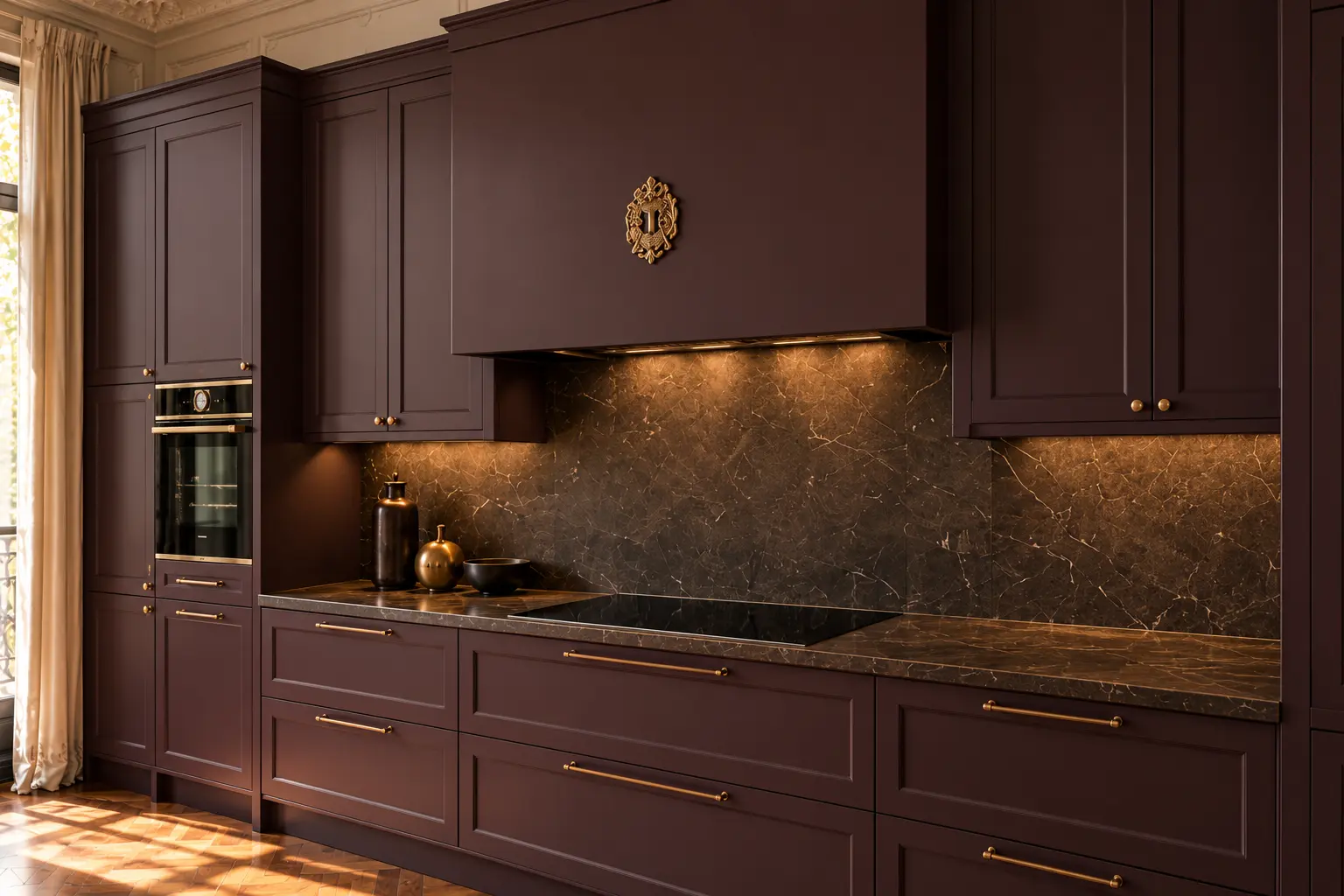
I kept the tall cabinets almost monolithic. The aubergine is dark enough to feel neutral at first glance, but warmer and more interesting than black. Fine brass handles pick up the small metallic details on the jacket without turning the whole kitchen gold.
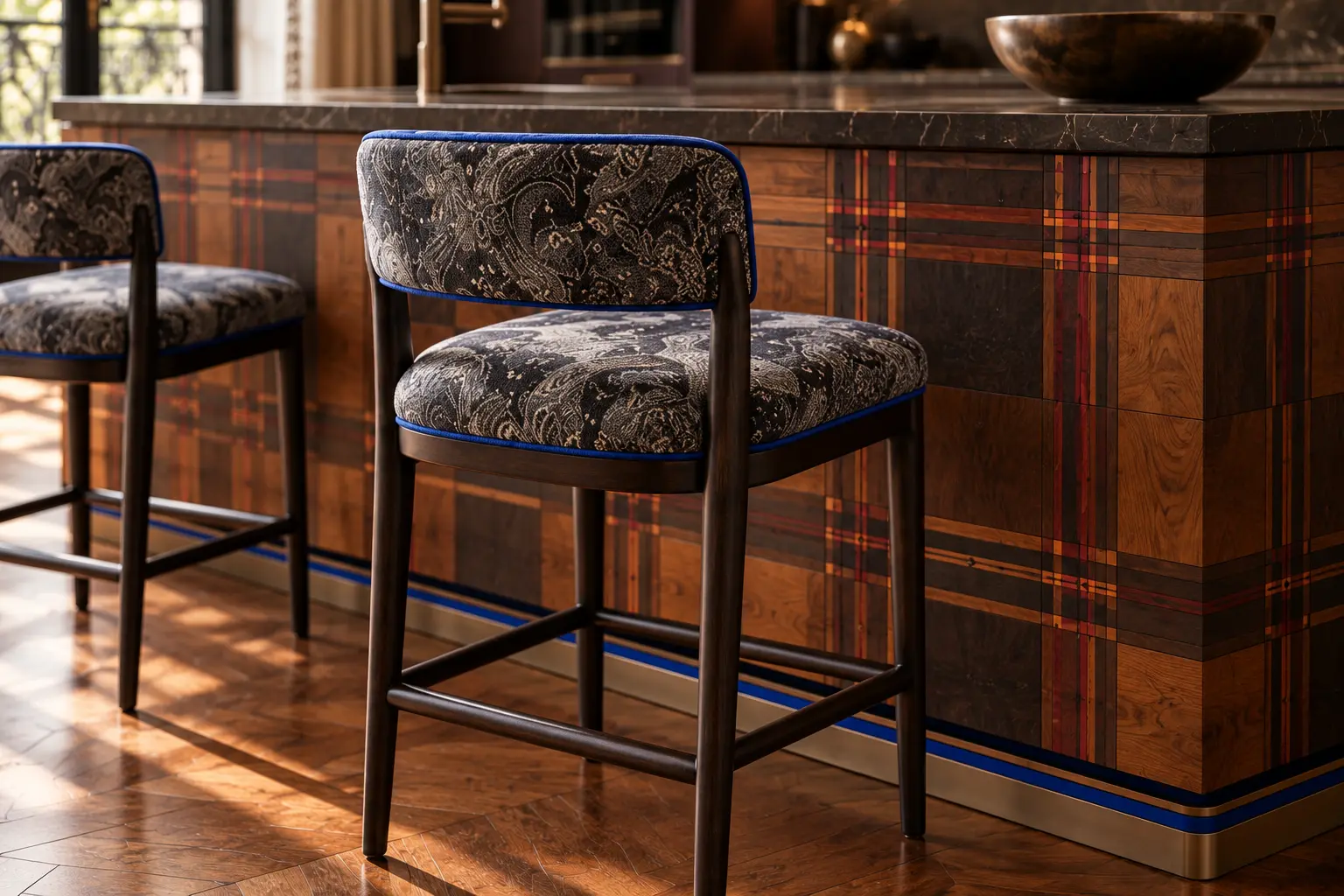
The stools borrow the grey-blue ornamental feeling of the boots. I used it on a small upholstered surface, where the pattern can be noticed closely without competing with the island. Their slender dark frames keep the arrangement visually light.
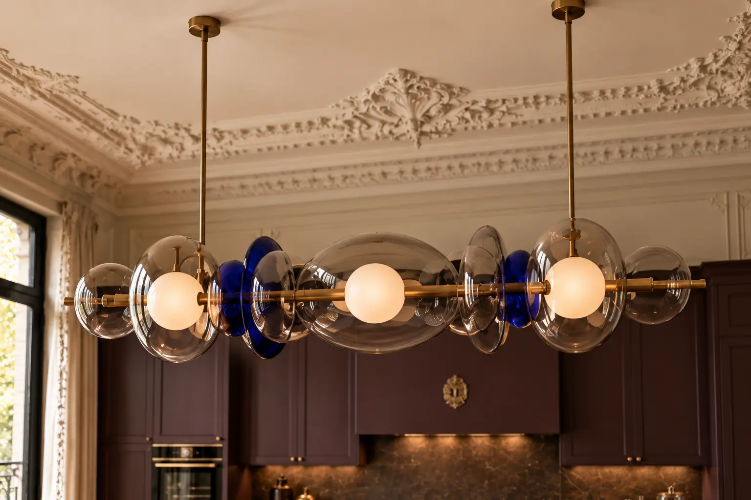
The blue-and-cream striped collar gave me permission to introduce cobalt glass into the chandelier. It is a small part of the outfit, but above the island it becomes the detail that sharpens the entire palette.
04
THE BEDROOM
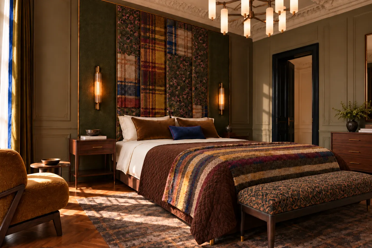
For the bedroom I chose the most layered look: a coat and scarf built from checks, florals, mustard, blue, brown and burgundy. My first instinct was to repeat the patchwork everywhere. It quickly became too literal. The room worked only when the wall carried the main idea and the bed, bench and chair answered it in different patterns.
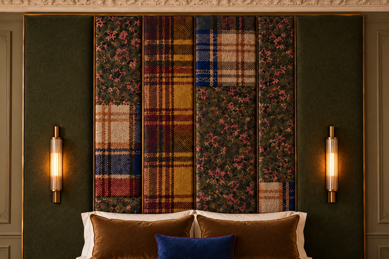
The panel behind the bed is the closest translation of the coat. Narrow sections of tartan and small florals are held inside an olive architectural frame. The slim wall lights sit outside it, so the textile reads almost like a large piece of art.
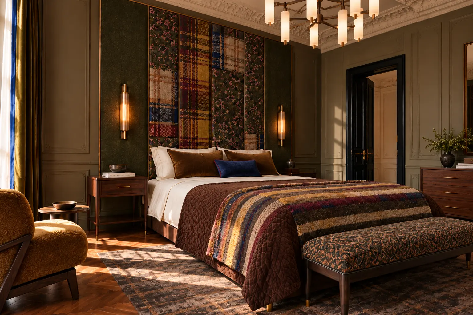
The bed uses stripes and irregular woven bands rather than repeating the wall. The colours belong to the same family, but the rhythm is different. The bench introduces another small-scale pattern. Together they feel related, not matched.
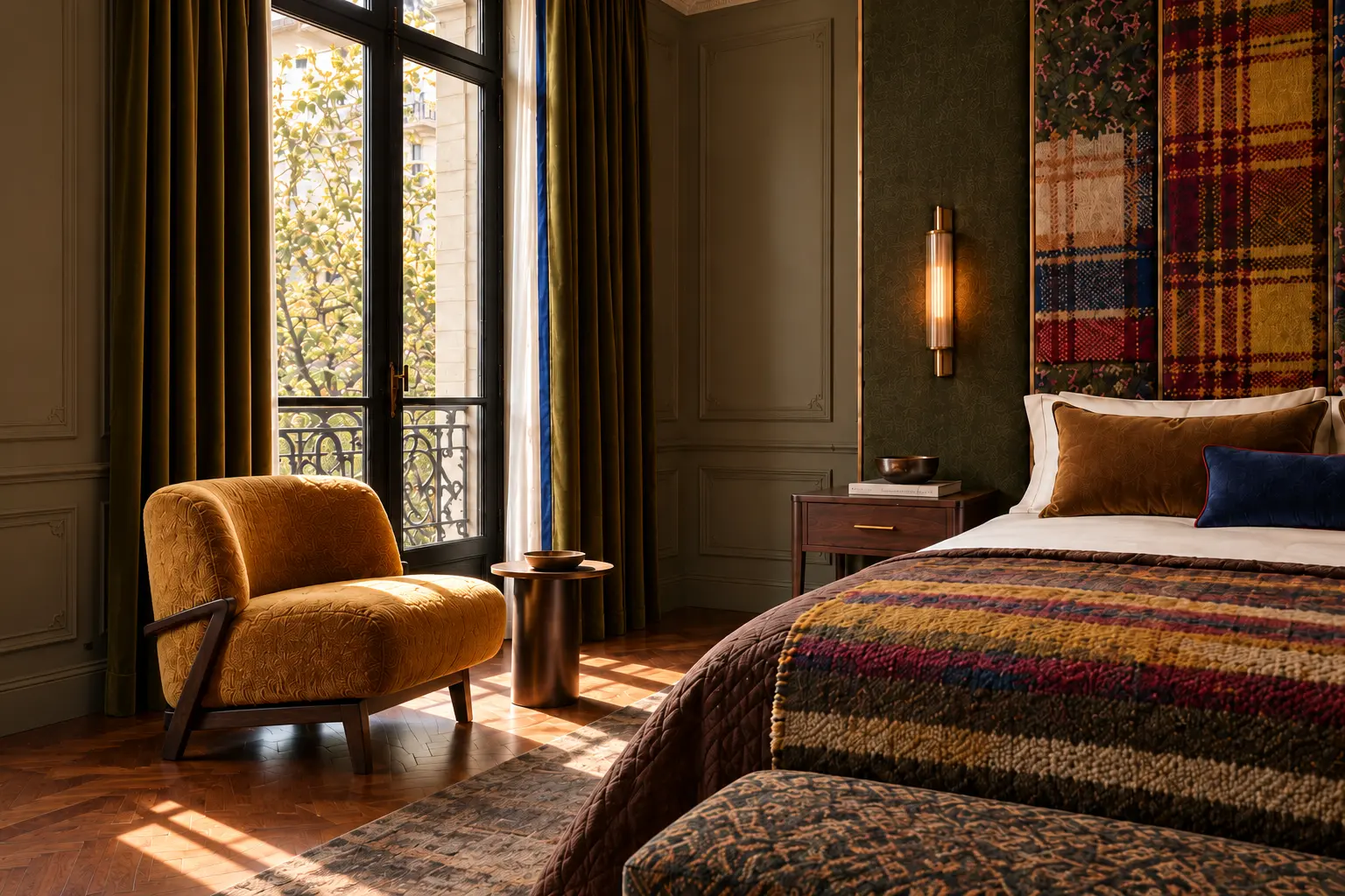
The mustard lounge chair takes one colour from the scarf and gives it room to breathe. Beside the tall black-framed window, it becomes a quiet reading corner and a useful pause from the more complicated wall behind the bed.
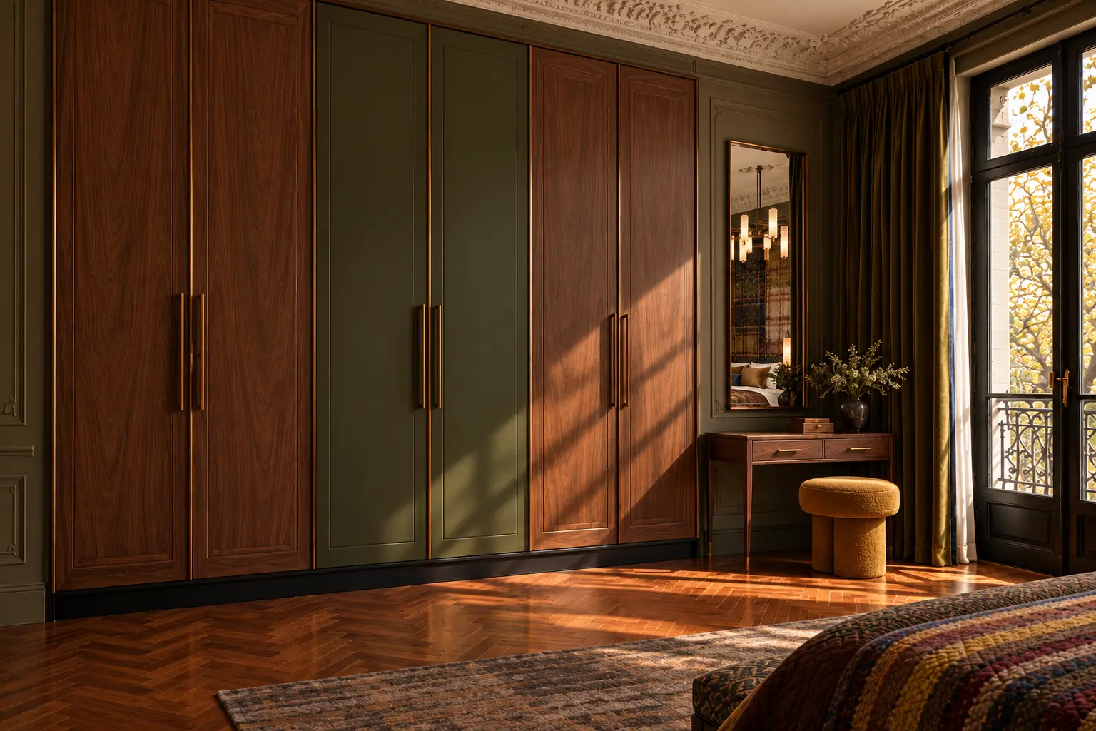
On the opposite wall, the wardrobe combines dark walnut with muted olive panels. It repeats the room’s architecture rather than its textiles. That difference matters: without the calm wood, the bedroom would feel like a fabric showroom.
05
THE HALLWAY
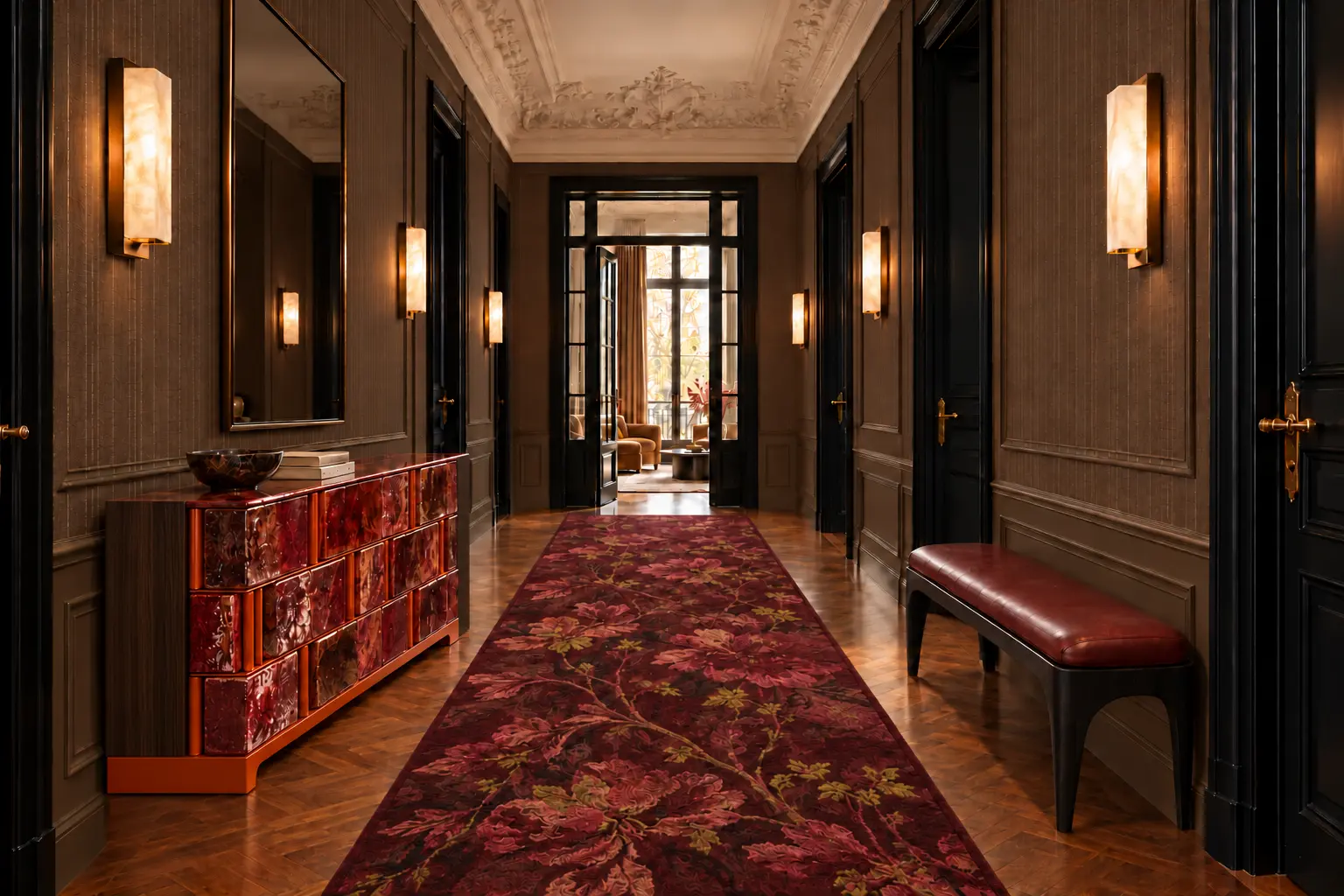
The hallway came from a long brown tailored coat with a bright orange-and-red striped collar and only a glimpse of printed satin underneath. I liked that most of the look was controlled and serious, while the colour appeared in narrow, unexpected places. The room follows the same balance.
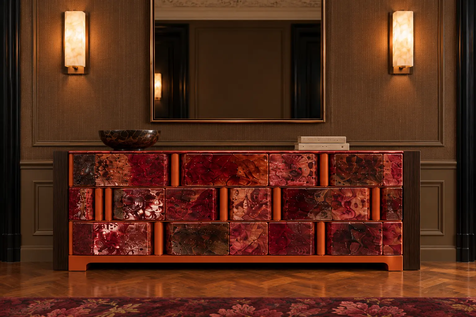
The glazed cabinet is the strongest object in the corridor. Its red and orange tiles have depth and small irregularities, while the dark wood sides keep the silhouette disciplined. It takes the idea of that hidden printed layer and gives it one precise architectural form.
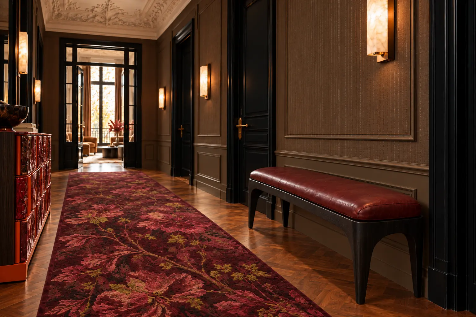
The runner is based on the colours visible beneath the coat rather than the brown tailoring itself. Deep red, pink and ochre stretch through the long space and make the corridor feel intentional, not simply like a route between rooms.
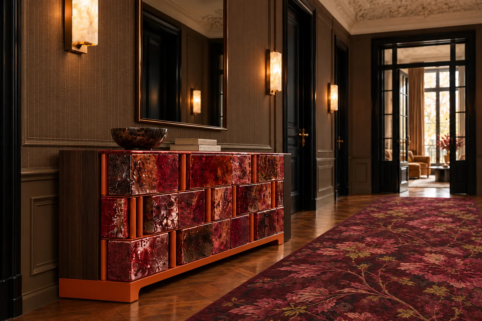
An oxblood bench and warm wall lights complete the quieter side of the look. Their shapes are simple, but the colour is richer than a conventional black or beige. The result is calm from a distance and much more detailed when you move through it.
06
THE BATHROOM
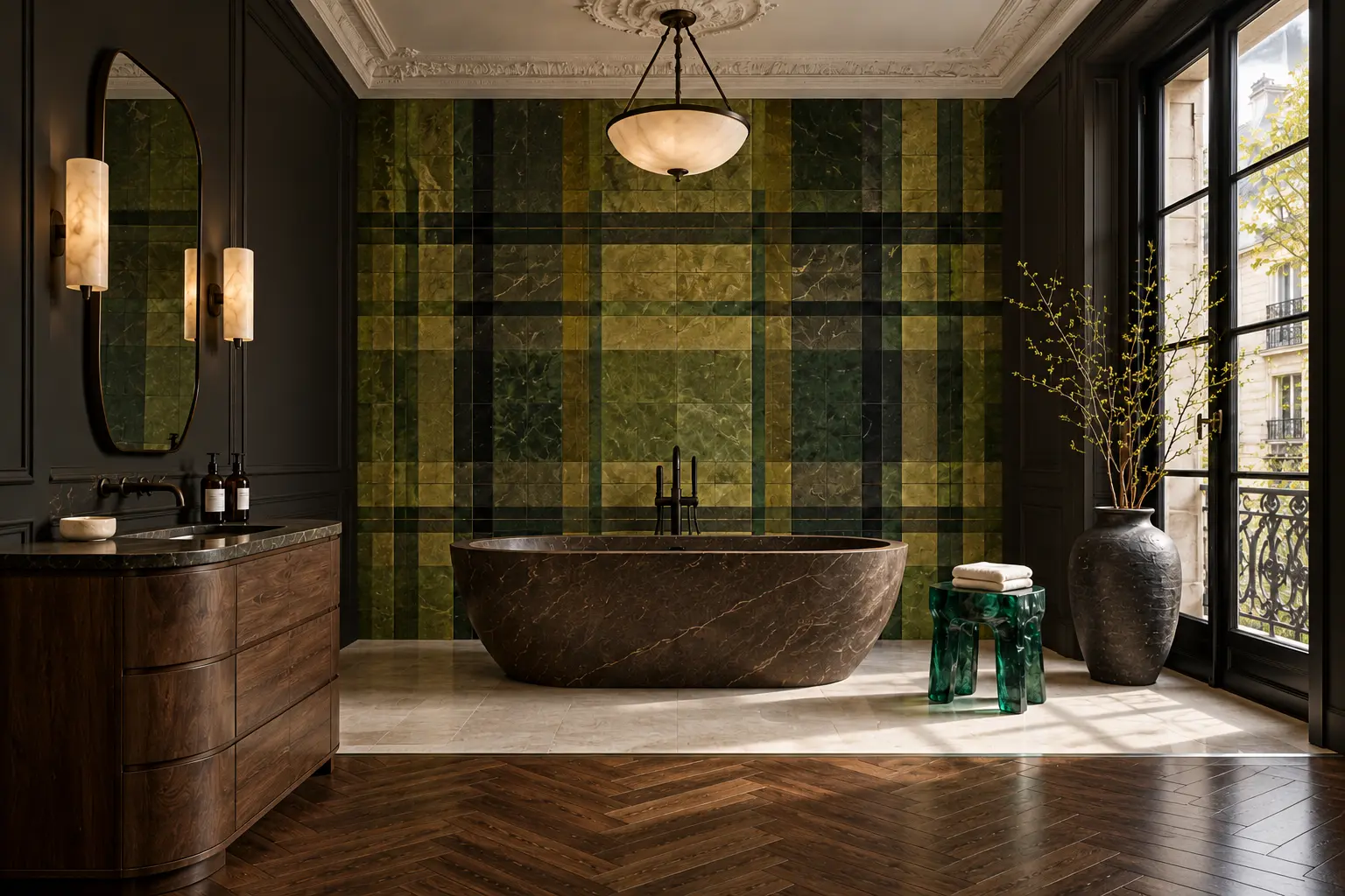
The bathroom is built around a green plaid coat worn over a black wrap top and dark checked trousers. I first tried carrying all of the green into the room. It felt too polite. The black from the top gave the scheme the contrast it needed and made the plaid wall feel stronger.
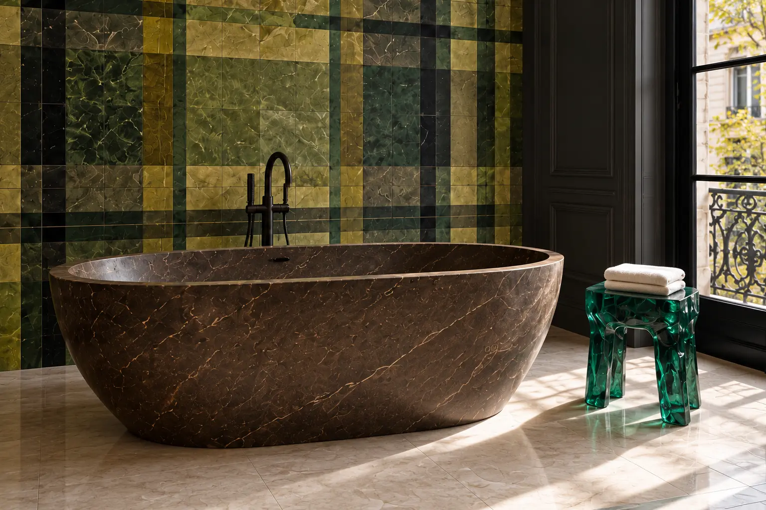
The brown stone bath relates to the boots and to the earthy threads running through the coat. In front of it, the translucent green stool takes one much brighter line from the trouser check and turns it into a small piece of resin. It is deliberately the only electric accent in the room.
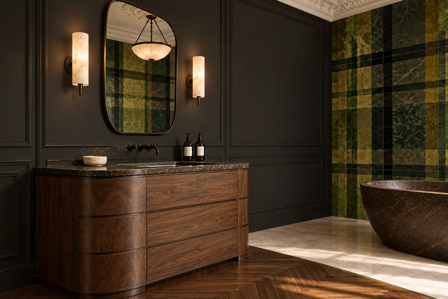
The vanity is warm, dark wood with a softly curved front. I wanted something tactile beside the hard stone and black fittings, but not another patterned surface. The mirror reflects the plaid wall and lets the pattern return without physically repeating it.
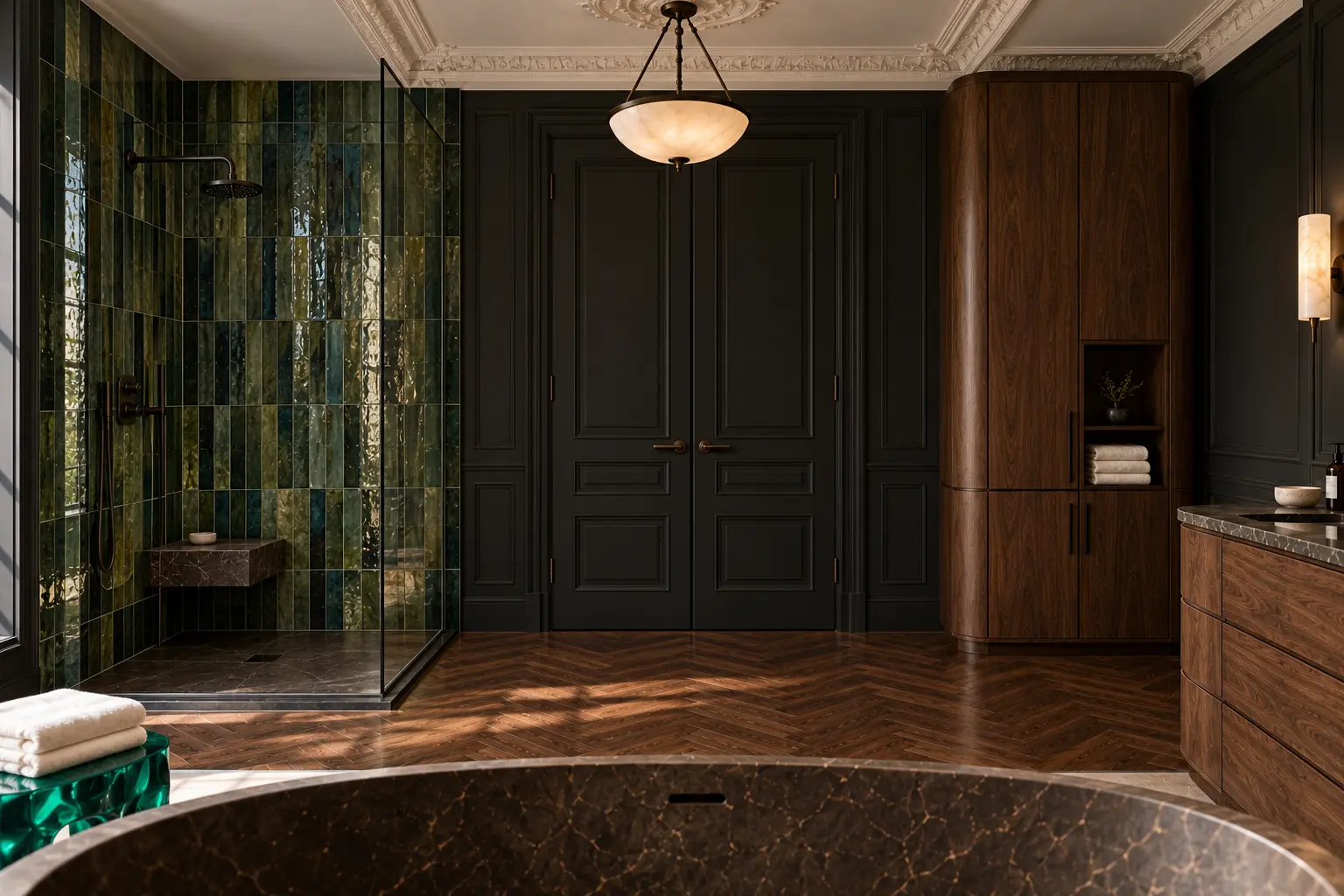
In the shower, the idea becomes deeper and quieter through glossy green tiles. They share the coat’s colour family but not its exact grid. This is where the translation becomes looser: the feeling stays, while the literal reference disappears.
07
THE POWDER ROOM
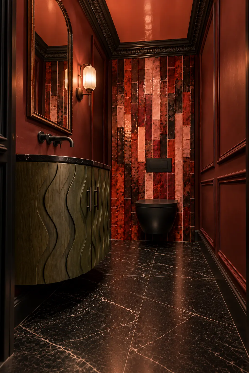
The smallest room takes on the collection’s largest flowers. The oversized coat is covered in coral, pink and red blooms on a black ground, but I did not want a tiny space wrapped in a literal floral print. Instead, I concentrated the colour and made the rest of the room dark and close. Black marble, deep brown panelling and black cornices make the narrow format feel cocooning rather than cramped, while the coral lacquered ceiling gives the eye somewhere unexpected to go.
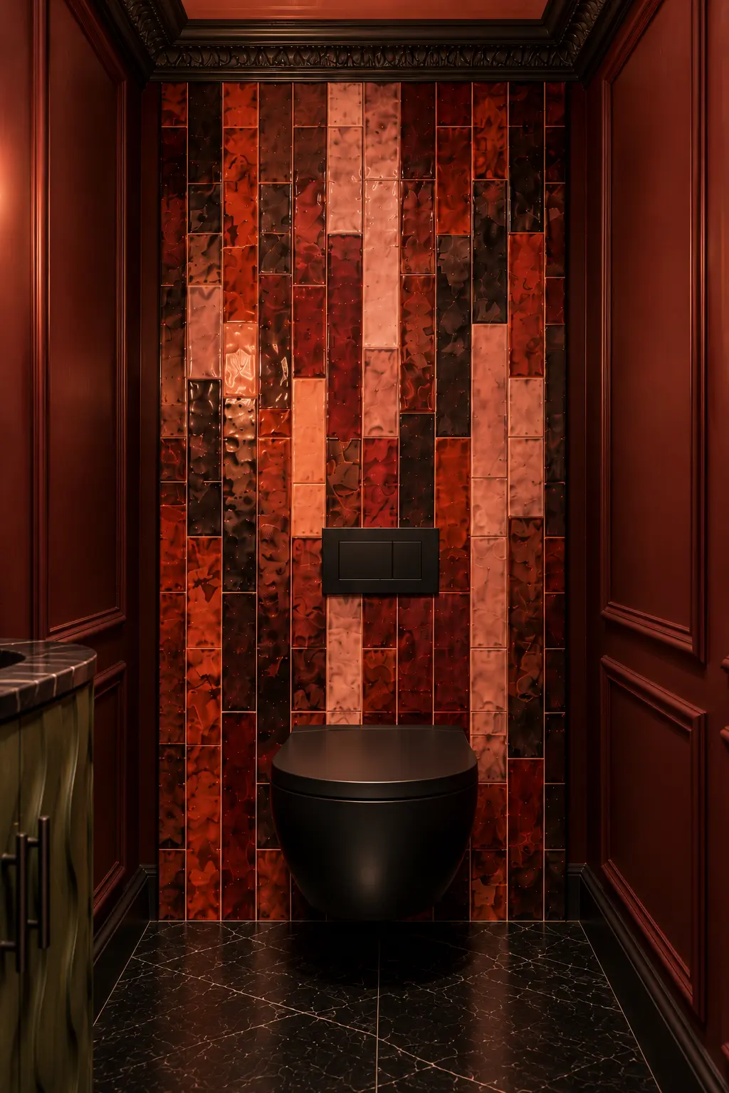
Behind the toilet, the floral palette becomes an abstract wall of red, coral and black pieces. From the doorway it has the same impact as the coat; closer up it reads as material and variation rather than a copied flower.
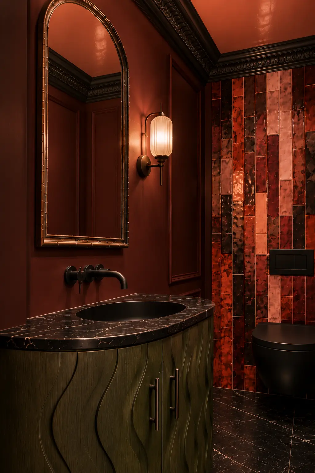
The olive relief vanity is the counterpoint. Its carved waves and visible handles make it feel like a real piece of furniture, while the green introduces one colour that is not obvious in the coat. Sometimes the room needs an answer to the inspiration, not another repetition of it.
ONE COLLECTION, ONE HOME
The rooms do not match. They belong together.
That is what I wanted to keep from the collection. A home does not need one repeated print or a perfectly controlled palette to feel coherent. It can change mood from room to room, as long as the choices share the same point of view.
The next Dressed Homes story will begin with a different collection and, hopefully, become a completely different kind of home.
Wear the room. Live in the collection.