01
The chocolate and apricot room
The colour relationship I would borrow first: a deep wall, softer upholstery and enough contrast to give both a purpose.
INTERIORS / 2026–27
Bedroom trends for 2026–2027: richer colour, expressive bedding, sculptural lighting and statement beds.
Bedroom trends for 2026–2027, through five ideas I would actually bring home: richer wall colours, expressive bedding, collected furniture, sculptural lighting and beds with presence.
About 7 min read
The images in this story are AI-generated editorial interpretations based on real designer pieces and interior references. They are not product photographs; proportions, finishes and details may differ from the originals.
The bedroom trends I am taking from 2026 into 2027 have five things in common: richer wall colours, expressive bedding, furniture chosen individually, light at more than one level, and a bed that gives the room its identity. Here are 20 ways to put those ideas together, using named designer pieces.
This is my edit of current collections and published design coverage, read alongside the colour forecasts for 2027. Some pieces launched in 2025 and remain part of the conversation in 2026; the rooms show how I would bring them together. A forecast is an invitation to experiment, not a rule for what your bedroom should look like.
01

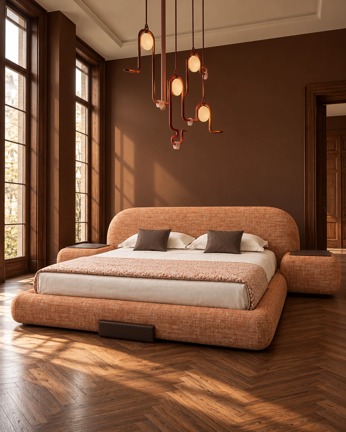
Chocolate brown makes the apricot Comfy bed glow. I like the contrast between the soft upholstery, smooth walls and dark herringbone floor: the room feels warm without becoming one long conversation about beige. The sculptural Apparatus lights give it a sharper edge.
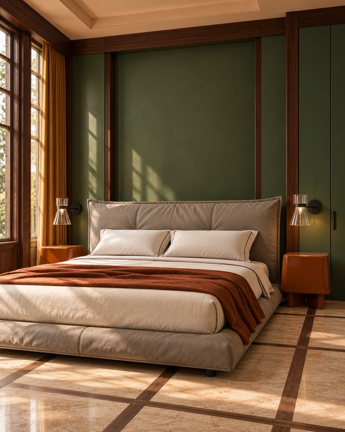
Green gains depth from walnut framing, soft leather and rust-coloured cabinets. Benjamin Moore’s 2027 palette includes Webster Green, Townsend Harbor Brown and Wild Aster. This room interprets the green colour family rather than an exact paint swatch.
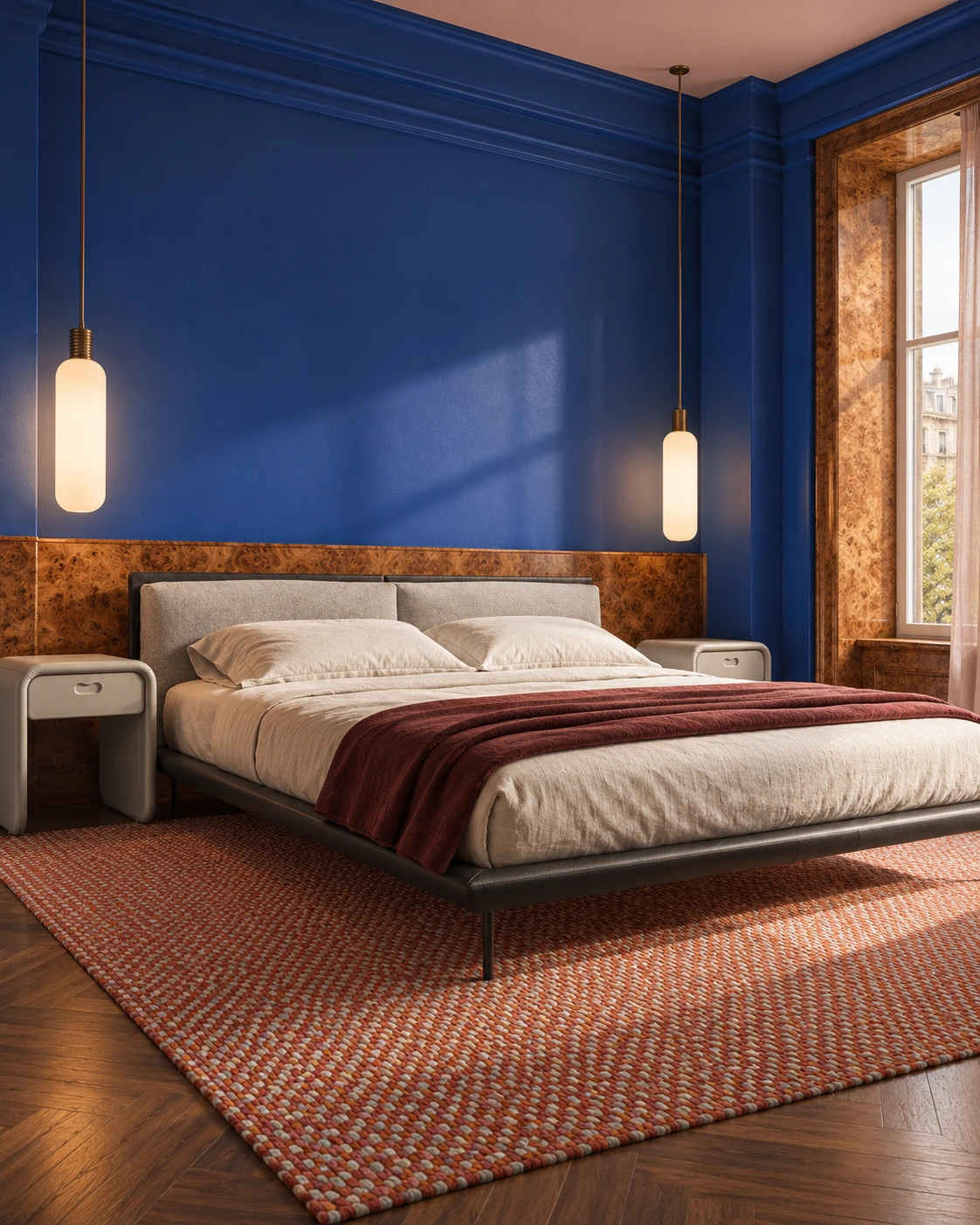
Blue finds its warmth in caramel wood and the berry weave of a rug. WGSN and Coloro’s Luminous Blue forecast offers another reason to reconsider the colour for 2027. Here, pale furniture and warm timber give the deeper blue something to answer to.
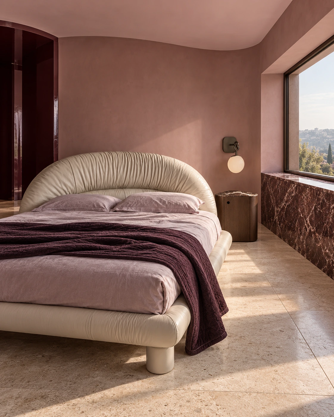
Pink becomes much more interesting beside plum textiles and wine-coloured stone. The curved wall and pale upholstered bed keep it soft; the darker accents give it substance. These are colour directions to explore, not a rulebook. The accent cushion can finally take a day off.
02
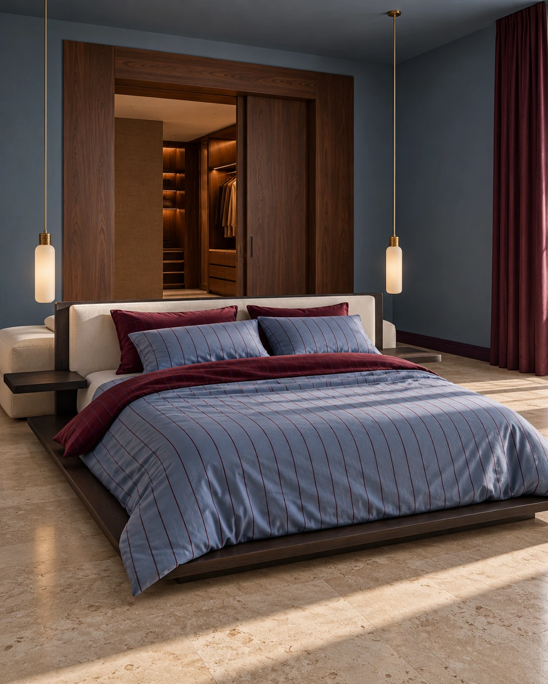
I can talk myself out of a new bed. New bedding is another matter. Hommey’s Oxford/Plum brings the precision of shirting to the room: fine blue and plum stripes, walnut framing and wine-coloured curtains. There is enough colour in the fabric to make the whole room feel connected.
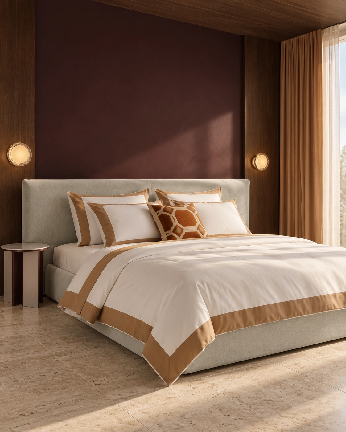
Frette takes a more tailored route. Its Design Reform collection for autumn/winter 2026, featured in Livingetc in July, puts geometry at the centre. A broad caramel border frames white bedding; a rust-toned Deco cushion adds a smaller, sharper pattern. White sheets suddenly have quite a lot to say.
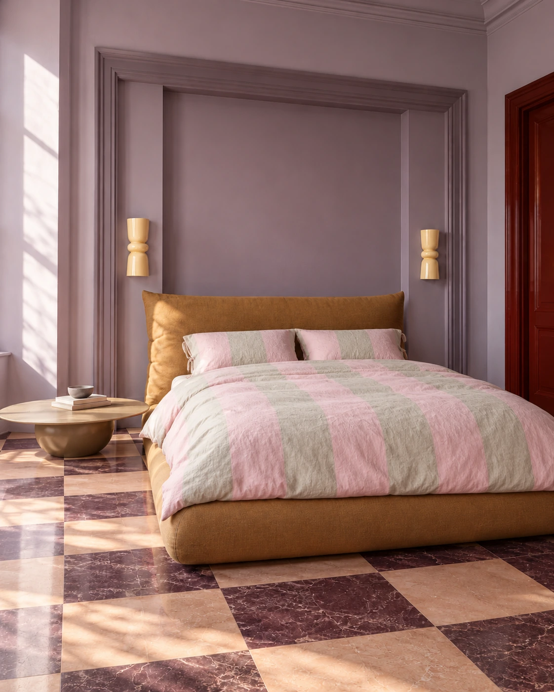
Millaux’s Farmhouse in Pink & Creme Stripe uses wide bands of colour in European flax linen, woven and tailored in Portugal. I love the relaxed creases against that enormous ochre headboard. The lilac walls and patterned floor are exuberant; the simple stripe gives your eye somewhere to settle.
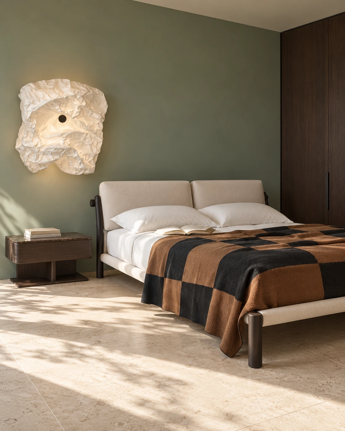
For a quieter room, Nordic Knots’ Square Kilim in Tobacco brings weight and texture. The handwoven New Zealand wool bedspread layers charcoal and tobacco squares over white bedding. Against green walls and pale stone, it gives Japandi a little more conviction.
03
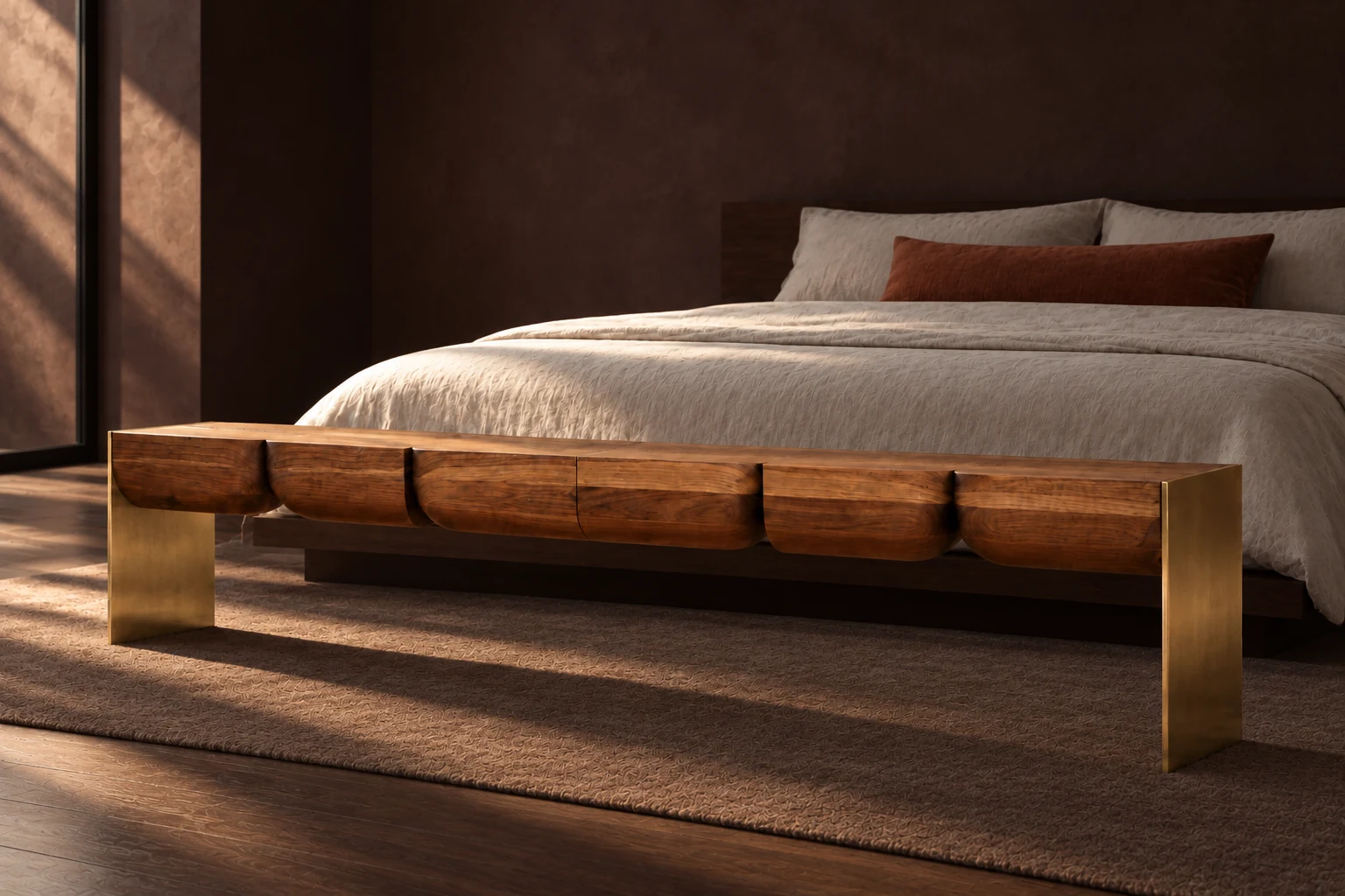
I have never been convinced by a bedroom set that looks as if it arrived in one truck. The Galvin Brothers Split Turned Bench brings a different silhouette to the foot of the bed. Dark carved wood adds weight without asking the whole room to match.
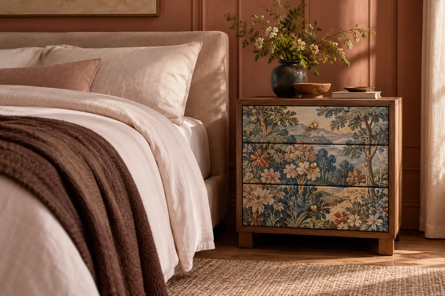
A bedside table can have more personality than the lamp on top of it. Anthropologie’s Judarn Hale uses a patterned front against warm terracotta. I like that it introduces another texture rather than repeating the bed: collected, not coordinated.
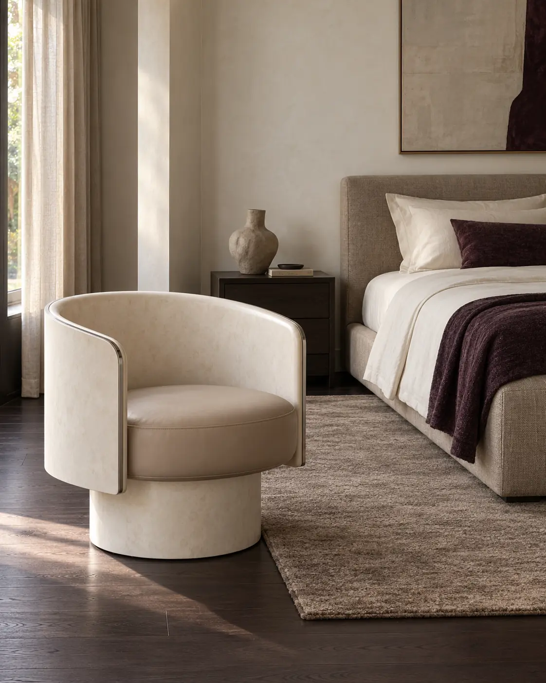
The Half-Pipe chair by Francesco Meda and David Lopez Quincoces for Gallotti&Radice is a good example of how materials are changing. The 2026 design comes in recycled glass powder or travertine powder. Its quiet shape has rather more behind it than it first suggests.
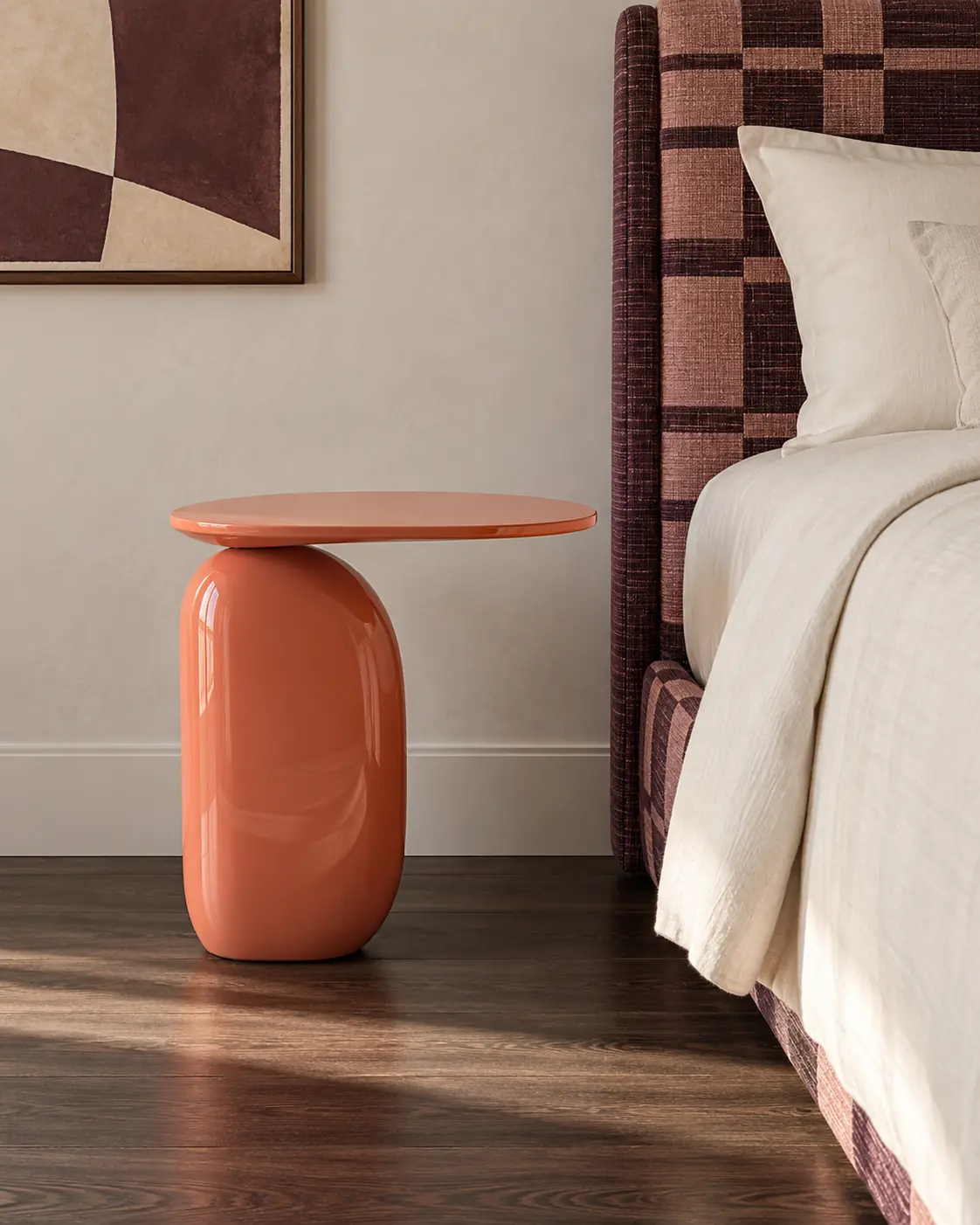
One lacquered table can change the mood of a bedroom. De Rosee Sa’s Lozenge brings a flash of coral beside the patterned headboard. It is a small piece with a clear job and enough attitude to stop the room feeling too coordinated.
A bedroom can have presence without asking every piece to perform.
04
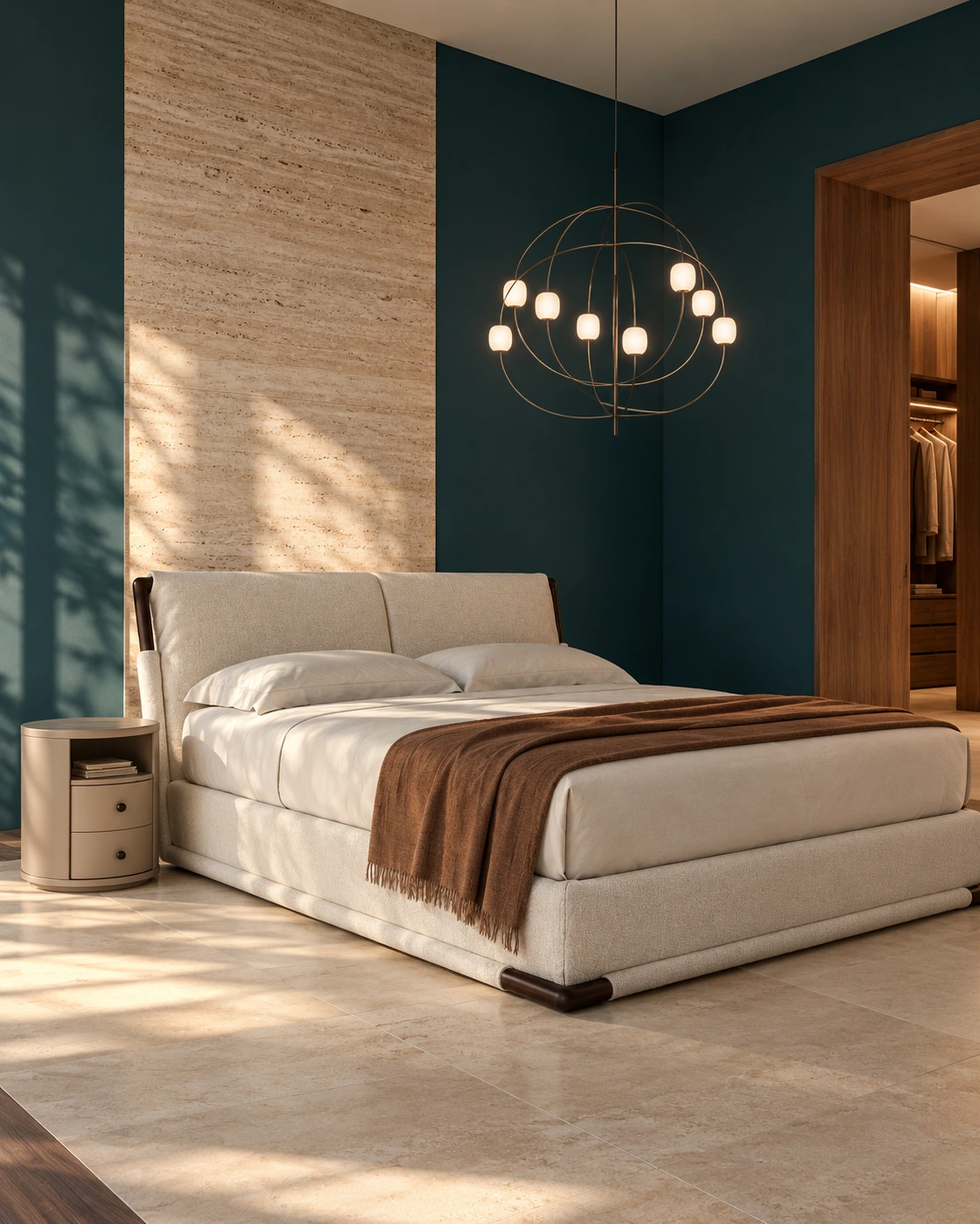
Light is becoming the jewellery of the bedroom: the silhouette matters even before you switch it on. Axia almost draws a chandelier in the air with copper lines and tiny points of light. Against petrol teal, pale upholstery and travertine, that lightness becomes the point.
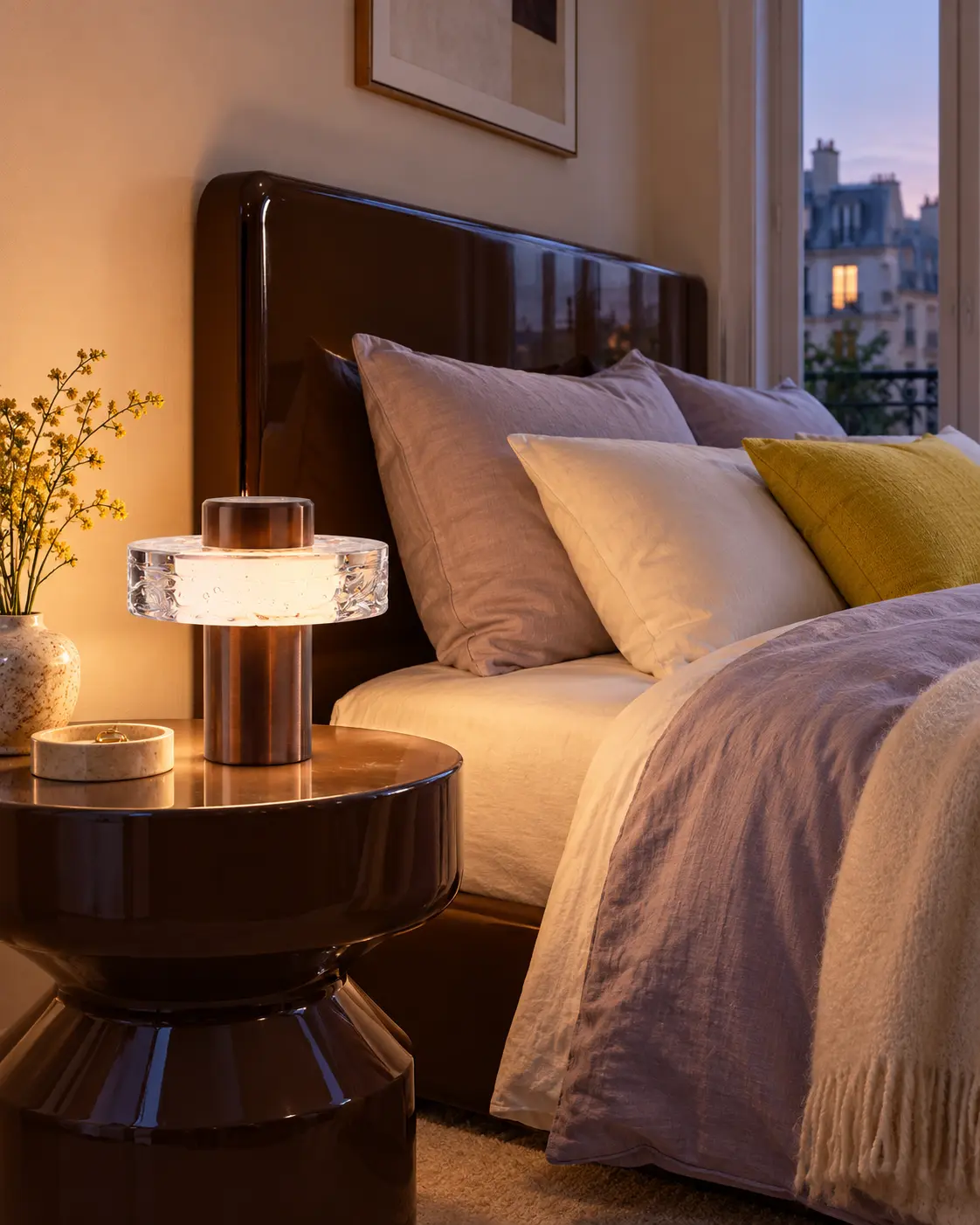
Ollo turns a portable lamp into a solid ring of glass you can carry from bedside to dressing table. Beside chocolate brown and lilac bedding, its glow feels intimate. This is the smaller light I would reach for when the ceiling source has done enough.
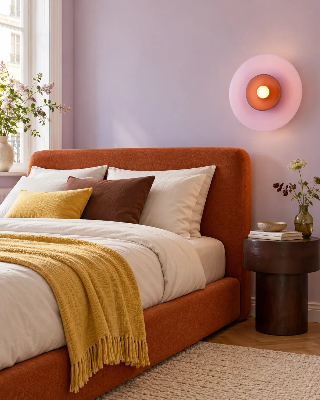
Curiousa’s Tempo Siren brings a joyful hit of lilac and coral to the wall. Against the burnt-orange upholstery, the colour feels deliberate rather than decorative. A bedside light can be useful and still be the detail you notice first.
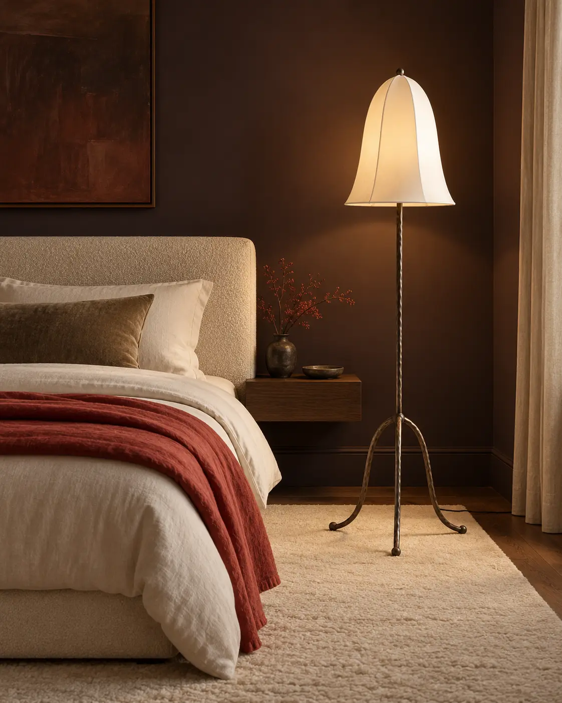
Eny Lee Parker’s Pamy stands on hammered legs beneath a softly imperfect linen bell. It gives the bedroom a lower glow without another matching bedside lamp. One good ceiling source, something close to the bed and a softer light for the evening: that is plenty.
05
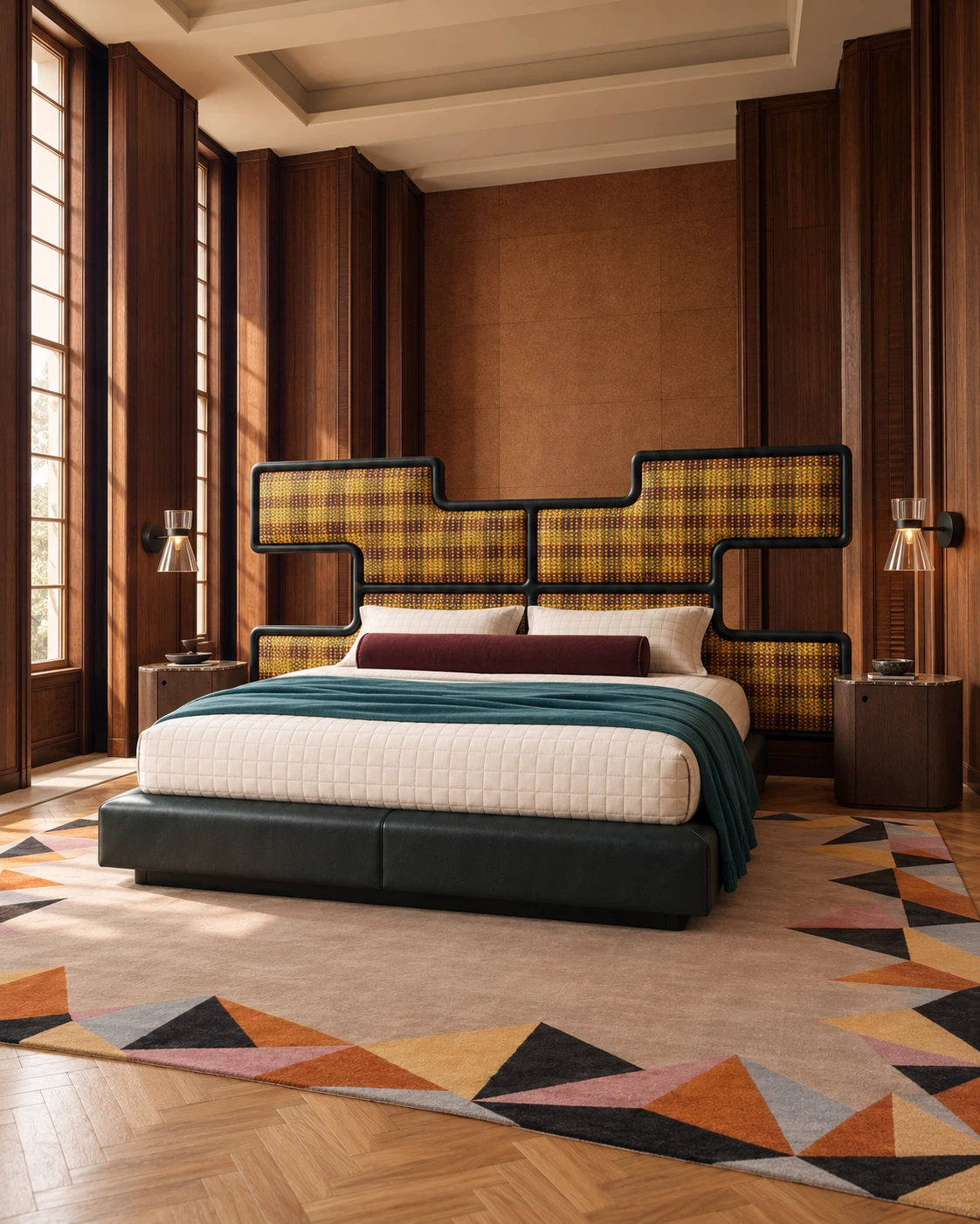
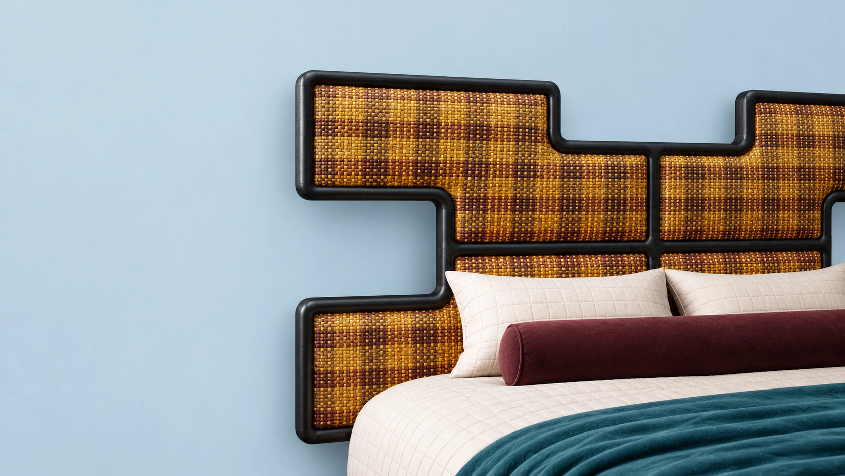
Sometimes the bed is the room’s best idea. Ozwald Boateng’s Authenticity for Savoir has the presence of a folding screen: a stepped oak frame and woven leather inspired by Ghanaian Kente cloth. Dark timber, precise glass lights and a rug with a quiet centre give it a setting with equal substance.
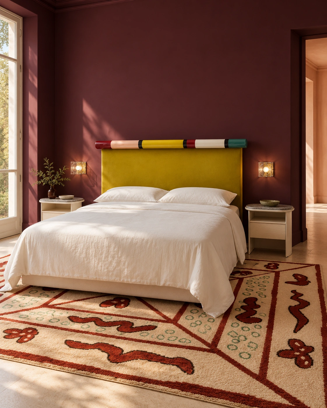
India Mahdavi’s Rosary for Bolzan has a different kind of confidence. Glazed ceramic colour sits above mustard-yellow velvet, almost like jewellery for the bed. Against the burgundy-plum wall, those small changes of colour matter. I would keep the bedding this simple: the headboard already has plenty to say.
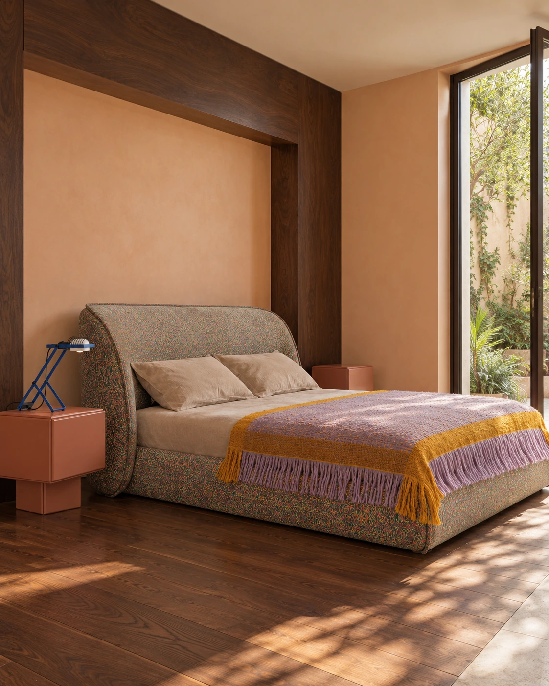
Sedona, by Patricia Urquiola for Moroso, makes its case through fabric and shape. Colour runs across the rounded base and generous headboard; lavender and mustard pull those quieter flecks into view. Apricot walls and dark wood add warmth. This is the sort of bed I would build a palette around.
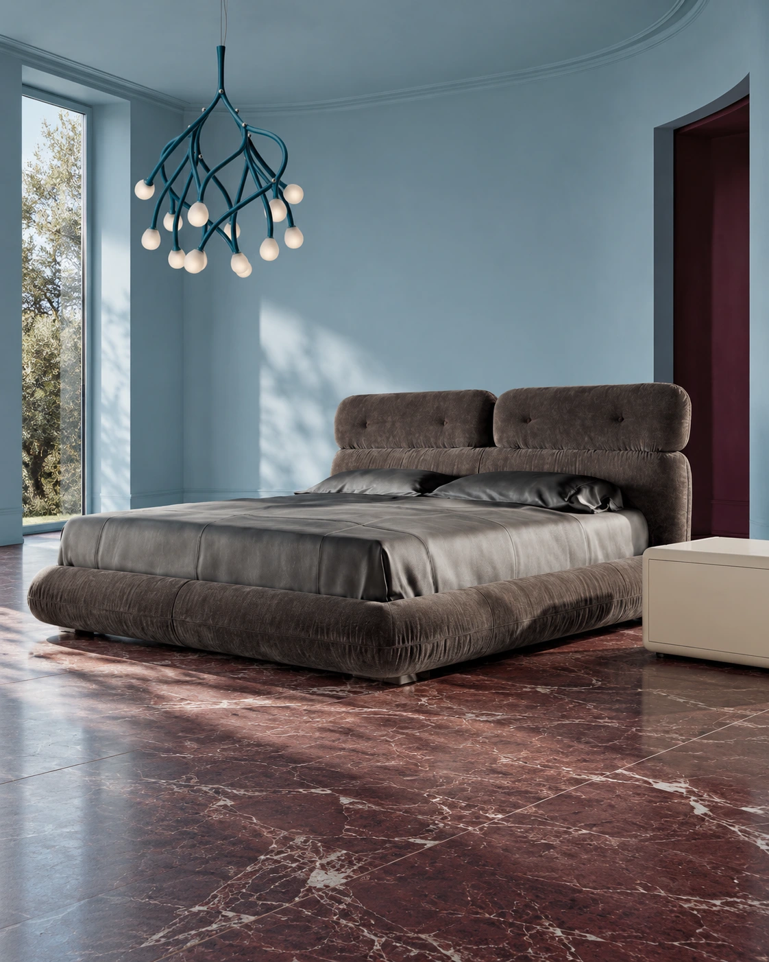
Minotti’s Libra, by Giampiero Tagliaferri, has a more tailored softness: rounded layers, buttoned headrests and little gathers along the upholstery. I like the dark fabric against pale blue. Burgundy stone brings weight; Foscarini’s Tilia pendant brings movement. The bed still gets the last word.
MY EDIT
01
The colour relationship I would borrow first: a deep wall, softer upholstery and enough contrast to give both a purpose.

02
The smaller change with a strong point of view. Blue and plum can bring a room together without replacing its furniture.

03
One expressive light is enough to give the bedside its own personality. The rest of the room can stay quieter.
THE TAKEAWAY
The bedroom trends worth keeping for 2026–27 are not a checklist. They are permission to make the room more individual: colour that changes its mood, pattern that makes the bed feel considered, furniture that does not arrive as a matching set, and light that supports the way the room is actually used.
Start with one decision you love. Let the rest of the room answer it.