01
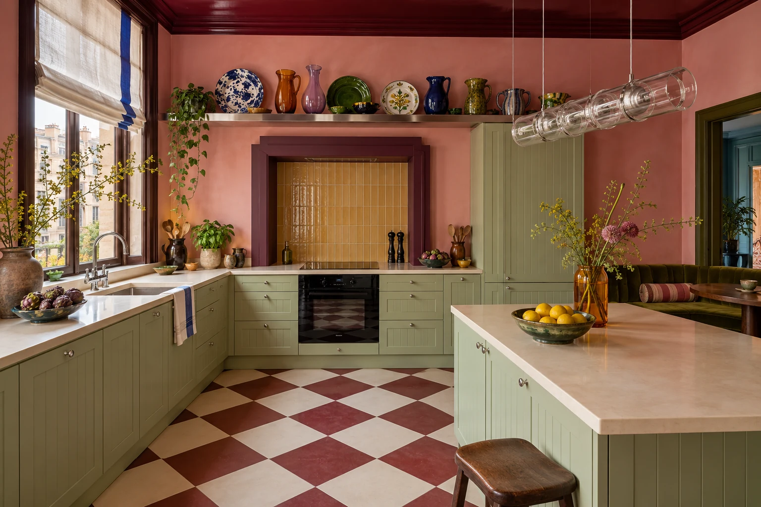
The coloured ceiling
Sage and burgundy make a strong pair without asking every surface to compete. The ceiling is the decision I would keep.
INTERIORS / IKEA UPDATE
Eight IKEA kitchen ideas for 2027. Bold colour, expressive surfaces and details worth borrowing.
About 4 min read
A standard METOD system can support a very personal room. These eight IKEA kitchen ideas explore colours and materials inspired by forecasts for 2027: rust, deep green, lilac, coloured glass and tactile fronts. Choose a room below, then borrow its strongest decision.
AI-generated editorial concepts. Named products are design references; colours and detailing may differ from the manufactured pieces.
01
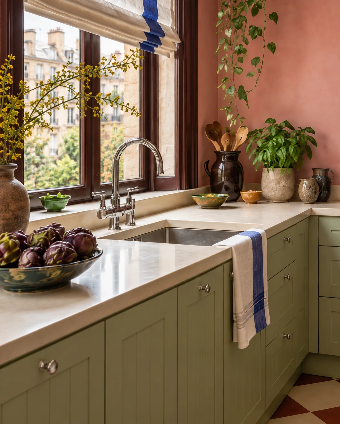
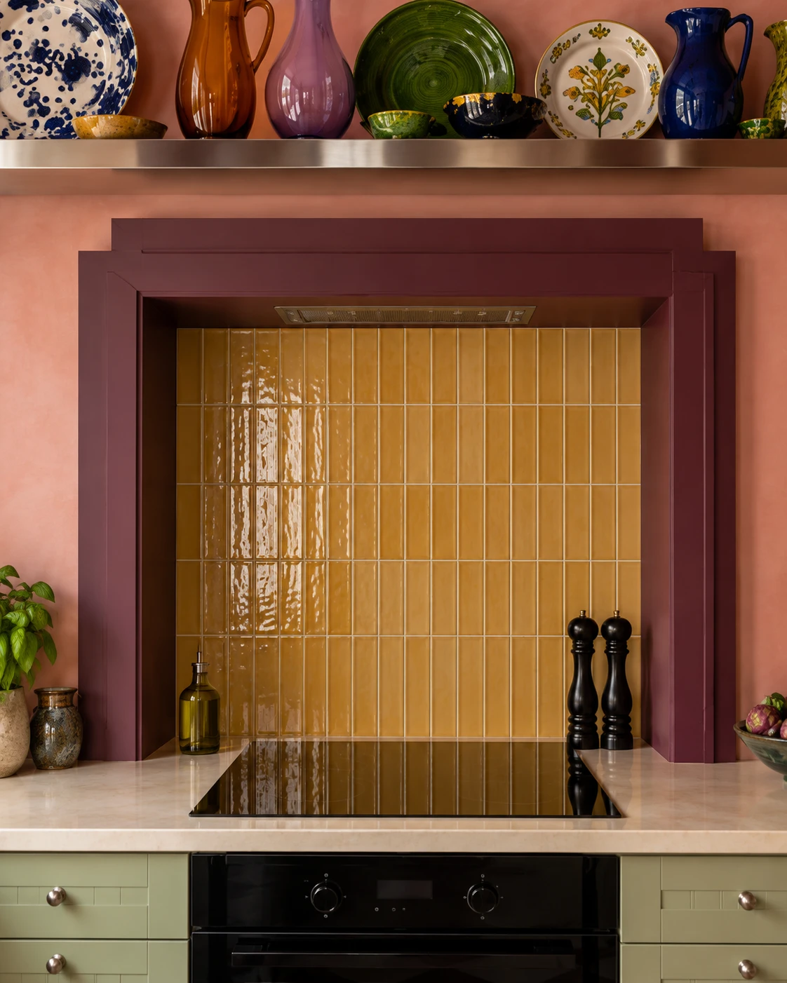
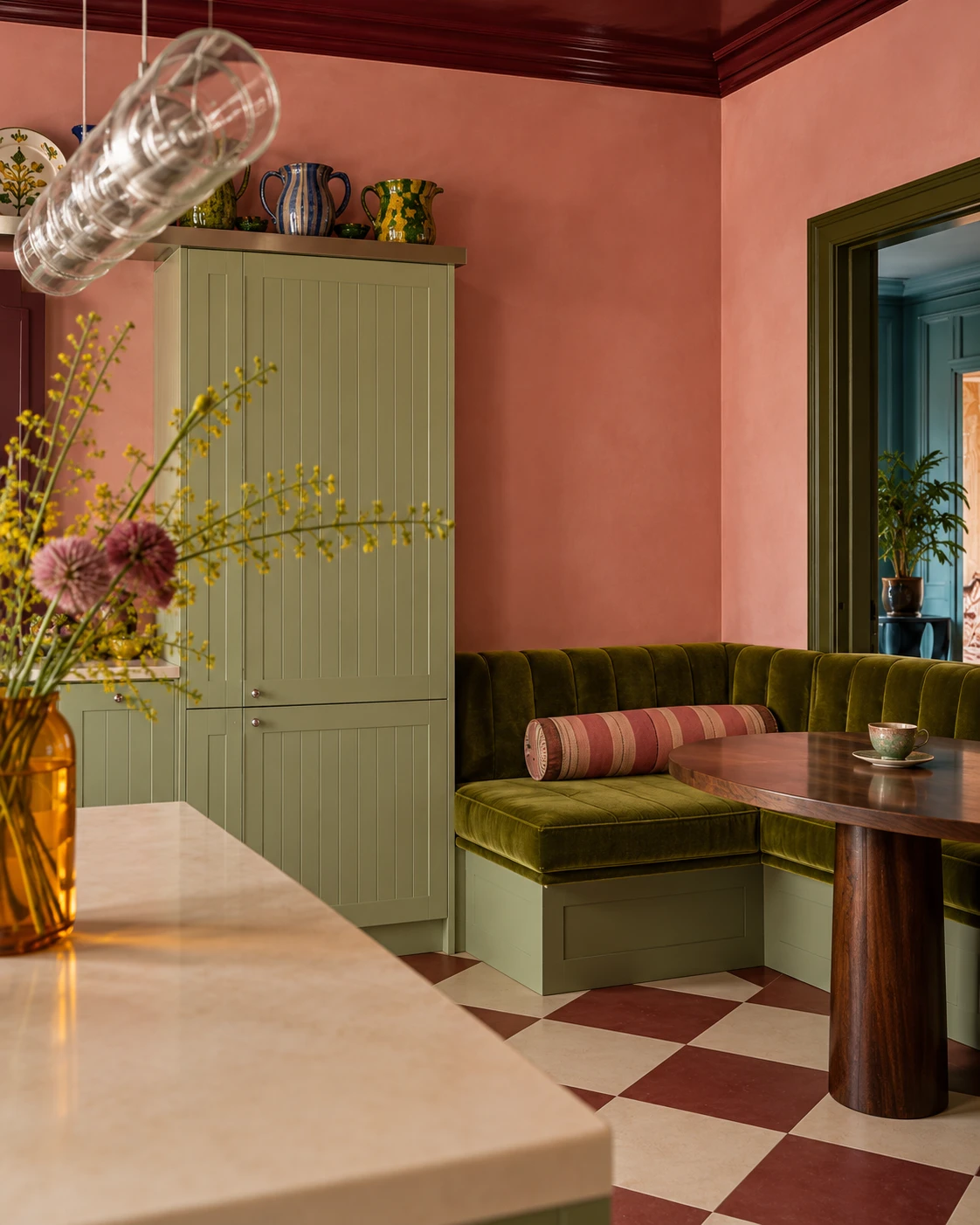
STENSUND · light green
Sage cabinetry becomes richer beside a burgundy ceiling, dusty pink walls and warm stone. Collected ceramics add character above the cooking alcove.
Borrow the idea: put the strongest colour on the ceiling and keep the fronts calm.

02
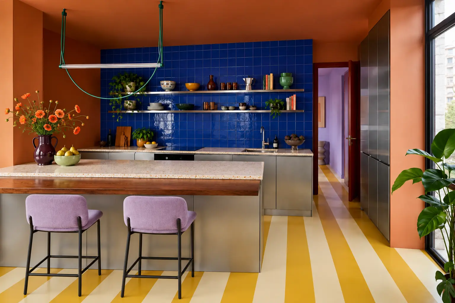
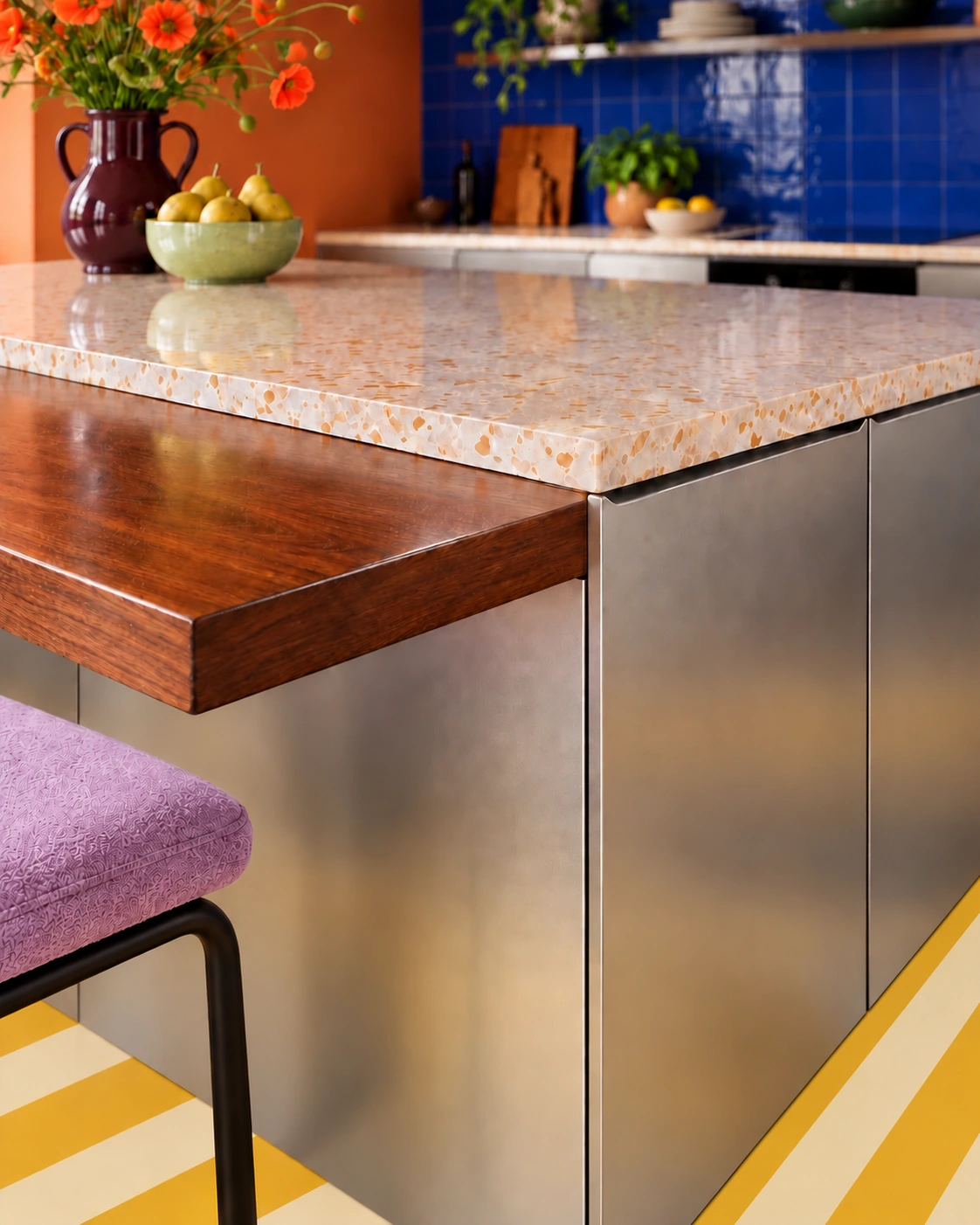
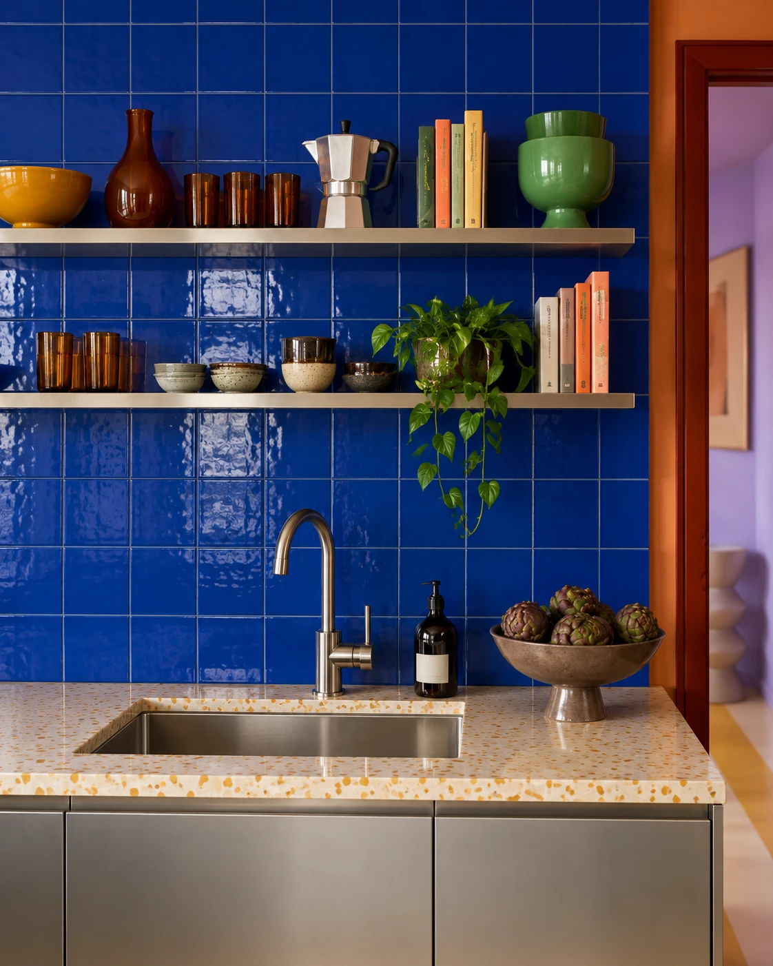
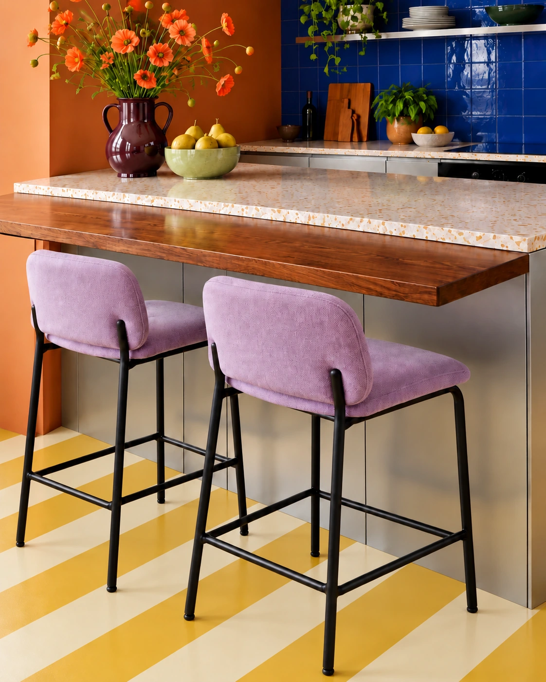
VÅRSTA · stainless steel
Cobalt tile and burnt orange give steel a warmer, domestic character. The timber ledge softens the reflective cabinetry.
Borrow the idea: pair metal fronts with one saturated wall and a natural material.
03
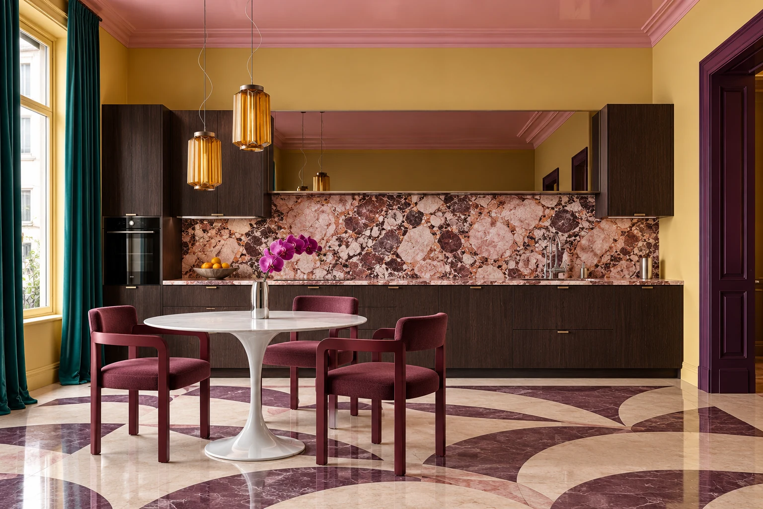
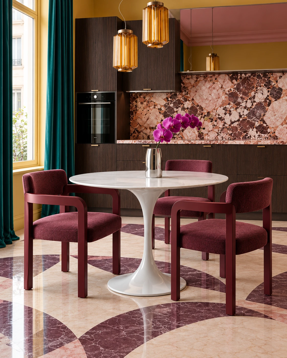
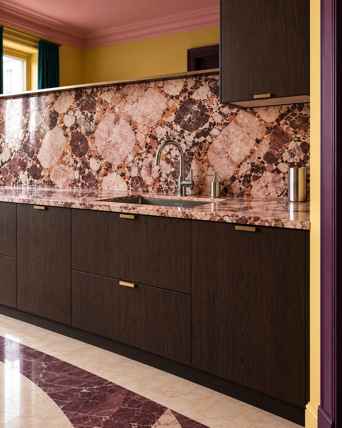
SINARP · brown
Dark wood anchors rose stone, aubergine seating and maize walls. The colours share depth without repeating each other.
Borrow the idea: let one dramatic slab supply the pattern.
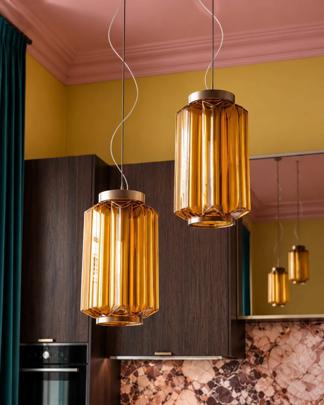
The kitchen can begin with a familiar system and end with a very personal decision.
04
BODBYN · off-white
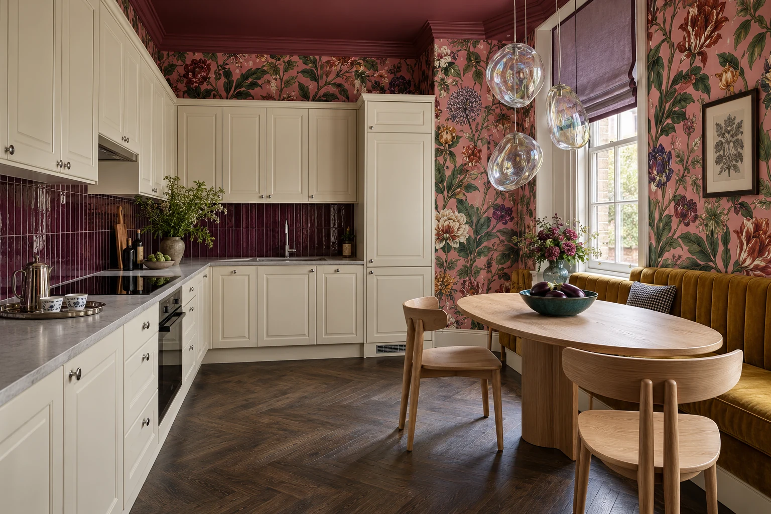
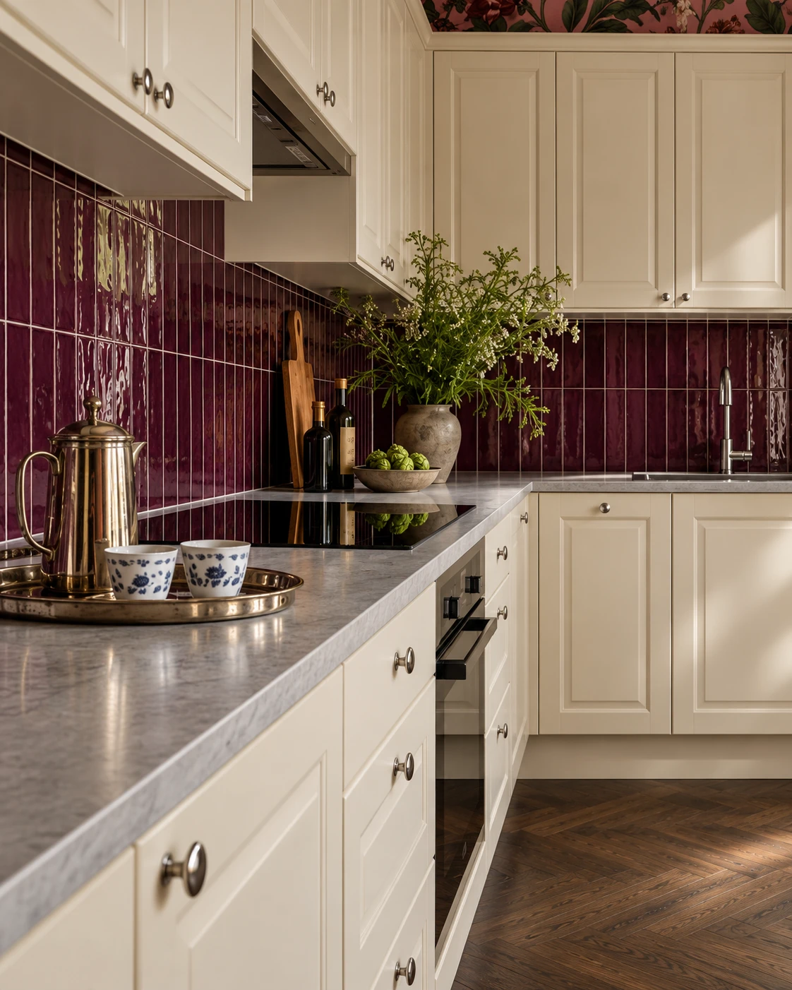
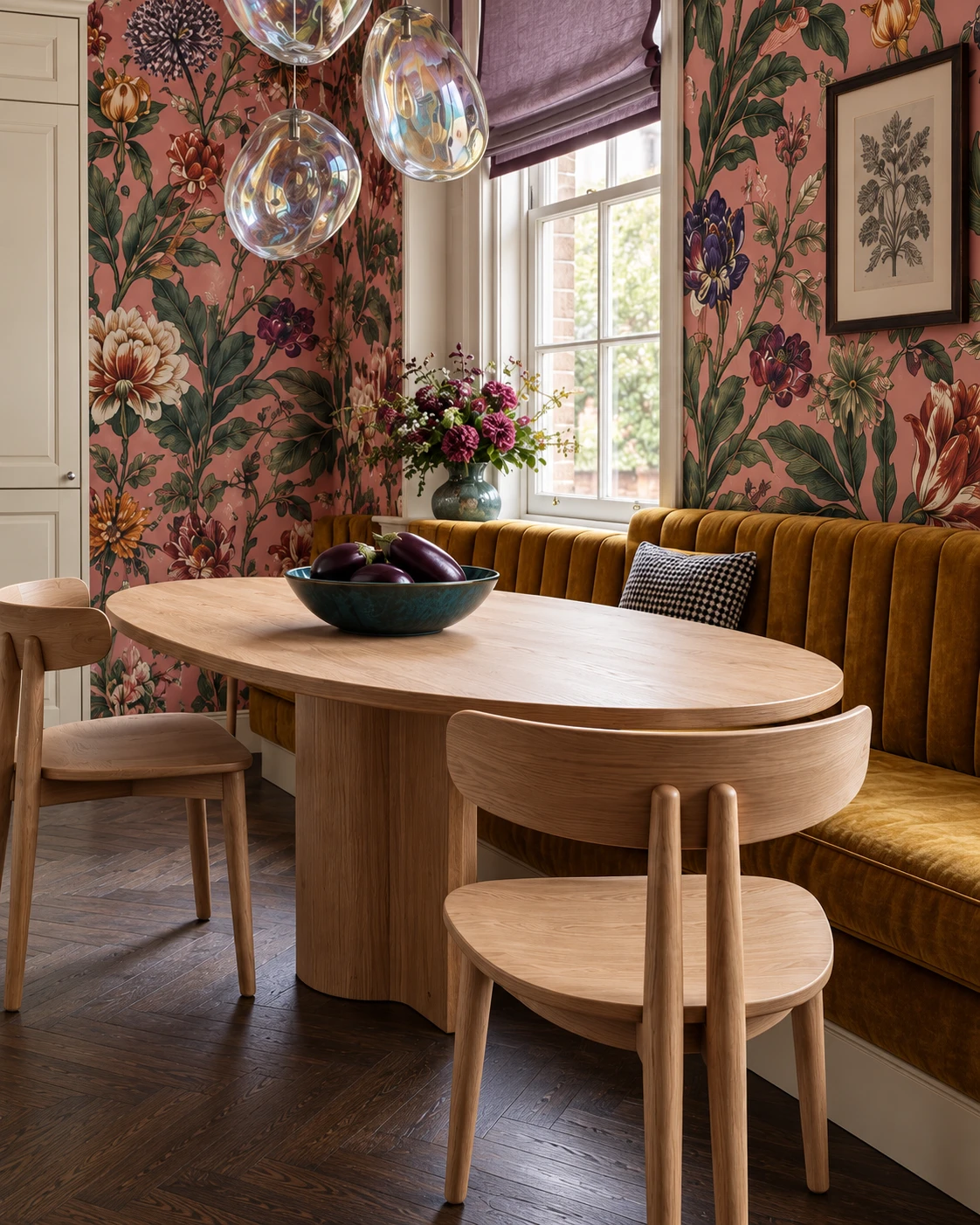
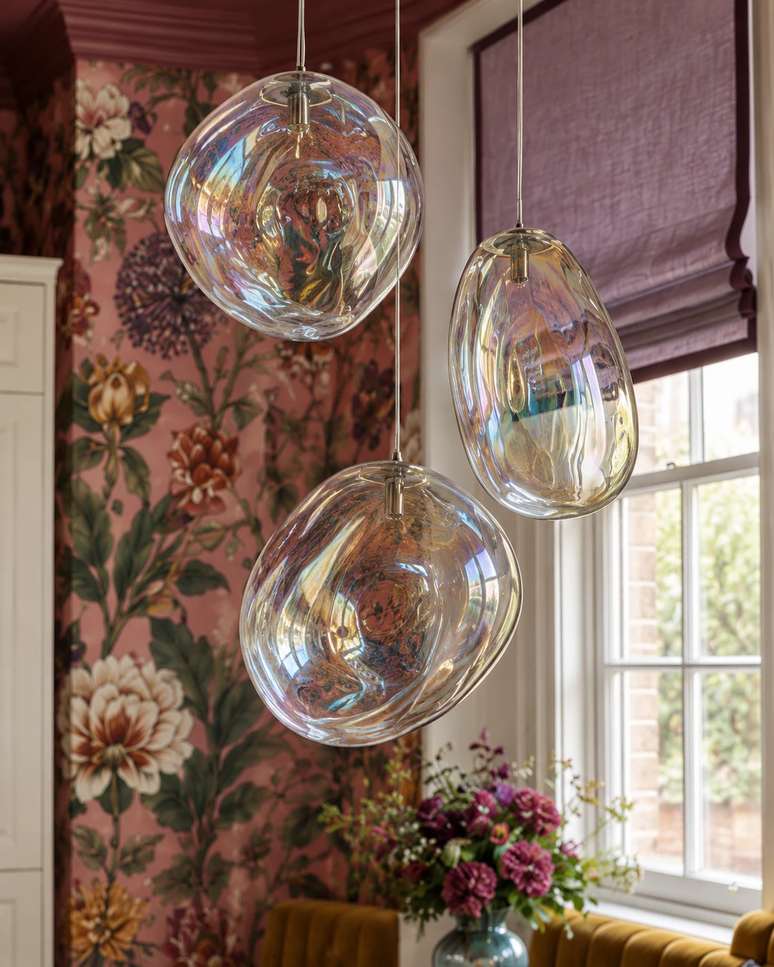
Framed ivory doors give oversized florals room to breathe. Plum tile adds depth, while oak brings warmth to the dining corner.
Borrow the idea: wrap the dining corner in floral wallpaper and balance the pattern with plain cabinetry and a tiled cooking zone.
05
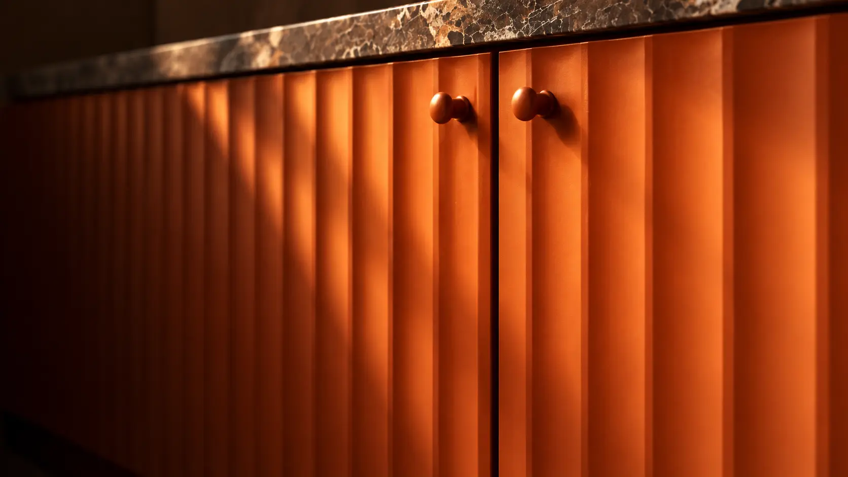
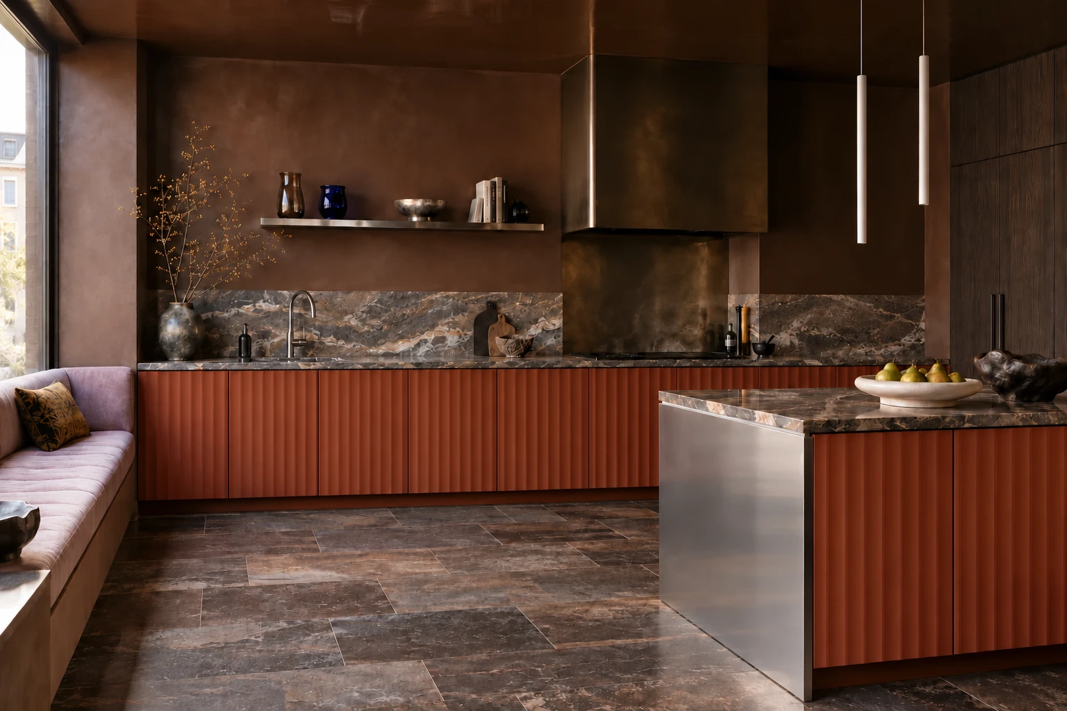
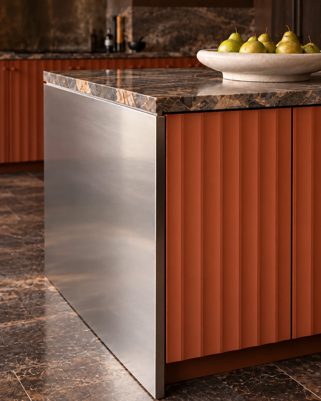
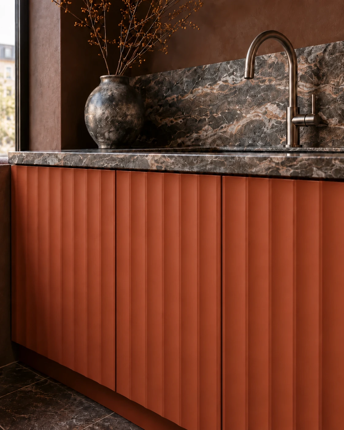
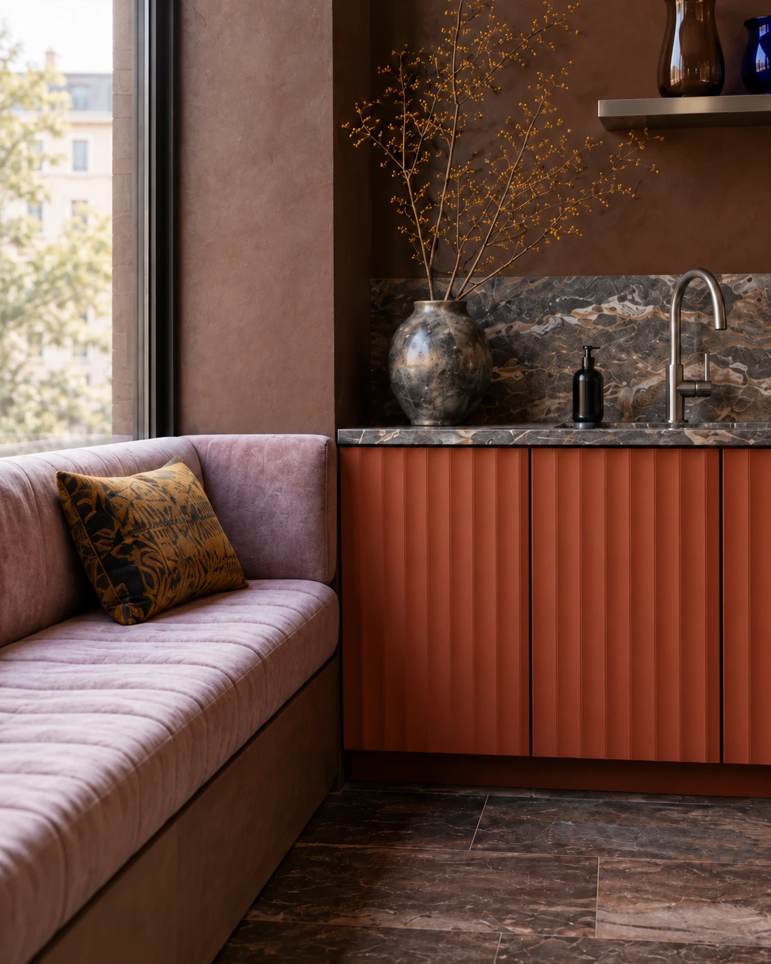
TERRSJÖ · red-brown wave pattern
Rust-coloured relief carries this dark kitchen. Smooth timber and horizontal stone veining balance the movement of the fronts.
Borrow the idea: use textured doors selectively and keep the surrounding finishes simple.
TERRSJÖ includes colour-matched knobs, shown in the opening image. This room explores a customised handle-free look; an alternative opening system would need separate planning.
06
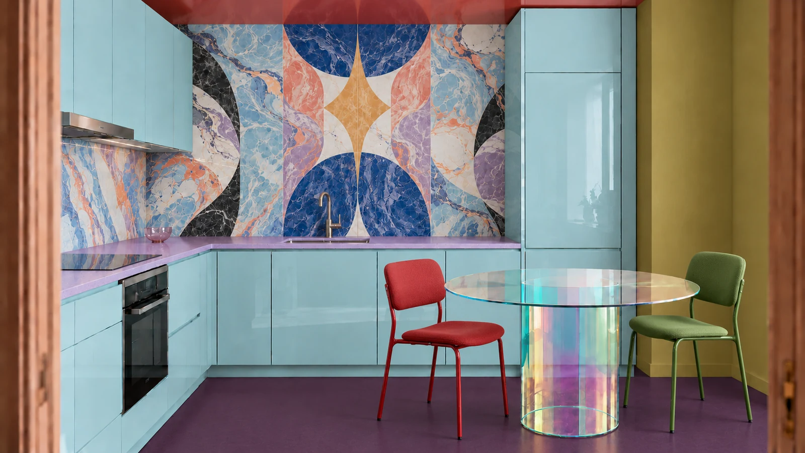
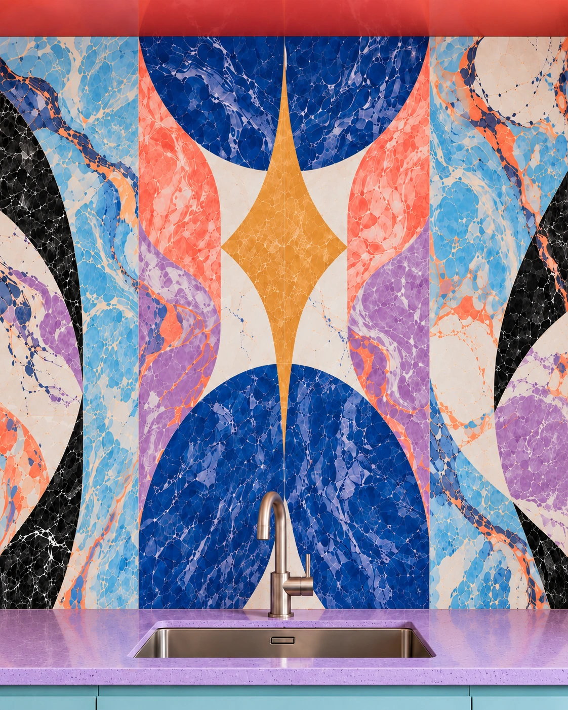
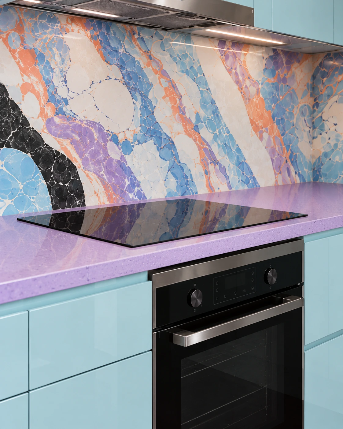
METOD · custom gloss fronts
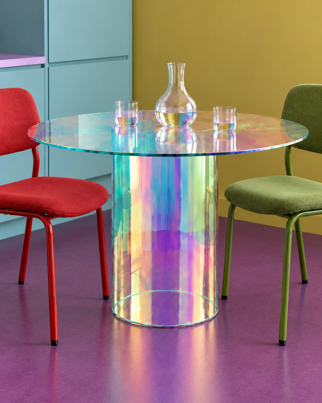
Pale teal gloss reflects the graphic wall, while a lilac worktop creates a clean dividing line. Coloured chairs keep the small dining area lively.
Borrow the idea: use custom fronts when their finish changes the whole room.
Design references: CEDIT Araldica · Durat · Glas Italia Shimmer · Magis Motta. Custom METOD-compatible fronts.
07
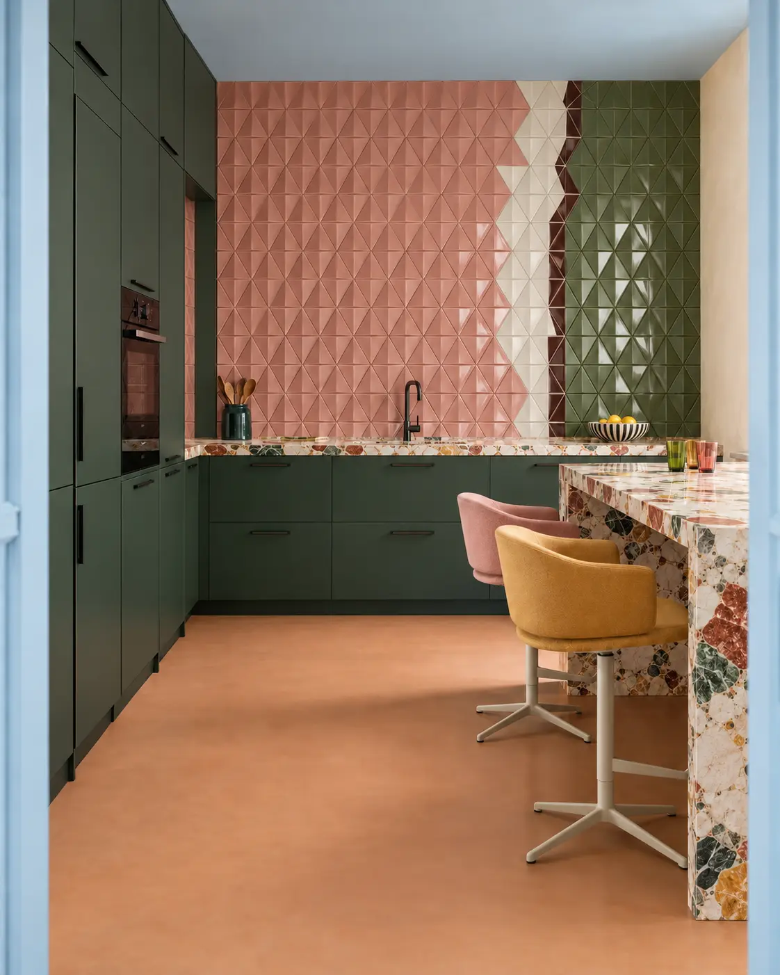
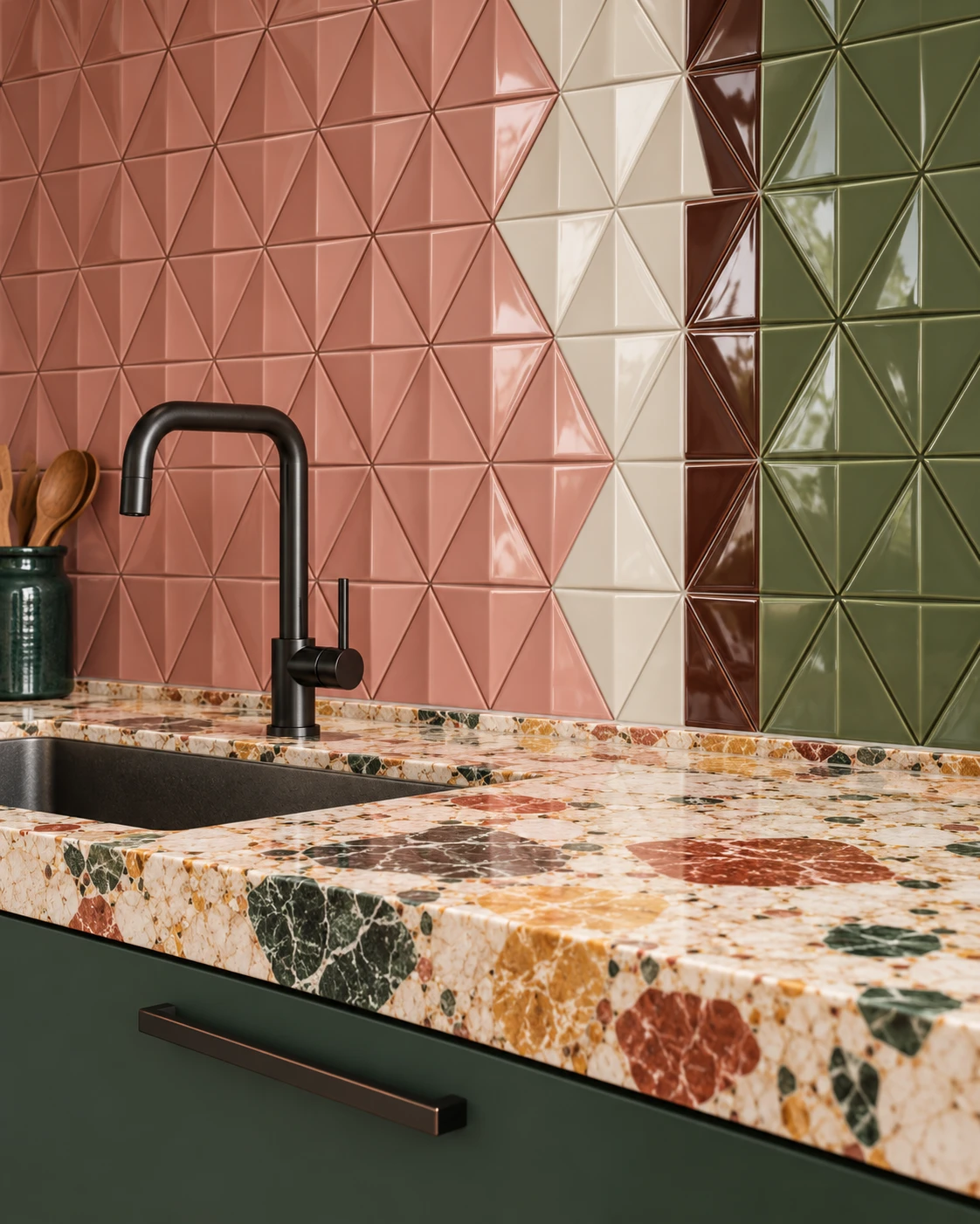
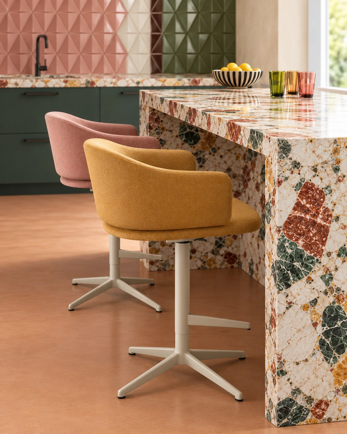
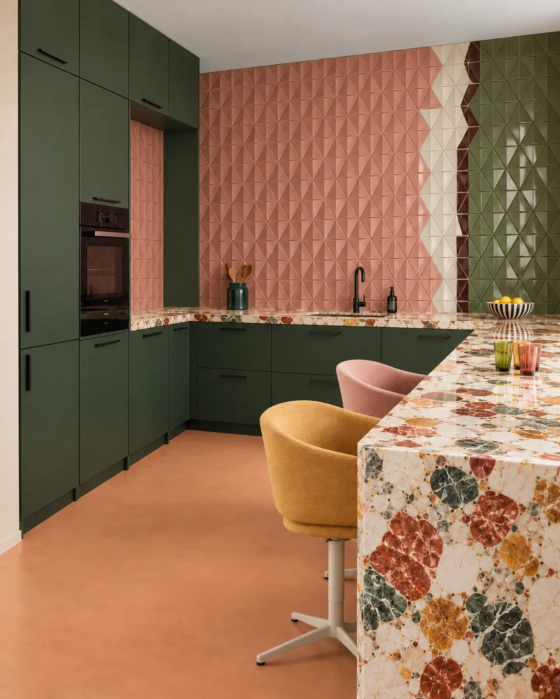
HAVSTORP · deep green
Dark green storage frames a sculptural pink-and-olive wall. Coral terrazzo and a quiet clay floor introduce different textures.
Borrow the idea: place relief where side light can reveal its depth.
08
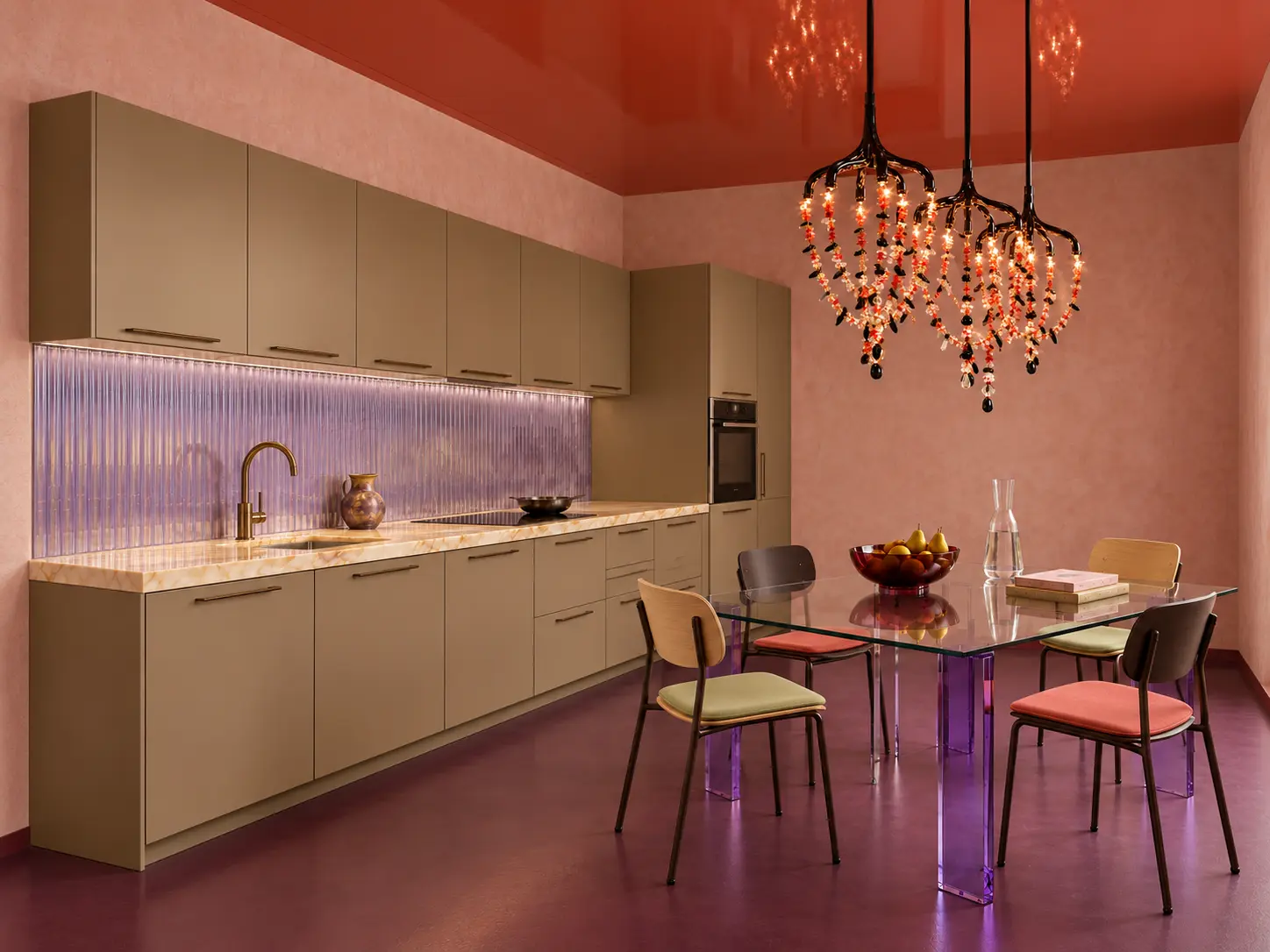
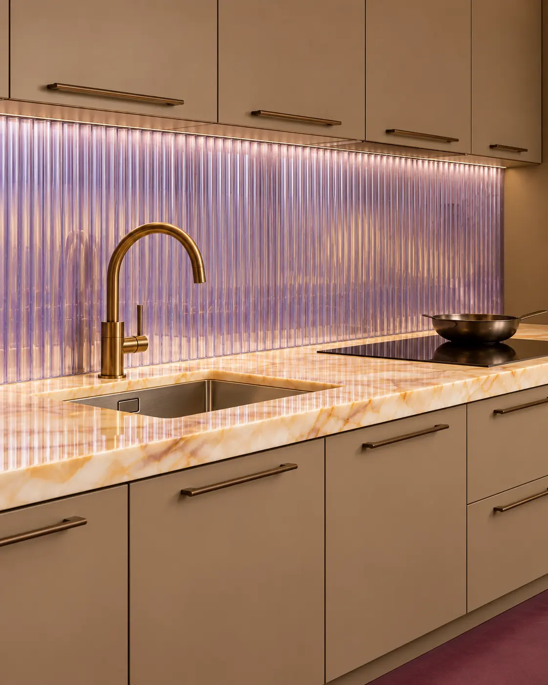
HAVSTORP · brown-beige
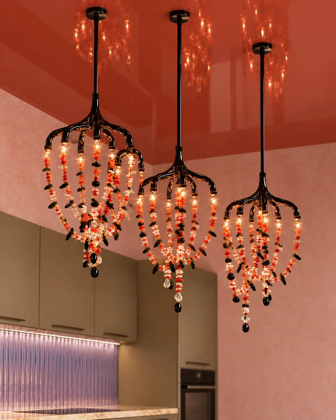
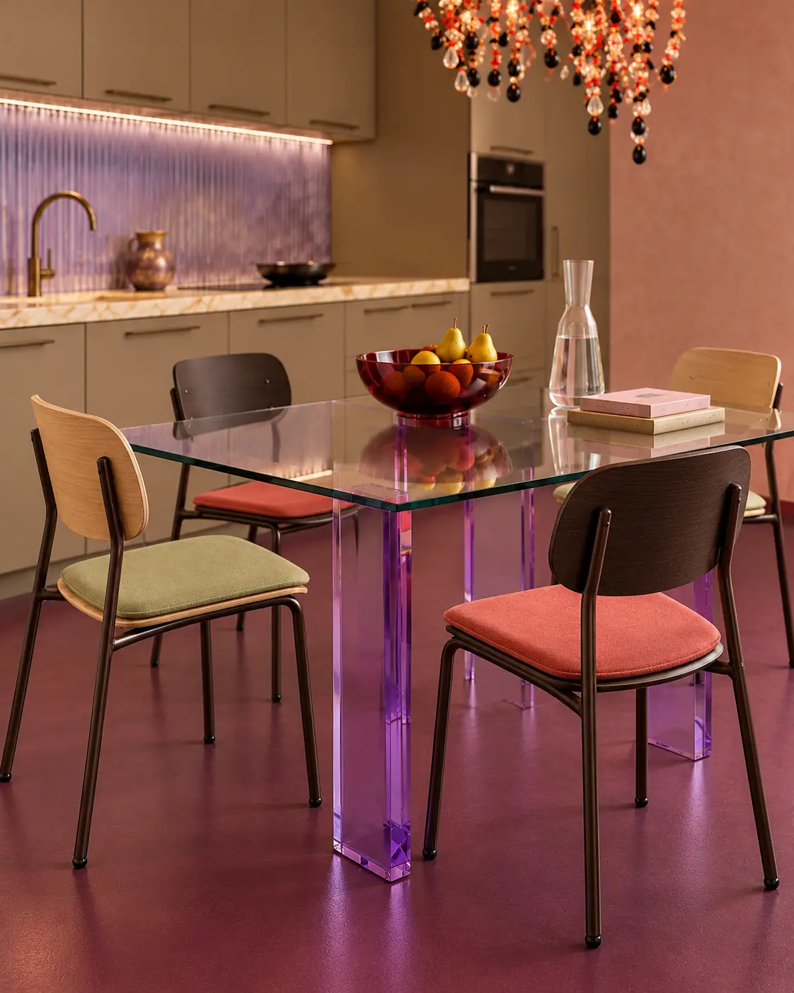
Neutral cabinetry supports lilac ribbed glass, a coral ceiling and a plum floor. A transparent dining table keeps the room open beneath the jewelled pendant lights.
Borrow the idea: let each colour belong to a different surface.
Design references: Madras FLUIDO-V with proposed lilac finish · Glas Italia Post Modern · Vitra Moca with added seat cushions. The pendant lights are based on an author-supplied reference; the maker has not been identified.
MY EDIT
01
Sage and burgundy make a strong pair without asking every surface to compete. The ceiling is the decision I would keep.

02
The wallpaper gives the everyday act of sitting down to eat a setting of its own. Plain cabinetry keeps the pattern in balance.

03
A smaller, lighter interruption in a practical kitchen. The contrast matters more to me than adding another dramatic material.
THE TAKEAWAY
A good kitchen does not need every idea in this story. Choose the colour, material or detail you would still want to see every morning, then let the rest support it.
RESEARCH + PRODUCT SOURCES