INTERIORS
How to Decorate with Ice Blue
Six rooms, from an aubergine living room to a clay-rose bathroom, that made me look at pale blue differently.
About 5 min read
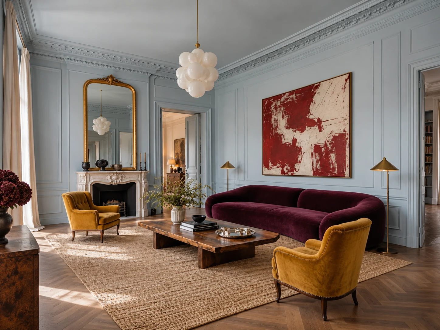
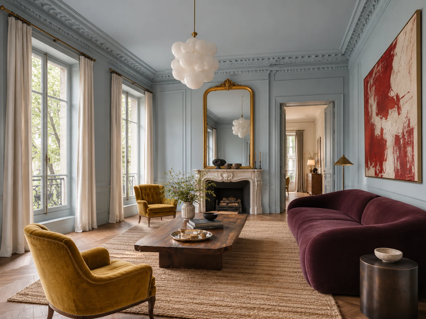
I changed my mind about ice blue when I saw it next to an aubergine sofa and two mustard chairs. Then I noticed the red painting. Then the ceiling, painted the same blue as the walls. The ceiling was the part I wanted to try at home.
That room made me look at pale blue differently. I started noticing what it did next to dark wood, how good it looked with rusty red, and how much of it I actually wanted in a room. In the living room I’d take it right up to the ceiling. In the bathroom I’d stop at the edge of the shower.
The rooms are editorial visualisations. Named products informed the designs, and details in the images may vary from the originals.
What Colours Go with Ice Blue?
Ice blue goes well with aubergine, mustard, rust, clay rose and warm woods such as walnut. I like using it on one surface first: the doorframe in a patterned room, the lower cabinets in a kitchen, or the tiles inside a shower.
- Aubergine and mustard bring out the coolness of ice blue in the living room.
- Ochre, burnt orange and burgundy sit well against a greyer blue in the bedroom.
- Rust red and amber give a blue-grey doorframe warmth in the dining room.
- Walnut and warm stone soften ice-blue cabinetry in the kitchen.
- Clay rose and walnut make a small area of ice-blue shower tile feel intentional.
01
An Ice Blue Living Room with Aubergine and Mustard
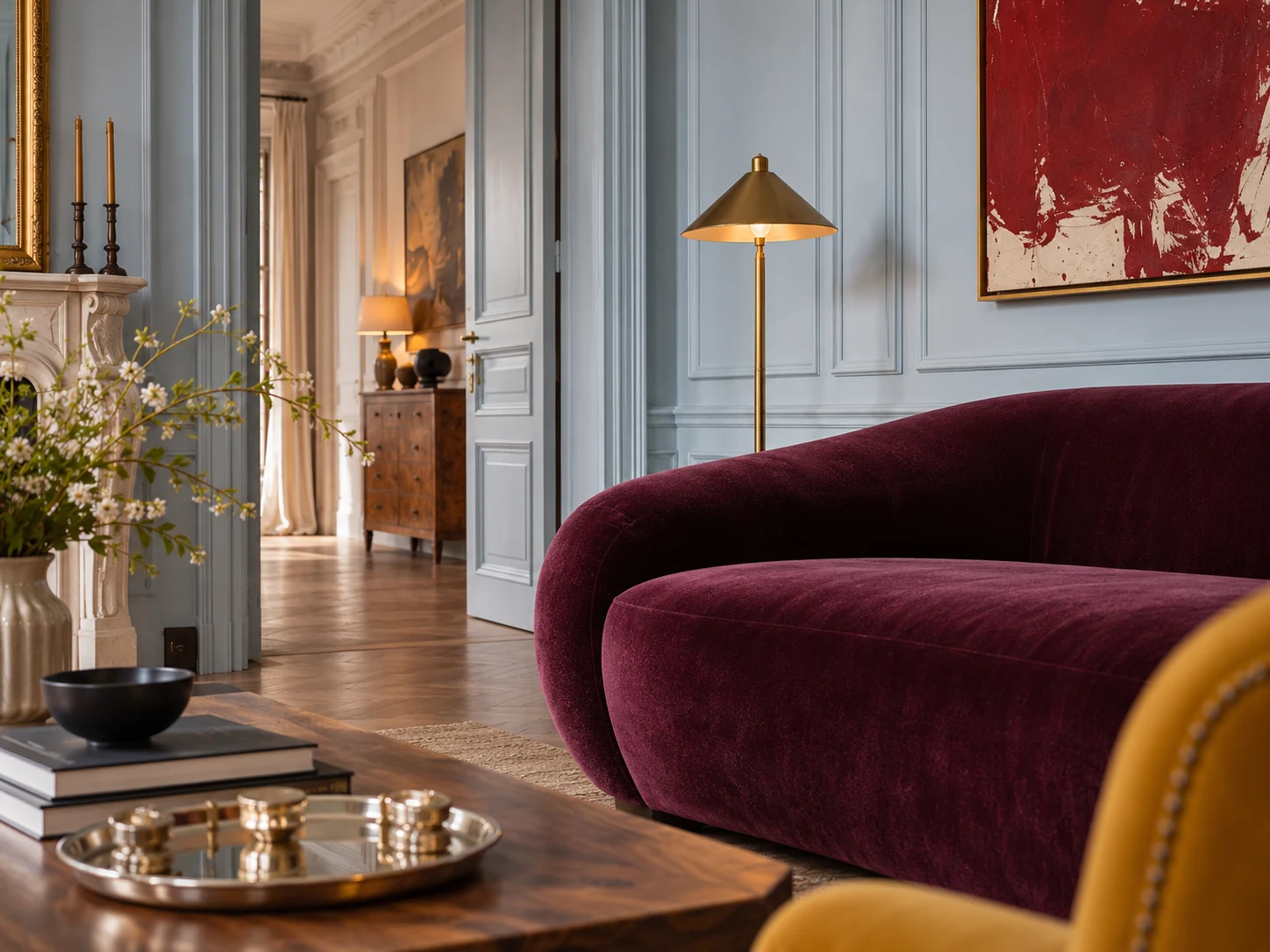
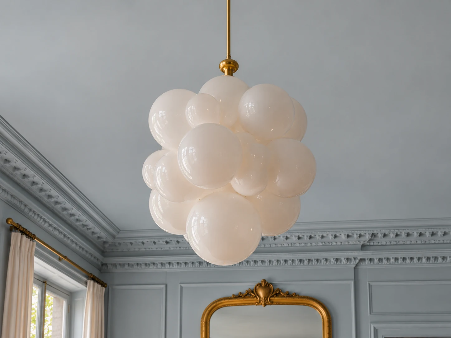
I’d paint the walls, the cornice and the ceiling the same ice blue. You can still see every bit of the moulding when the light catches it. The aubergine velvet gives the room depth, and the mustard chairs pick up the warmth of the gilded mirror. I’d leave the brightest red in the painting. One piece that size is plenty.
I’d paint a large sample and hold it against the wall and ceiling before committing to both. The same blue can look quite different on those two surfaces.
02
A Blue-Grey Bedroom with Burnt Orange and Burgundy
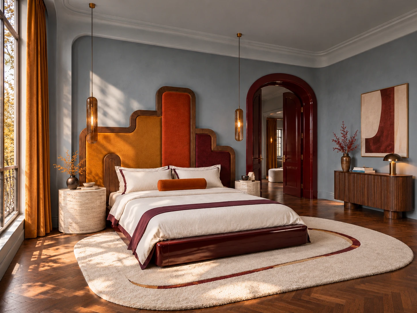
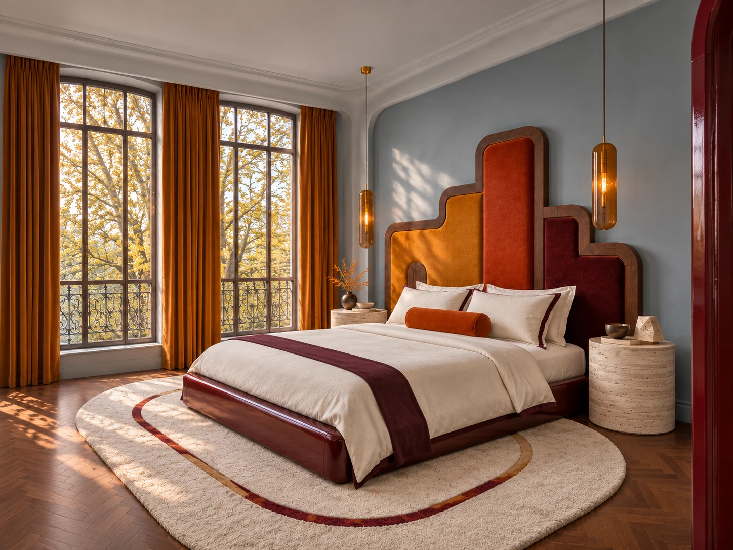
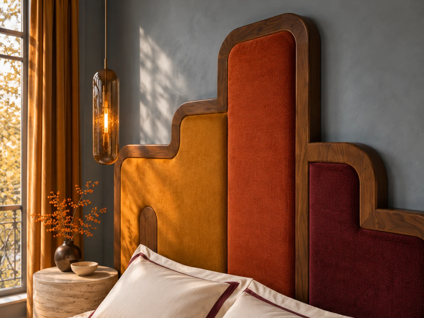
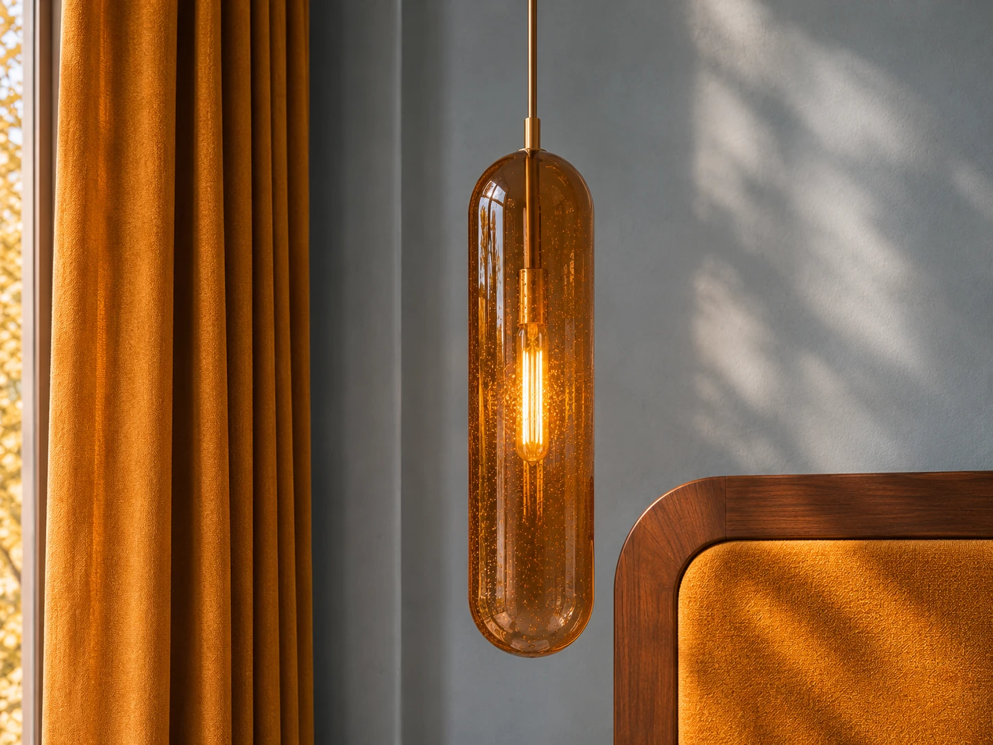
In the bedroom I’d go a little greyer. The stepped headboard already has three strong colours, and the blue-grey plaster lets you see where the ochre ends and the burnt orange begins. I’d check a paint sample next to the amber glass in the evening, when the lamps are on.
I’d put the paint sample behind the headboard fabric and check it twice, once by the window and again under the amber pendant.
03
A Dining Room with Blue-Grey Trim and Rust Wallpaper
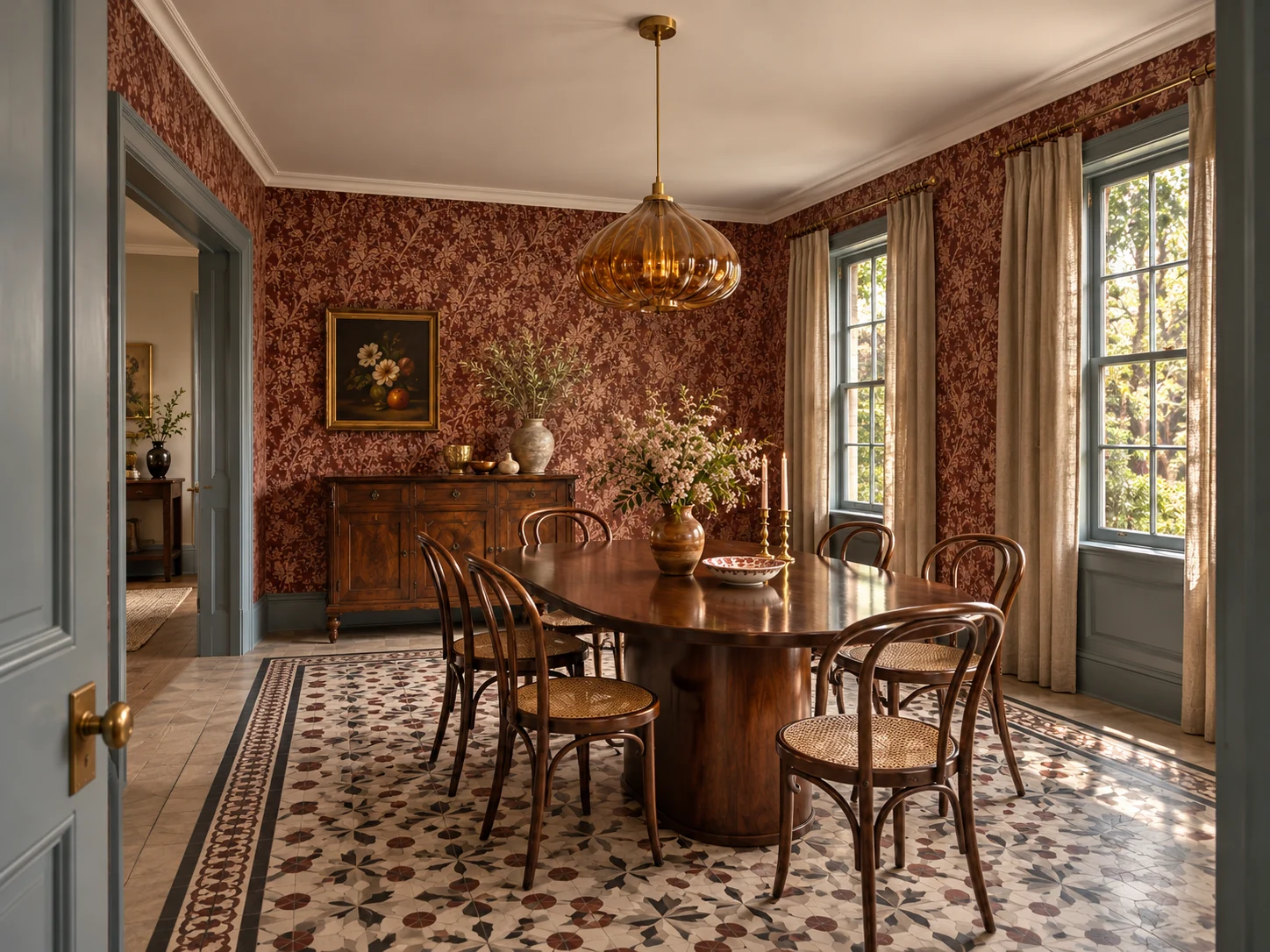
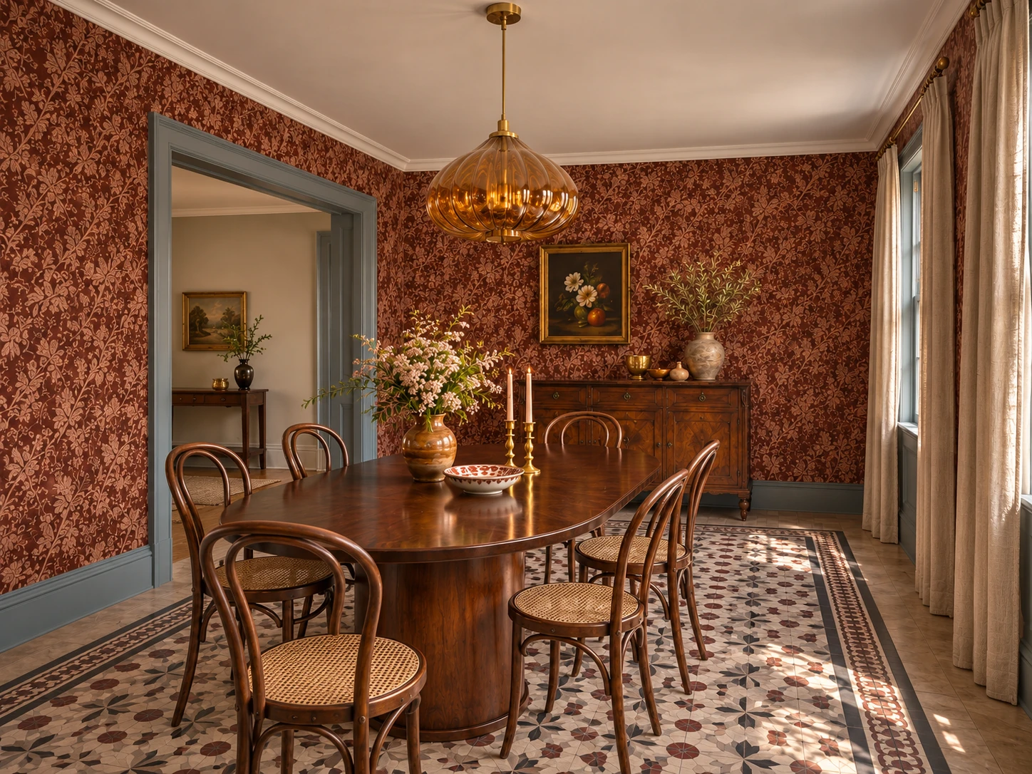
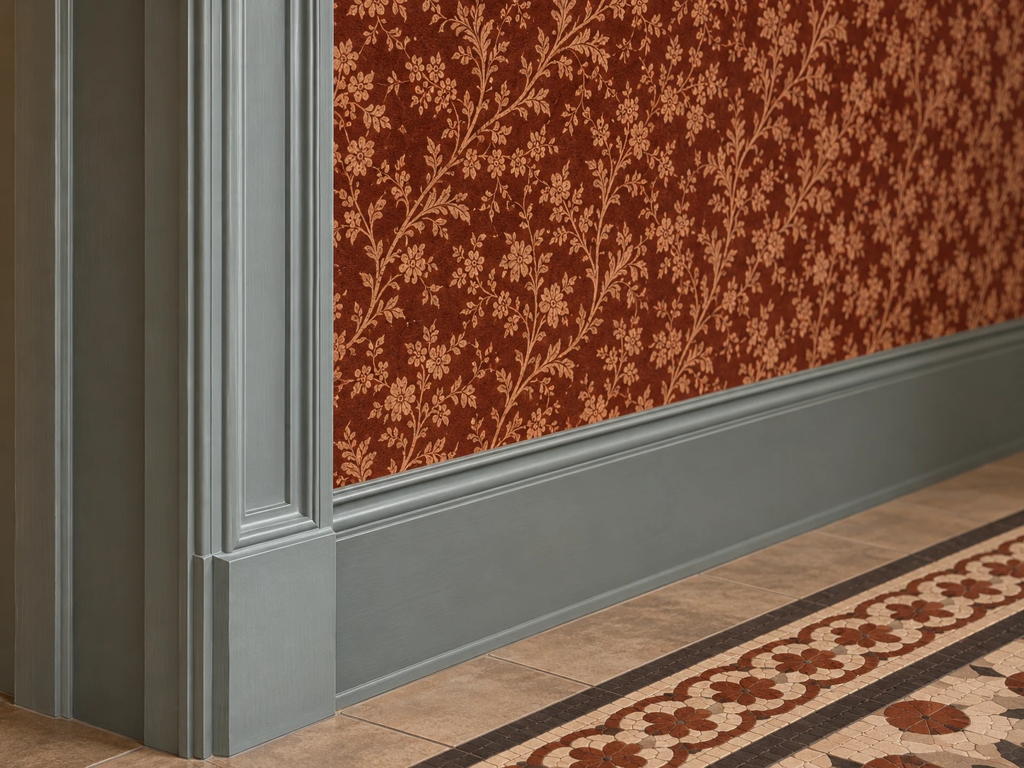
The doorframe is my favourite part of this room. There’s a floral print on the wall and another pattern under the table. A strip of blue-grey between them gives your eye somewhere to rest. If you have a wallpaper you love, try a small patch of cool blue right against the paper.
I’d paint a sample board and hold it against the wallpaper at the doorway. That lets you judge whether the blue has enough grey to sit comfortably beside the rust.
04
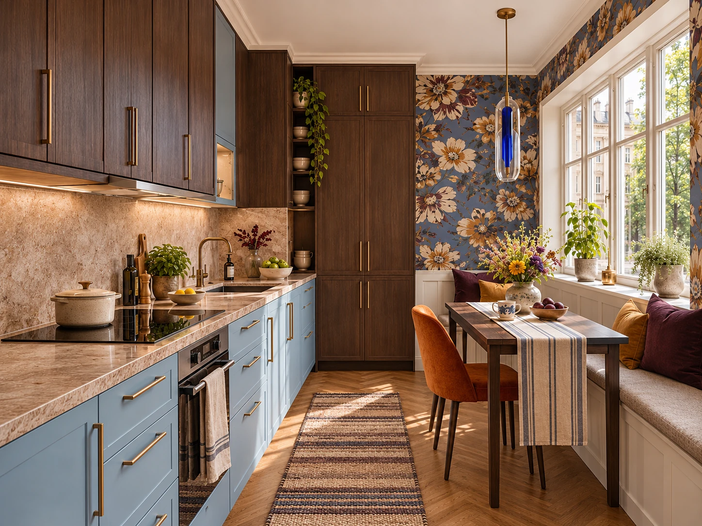
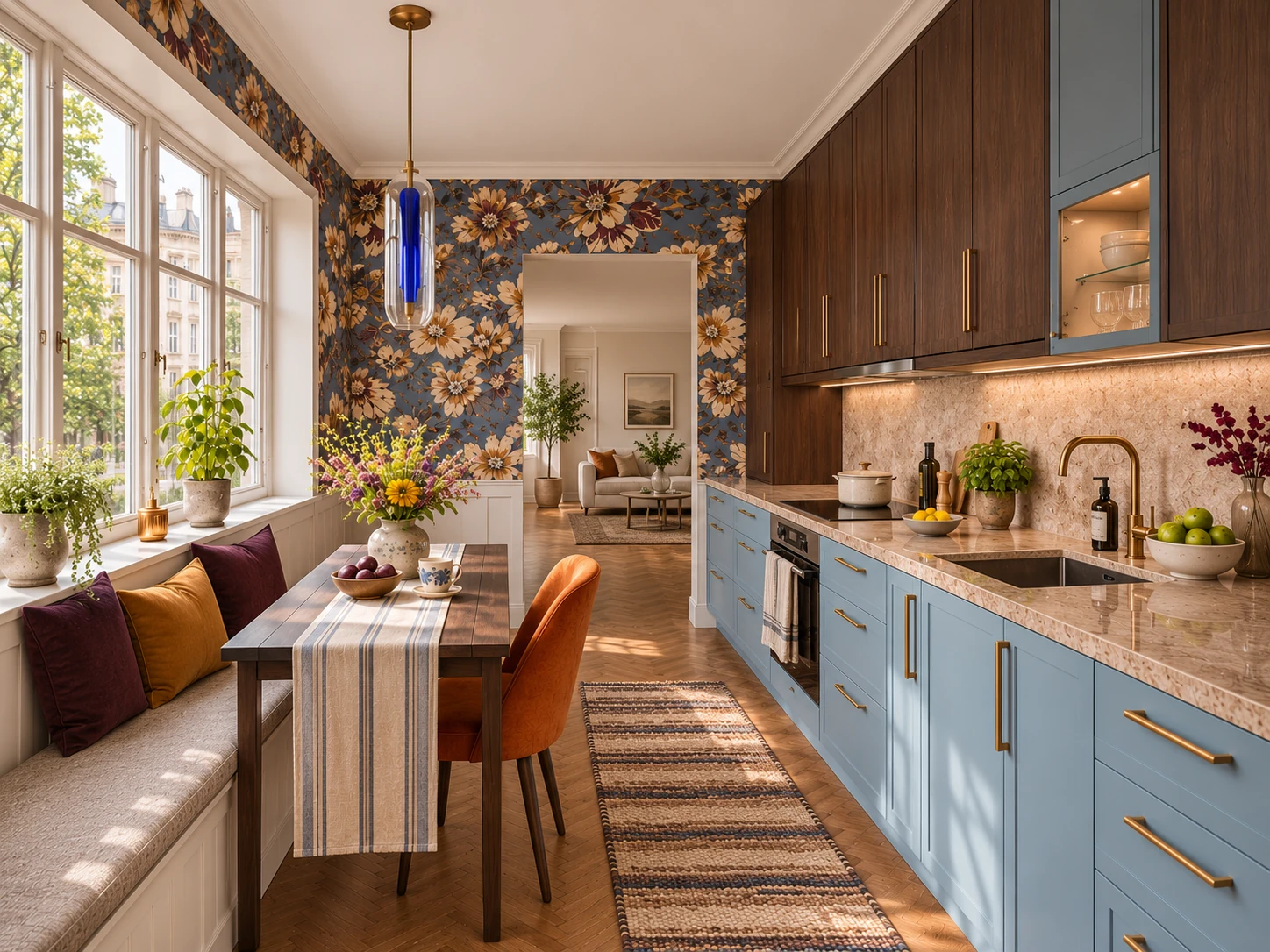
An Ice Blue Kitchen with Dark Wood Cabinets
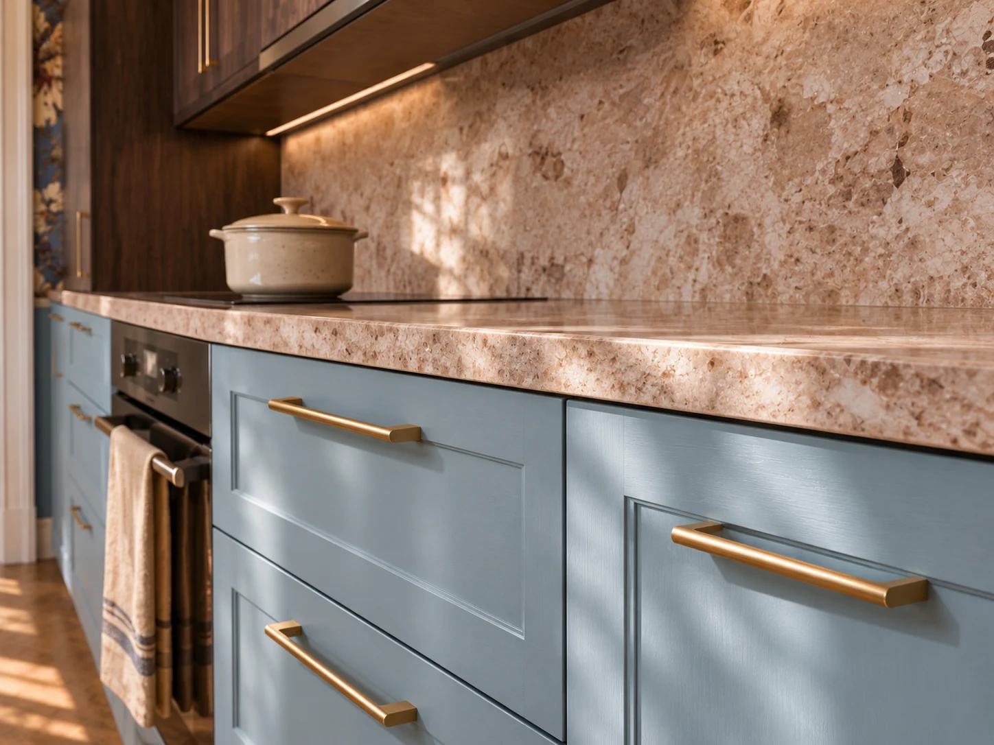
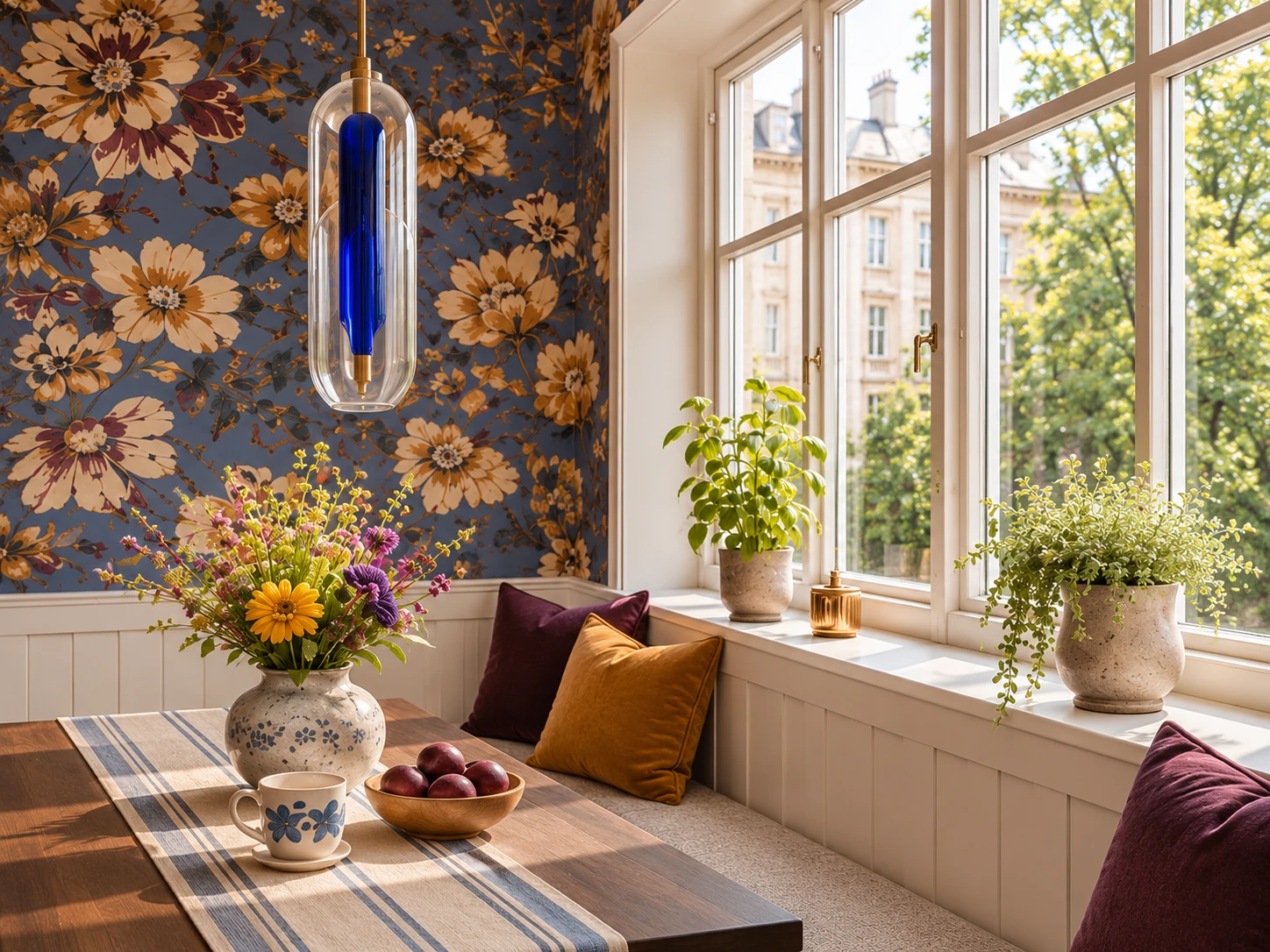
I like the blue most on the lower cabinets, where daylight from the window catches it. The dark wood above makes the kitchen feel more like part of the house. I’d let the floral wallpaper stay by the table, where you can enjoy it over breakfast.
I’d hold the blue sample vertically beneath the counter, with the stone and a brass pull beside it. That’s how the cabinet colour will actually catch the light.
05
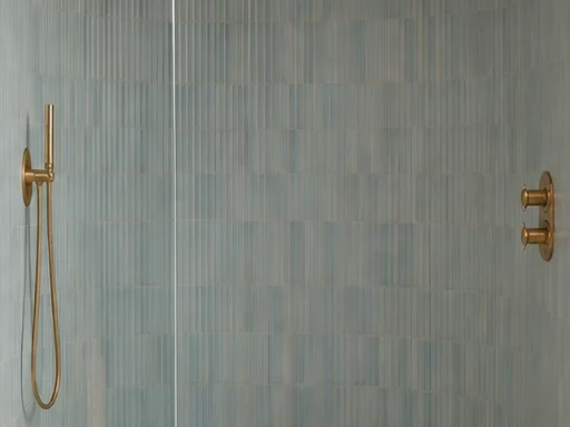
An Ice Blue Shower with Clay-Rose Walls
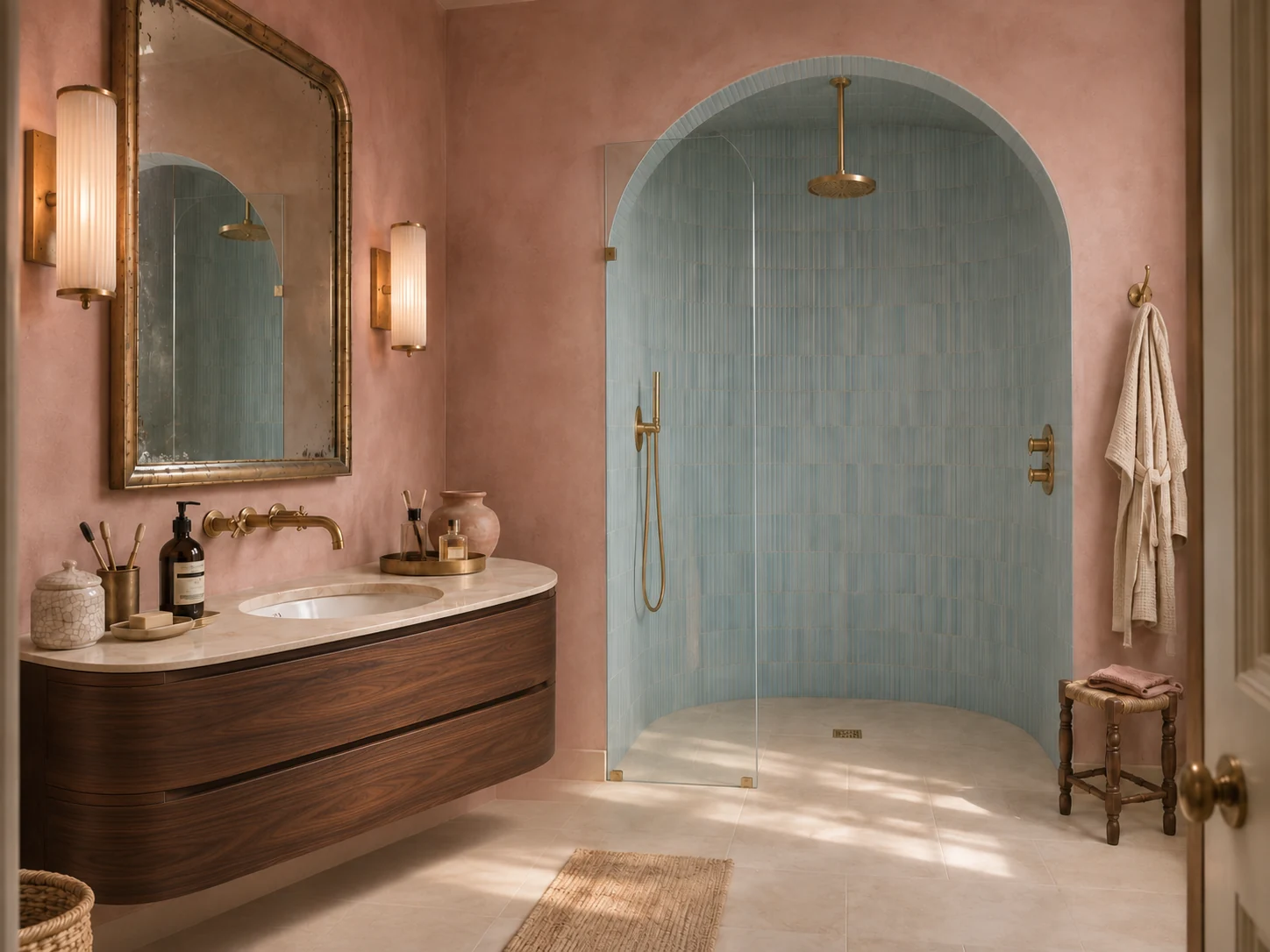
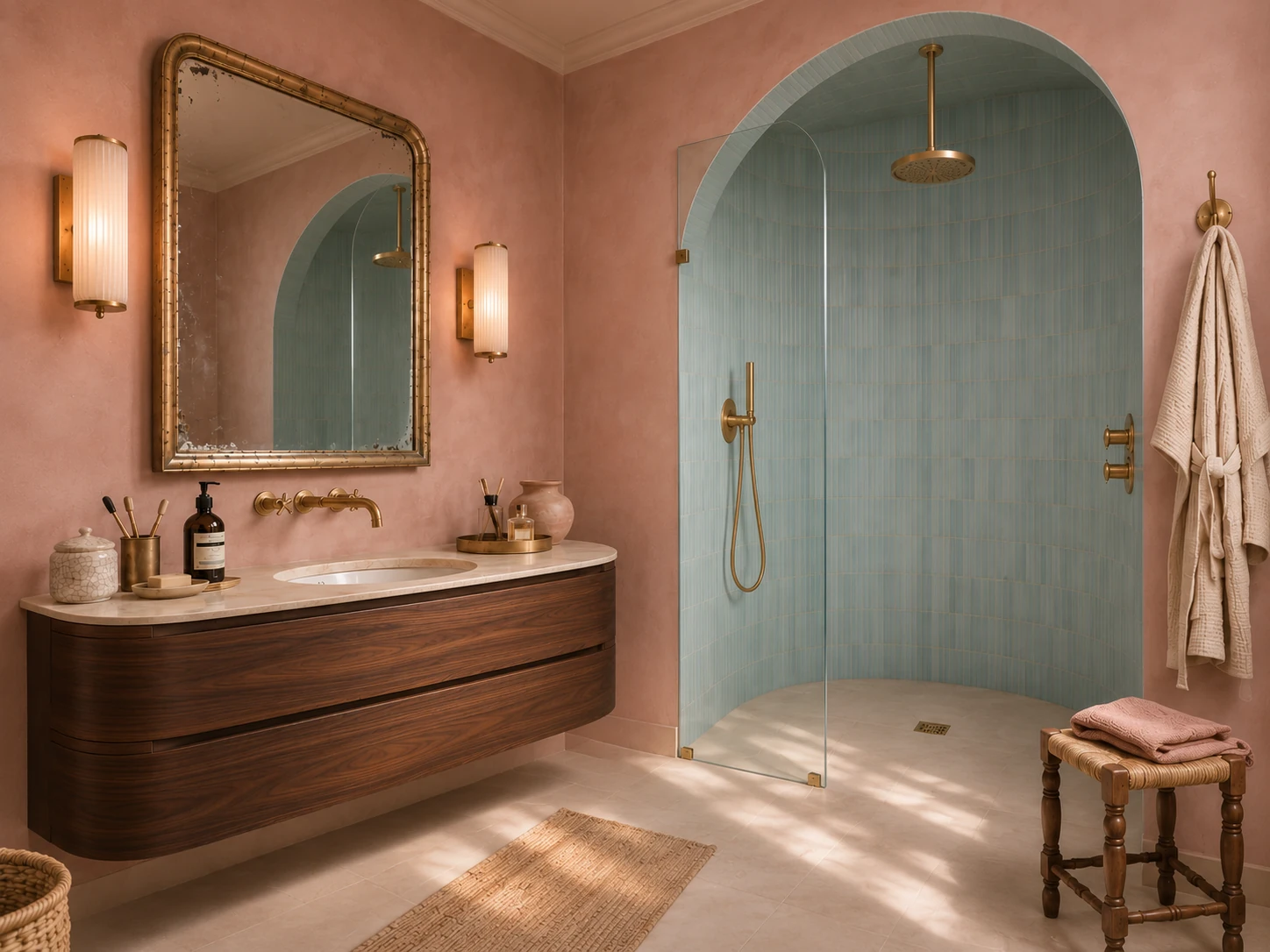
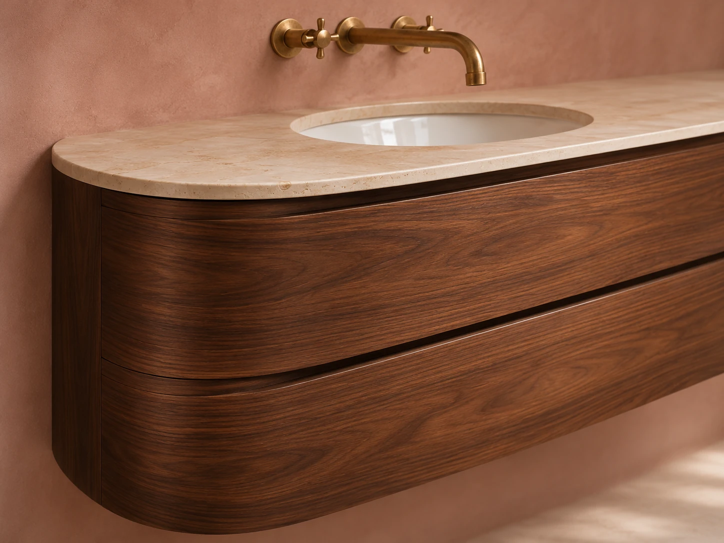
The blue is all inside the shower arch. I like seeing its edge against the clay-rose plaster, especially where those narrow vertical tiles follow the curve. The floating walnut vanity gives the room a darker note and leaves the floor visible underneath.
I’d look at a few sheets of mosaic together next to the clay-rose sample. One tile on its own won’t show how much the blue varies across the shower.
06
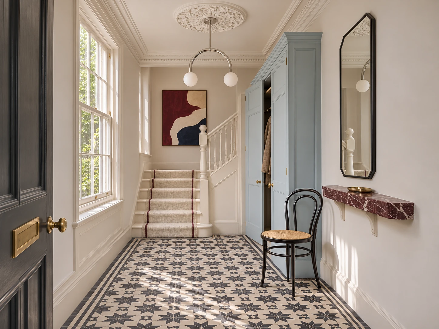
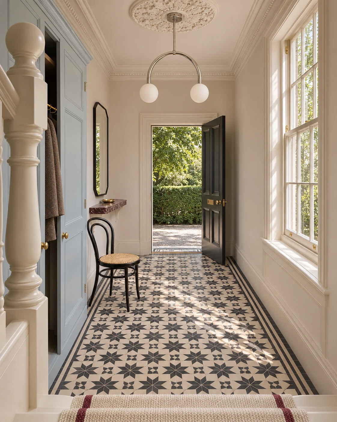
An Ice Blue Hallway with Black-and-White Tiles
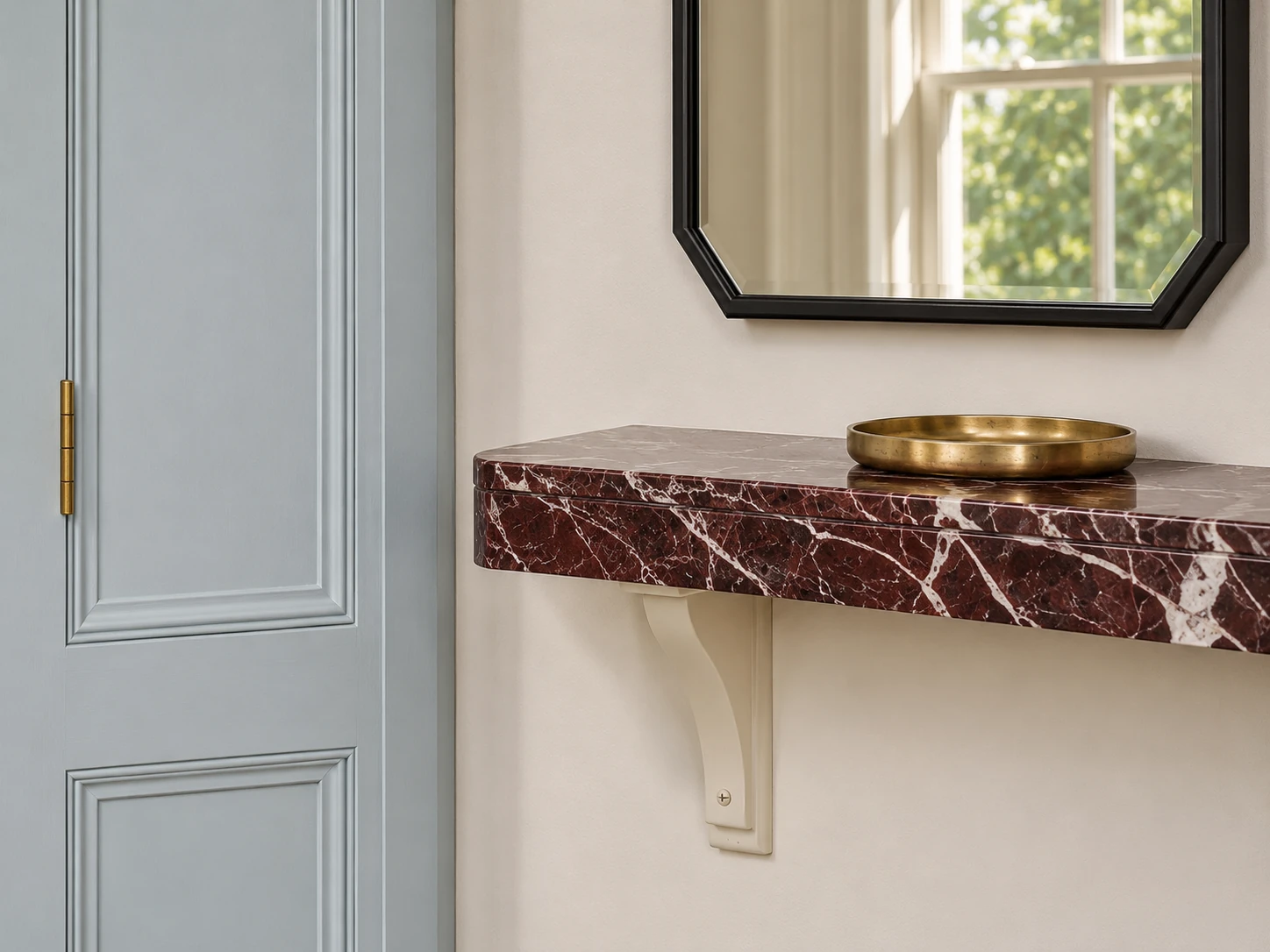
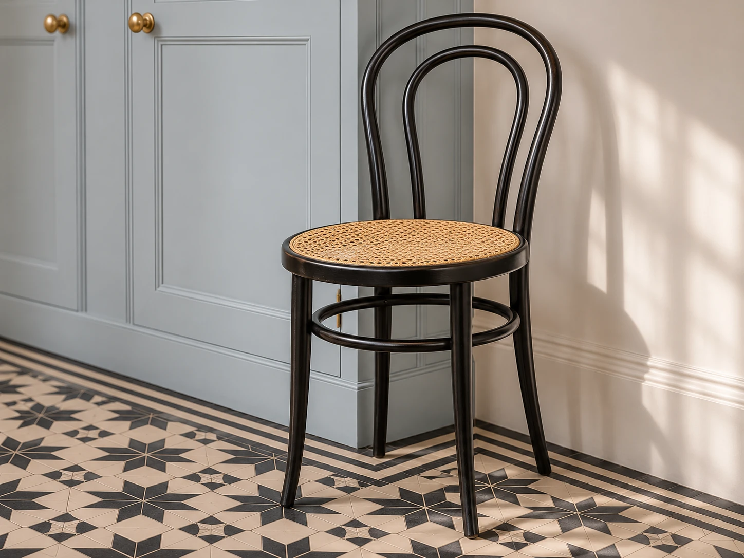
Here I’d put the blue on the coat cupboard. The black-and-white stars already give the floor plenty of movement. My favourite detail is the red marble shelf under the mirror. From the doorway you can see it, the two lines on the stair runner and the burgundy in the picture above the stairs.
I’d put an ice-blue sample at the bottom of the cupboard, close to the black-and-white mosaic. It’s easier to see whether the two work together there than at eye level.